| Image |
Comment |
| 01/07/2004 08:28:37 PM |
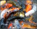
Feeding Frenzyby sherComment: This is just superb shot. Amazing, electrifying. Great colours. My absolute favourite. 10 |
 Photographer found comment helpful. Photographer found comment helpful. |
| 01/05/2004 08:00:51 AM |
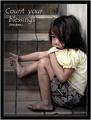
Count Your Blessingsby librodoComment: I have to say hats down to this entry. I feel really weird winning the third place with a droplet of water image... Yours is just truly emotional for me. There were many great posters in this challenge, but in my heart this is the winner for me. |
| Photographer found comment helpful. |
| 12/29/2003 06:29:22 AM |
|
| Photographer found comment helpful. |
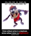
| 12/29/2003 06:27:02 AM |
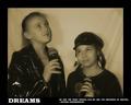
Dreamsby NeuferlandComment: Cute photo of the girls, but it has some bad yellow cast. If you intended a tone in you image, more warmer tone would have been more pleasing with this subject. This cast makes them look jaundiced. The word Dreams is OK, but the smaller text is illegible. If you didn't use all caps, it would have been more clear. |
| Photographer found comment helpful. |
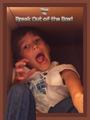
| 12/29/2003 06:25:10 AM |
Break Outby GraciousComment: Funny shot. The border is just plain bad. You need a bit of colour adjustments as well and sharpening. The text is overdone as well. Simplify and you will see how much nicer your images will be. |
| Photographer found comment helpful. |
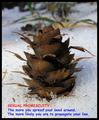
| 12/29/2003 06:22:52 AM |
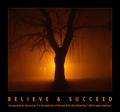
Sexual Promiscuityby drgsoellComment: What exactly are you promoting here? I am not sure how I should be motivated by this? To do what? Sorry for playing a dumbhead, but I don't think this would be hanging in very many offices. |
| Photographer found comment helpful. |
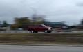
| 12/29/2003 06:21:13 AM |
Panningby MusicmanComment: I have absolutely no idea what this has to do with motivation. It looks like a snapshot of a fast moving car on very greay day. Sorry. |
| Photographer found comment helpful. |
| 12/29/2003 06:20:31 AM |
|
| Photographer found comment helpful. |
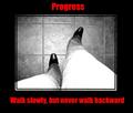
| 12/29/2003 06:19:06 AM |
Progressby kncoughlinComment: Interesting viewpoint. Like that it is b&w. The mat is well done, but the red text took it over board. If your text was simply white and a bit less heavy, I would have scored it much higher. |
| Photographer found comment helpful. |
| 12/29/2003 06:17:42 AM |
Dreamsby wwjdwithcaComment: You are mixing too many different text styles for this to bee effective. The text on the top of the image is too much. It's heavy and half reversed. I am not sure about this motivationg me into anything else but running away from it. |
| Photographer found comment helpful. |
Home -
Challenges -
Community -
League -
Photos -
Cameras -
Lenses -
Learn -
Help -
Terms of Use -
Privacy -
Top ^
DPChallenge, and website content and design, Copyright © 2001-2025 Challenging Technologies, LLC.
All digital photo copyrights belong to the photographers and may not be used without permission.
Current Server Time: 12/21/2025 11:38:24 AM EST.