| Image |
Comment |
| 05/05/2009 08:30:13 AM |
Table settingby jettyimagesComment: Interesting, unique and different - an inspired set piece perfectly executed. The very sutble treatment and excellant grayscale conversion enhances the soft focus creating a very empyrean effect. This image compares favorably with some of the more classical romantic period painters and in some ways could be considered a homage to their style and technique. An outstanding image that is very unique in this challenge. A standing ovation would be in order for submitting such an excellant image. |
 Photographer found comment helpful. Photographer found comment helpful. |
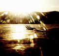
| 05/05/2009 08:25:49 AM |
sun sets over table & forkby cutoutComment: One of the more interesting aspects of reviewing imagery is determining what works and what doesn't. In this instance, the woulda, shoulda, coulda is that an outstanding image presentif the top third had been cropped out eliminating the over done sun bloom and background hill profile. With that crop, this becomes an outstanding photo in the style of Rennasiance genre romanticism. With the bloom cut out, the effect is ethereal with the subtle and gentle brown tones. The image immediately becomes successful in both a technical and artistic sense being very pleasing to the eye due to the subtle touches of complimentary color and white space. The author may want to attempt this and make a photo on canvas print for entry into print competitions as the printing technique along with the excellant composition would be a winner in any setting. |
| Photographer found comment helpful. |
| 05/05/2009 08:15:19 AM |
Hide & Seekby hesitantComment: Whimsey and humor is always appreciated after viewing 70 odd images - it provides a break and refreshes the mind. This is a great construction and set piece image - very clever and inventive with all the technicals in place and properly executed. From an artistic standpoint, it demonstates a different way of looking at the challenge which is a huge positive. If there was one complaint, it would be that a little better DOF control would have been a slightly better choice, but that is a completely minor issue - so minor, it's barely worth mentioning. Well deserved kudos for being creative and clever - this image deserves high placement for being a demonstration of having fun with a camera. Well done. |
| Photographer found comment helpful. |
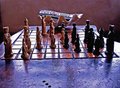
| 05/05/2009 08:10:28 AM |
Table Shot IIIby whiterookComment: The temptation to view this as a "throw in" image to the challenge was significant. When faced with this impression, the correct choice was to back off and take a longer look. There are several positive aspects to this image begining with the wonderful wood table and board - there is lots of character there and interesting details properly exposed. The intricate detail of the tan chess pieces is a plus. The subtle background is also a huge plus being very neutral in tone and texture. Unfortunately, the odd lighting angle didn't do this image any favors creating highlights that wash out the interesting tones and colors of the table. Additionally, the black chess pieces lost all the intricate detail present on the tan pieces. Taking a piece of blank paper, one can see the difference by isolating the tan pieces and viewing them seperatly from the entire construction. More thought into how this set piece was lighted would have helped it tremendously and made it a potential ribbon winner - there is a lot of positive potential in this image and the author should be encouraged to revisit this scene keeping in mind the lighting problems. |
| Photographer found comment helpful. |
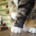
| 05/05/2009 08:02:34 AM |
Sibling Thieveryby bspurgeonComment: A very candid moment in time, the excellant conversion to black and white makes for a very effective presentation. The temptation to over use the table reflection was avoided and the subtle treatment of that aspect is a huge positive. Richly detailed with no major technical issues to distract the eye, the entire effect is pleasing and notable. A very good entry into the challenge from both an artistic and technical standpoint. |
| Photographer found comment helpful. |
| 05/05/2009 08:00:07 AM |
You are now entering the backspace - please stand byby cjoconn22Comment: When faced with an out of the ordinary concept, the temptation is to immediately react to the image during review. In this case, the immediate reaction was not completely positive, but after sitting back and taking in the whole gestalt of this particular image the idea came into context. Very scifi, the clever combination of Enter and Backspace in addition to the blue sine wave ties the whole title/image combination together although it isn't immediately apparent. Probably not to general taste, this reviewer has a certain affection for scifi constructions - well done. |
| Photographer found comment helpful. |
| 05/05/2009 07:52:57 AM |
I warn you, don't push itby TitiaComment: It took a while to understand the title/image combination concept, but eventually light dawned on Marblehead. A clever title and image that just falls short of being completely successful. Technically competant with proper exposure and good DOF control, it's artistic impact, while there, is very subtle and could have used a more in your face treatment. Still, a very good entry into the challenge meeting the challenge criteria. |
| Photographer found comment helpful. |
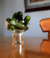
| 05/05/2009 07:49:01 AM |
Gherkins Anyoneby CraftyComment: The immediate impression is not a positive one. The highlights, while right on the edge of being edge of being over done, are very distracting and immediately draw the eye to them. This is very unfortunate technical issue because from an artistic sense, this would have been a very good minimalist image with some very interesting artistic aspects - notably, the interesting optical effect at the bottom of the glass and the pickles in the cup of the glass. A little more thought and lighting control would have given this image a high place in the challenge. |
| Photographer found comment helpful. |
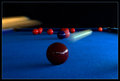
| 05/05/2009 07:44:12 AM |
Red Ball in the Corner Pocketby BrianRComment: This is one of those ideas that could have gone horribly wrong or perfectly right. In this case, it's kind of a combination of the two in that the static balls are distracting while at the same time the cue ball is perfectly captured in motion and the highlight present on the other balls which is a negative is a positive on the cue ball enhancing the sense of movement and speed. The one issue that immediately jumped out at this viewer is the cue stick - the double exposure effect just doens't work - it would have been better if it had more linear motion similar to the cue ball. While a different image, a possible solution to controlling all the positive and negative aspects of this image would be to remove the other balls (except the one in the corner) from the table and do the shot excluding the cue stick. In that way, the depth and dimension of the table would have been intact, the sense of power and motion expressed by the cue ball would have been enhanced and overall the entire effect would have been very positive. A very good idea that just falls short of being excellant. All that being said, it's a great idea and should be recognized as such. Well done. |
| Photographer found comment helpful. |
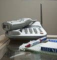
| 05/05/2009 07:35:21 AM |
I'll be right back.by rlmichaelComment: The flat appearance and lack of color saturation do not do this image any favors. A longer look with all details in focus would have been a better approach. Additionally, a little more lighting control would have had significant benefit to this image and created more interest. |
| Photographer found comment helpful. |
Home -
Challenges -
Community -
League -
Photos -
Cameras -
Lenses -
Learn -
Help -
Terms of Use -
Privacy -
Top ^
DPChallenge, and website content and design, Copyright © 2001-2025 Challenging Technologies, LLC.
All digital photo copyrights belong to the photographers and may not be used without permission.
Current Server Time: 06/28/2025 08:48:35 AM EDT.