| Image |
Comment |
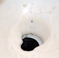
| 05/05/2009 11:13:15 AM |
Oreoby C4PicturesComment: An image that is so gob smackingly awful it defies accurate description - there must be a reason for submitting it. One can only assume that it's meant to achieve the lowest score possible which can be obliged. |
 Photographer found comment helpful. Photographer found comment helpful. |
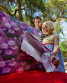
| 05/05/2009 09:37:02 AM |
Birthday in the Park with Dadby mindbottlingComment: A candid moment that seems staged and slightly forced (not that is was staged and posed - it just gives that impression). The contrasting colors are very pleasing to the eye and the angle at which the image was captured perfectly meets the challenge criteria. Another minor issue is that the image is too tall to be truly effective - a crop of maybe an 1/8th of the top would have improved the image. A good entry into the challenge, it falls just short of having major impact on the viewer. |
| Photographer found comment helpful. |
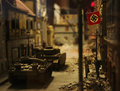
| 05/05/2009 09:33:08 AM |
Chilling reminderby snafflesComment: Model set piece imagery is always difficult to evaluate because there is so much to look at. In this case, it might have been a better idea to include the whole image as sharp as possible to increase the sense of depth and dimension to the image - the DOF technigue used here leaves the image rather flat and undetailed which seems opposite of the modeling image genre which would be to reproduce, as accurately as possible, a moment in time. A longer look would have been more appropriate to gain maximum impact from a dramatic and interesting scene. |
| Photographer found comment helpful. |
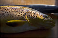
| 05/05/2009 09:29:23 AM |
Yesterday: caucht - cooked and eatenby GlanniComment: The angle of this image makes is suspect from a strictly challenge criteria standpoint being from an angle that is unnatural for a table surface image. On the other hand, there is nothing that says that the camera can't be placed on an object on the table, although this has the feel of a hand held capture. The rich and detailed fish is a pleasant surprise and while the lighting created some highlights that are distracting, they aren't overwhelming and give a sense of freshness to the subject - almost as if it has been freshly caught. A unigue subject for this challenge. |
| Photographer found comment helpful. |
| 05/05/2009 09:26:06 AM |
Yahtzeeby rrdjservComment: An interesting double double with the live dice being expertly framed against the static dice in the background. A very clever concept that is pleasing and amusing - technically competant with no major issues. From an artistic sense, everything seems in place including the hand letting the dice go which is a very subtle but clever and inventive touch. One minor little issue is that the bottom of the image could be cropped to eliminate the table surface which would have concentrated the eye on the more interesting aspects of the image, but that's a personal choice - it's still very good as it is. Well done. |
| Photographer found comment helpful. |
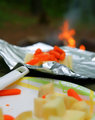
| 05/05/2009 09:22:44 AM |
Foil : essential for Campfire Cookingby glad2badadComment: Not quite as effective as it could be, the narrow center focus field is more of a distraction than a focal point of interest. The overall appearance of this image seems rather bland. While the color combinations are interesting, the lack of depth and dimension are a negative and could have been handled more effectively. A better idea might have been to use a more focused approach and concentrate on the meal ingredients and the foil itself as the plate in the foreground is diametrically opposed to the title and subject matter. |
| Photographer found comment helpful. |
| 05/05/2009 08:51:53 AM |
Table Wineby AmmieComment: While this sentence may seem to be over wrought with angst, sometimes it helps to just reach out and scream "what were you thinking?". This is a brilliant composition in the meme of minimalist imagery which is marred by less than competant lighting control. The back lighting created blooms which ruin the gentle, pleasing tones and colors including washing out the incredible details in the right wood chair top and negatively affecting the bottle, glasses and candle stick. A little less exposure to control the white flare on the table top and candle flame and the elimination of the back lighting would have brought this image to perfection from both an artistic and technical standpoint. The author should revisit this scene and recompose to eliminate these issues and enter the image into a print competition - it would place very high in that context. |
| Photographer found comment helpful. |
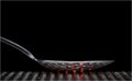
| 05/05/2009 08:43:16 AM |
Hot Spoonby peterComment: Cropping a good third off the top of this image would have increased viewer interest due to presenting the viewer with less blank space to distract the eye. A simple composition with subtle DOF effects, it is very effective given that the crop was made. A worthy entry into the challenge. |
| Photographer found comment helpful. |
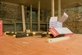
| 05/05/2009 08:40:20 AM |
Work in Progressby raishComment: A very good look at the process of construction, a little more lighting control would have moved the image from average to outstanding. The washed out and rather flat color and tones are a negative as the details on the fastener boxes and ruler being lost. A little more saturation and proper lighting would have really made this image pop and give it some wow factor. A very good set piece marred by a few minor technical issues. |
| Photographer found comment helpful. |
| 05/05/2009 08:35:10 AM |
Her Dayby eyeduphotosComment: The fish eye effect is very effective, but the combination of sharp detail and soft focus causes one to constantly squint and try to clear the eye - it would not be too strong a statement that this effect makes the eyes water from trying to resolve the various elements into a cohesive whole. Additionally, the over done white framing on the wine bottle also creates an unnerving effect and makes the viewer uncomfortable. A better approach might have been to use a mitigating screen on the window such as a light curtain which would have reduced the over done white and reduced the glare to a more managable level for the viewer. From an artistic standpoint, this is a well constructed set piece that fails from some rather severe techical issues. |
| Photographer found comment helpful. |
Home -
Challenges -
Community -
League -
Photos -
Cameras -
Lenses -
Learn -
Help -
Terms of Use -
Privacy -
Top ^
DPChallenge, and website content and design, Copyright © 2001-2025 Challenging Technologies, LLC.
All digital photo copyrights belong to the photographers and may not be used without permission.
Current Server Time: 06/28/2025 12:07:52 AM EDT.