| Image |
Comment |
| 05/07/2009 09:34:32 AM |
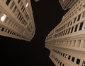
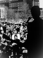
One Dark Night in my neighbourhoodby anwarranaComment: The initial reaction is "whoa". Very impressive - almost as if one were looking at a staircase going straight up into nothing. The other buildings at the top of the image seem a little out of place, but it works as it is. One minor issue with DOF, but that can be over looked. Very nice. |
 Photographer found comment helpful. Photographer found comment helpful. |
| 05/06/2009 09:22:15 PM |
lostby JeniYComment: It's not often that a commenter feels the need to allow the image to speak for itself. This is one of those times. Well done. |
| Photographer found comment helpful. |
| 05/06/2009 09:21:17 PM |
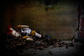
dark daysby timfythetooComment: A repeat of an image from a previous challenge, the same commentary is useful in comparing the two images. However, the black and white treatment is seemingly more effective, but that may be a personal preference for black and white imagery. Well lighted and strongly emotional type of imagery. One suggestion the author might wish to attempt is to tinker a little with subtle monotone color in the tan or blue range - a very light treatment of either might make this a very effective and powerful image. |
| Photographer found comment helpful. |
| 05/06/2009 09:11:13 PM |
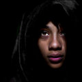
Inyanga by MAKComment: In general, an elegant portrait which is very powerful and nicely composed. However, the highlights on the lips and reflections in the eyes are not necessarily a positive - a more matte type lip stick would have reduced the reflection and the resultant glare. Same issue with the eyes, as the reflections detract from the image's impact - in particular on the right where it's located right over the pupil. On the other hand, the lighting is very effective in conveying a senes of mystery and intrigue. Given the minor highlight issue, this is a very worthy entry into the challange and should place high. |
| Photographer found comment helpful. |
| 05/06/2009 08:42:54 PM |
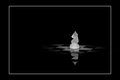
Dark Knightby project365Comment: Simple and elegant, the single lighted knight is perfect - a the gentle glow expands in all directions fasing into the dark with any abrupt dividing lines. One curiosity is the reflection with the dark bar - not sure if that was intentional or not as it could be viewed as either a positive statement or a negative artifact without examaning at a higher resolution. That being said, this is a very worthy entry into the challenge. |
| Photographer found comment helpful. |
| 05/06/2009 07:41:13 PM |
shadow rockby varlyte79Comment: The silhouette technique used here is intriguing and effective - a common color technique translated into black and white. All the common elements that make up a black and white image are present and effective. There is a technical issue with the lower corners fading which is a negative as, while not a distraction exactly, it doesn't have a matching face at the top of the image and seems out of place. Still, a very worthy entry into the challenge with detail and inventive use of the silhouette techniqe. |
| Photographer found comment helpful. |
| 05/06/2009 07:30:21 PM |
Dark lightby kiskatComment: Very inventive and unique so far in this challenge. Creativity is always a highly prized component in any competitive endeavor and this demonstrates that axiom. Simple and elegant, the image is technically perfect and artistically impressive. While up against some stiff competition, it should place very high if not win a ribbon just for originality in addition to it's technical and artistic success. Well done. |
| Photographer found comment helpful. |
| 05/06/2009 07:27:51 PM |
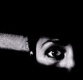
Don't breathe, he'll hear you....!by PaulComment: Incredibly effective - very Hitchcockian which could very easily been a cut scene from any of his movies. Very effective and very noir. The lighting angle with the rich dramatic black and abrupt facial shadows give a feeling of intensity not often seen in images like that. Simply outstanding from both a technical and artistic standpoint. One more comment - this image would have worked framed smaller with the dark cut off right at the ear. While the partially lighted ear gives the scene some depth and dimension and transitions the light angle from the face to the wall, it just seems a little out of place. A crop just to the right edge would have helped and a total clone out would provide a two step technique to the lighting which might improve it very slightly. That being said, this is perfect as it is and the ear comment was only something to experiment with. This would work really well as an entry into a print competition. Well done - congratulations. By rights a ribbon winner hands down. |
| Photographer found comment helpful. |
| 05/06/2009 04:25:35 PM |
Locascioby SEGComment: There is a very effective monotone feel to this even though it's not a monotone image. Very dramatic in feel and dark and forebidding from an emotional standpoint - a very good artistic success. From a technical standpoint, it's a little oversharpened, but that can be viewed two ways - as a positive halo effect or a negative one. Given the rich and variable detail, the positive approach is much more valid. Well done. |
| Photographer found comment helpful. |
| 05/06/2009 04:22:56 PM |
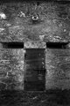
Doors to the darksideby marvinComment: Very clever and inventive - the eyes, nose, mouth apparent in the thumbnail sort of resolved into eyes/mouth on full view, but a very good concept captured perfectly. A little less flash would have helped as the center of the image around the door seems a little overdone, but that's a very minor nit pick. Well done. |
| Photographer found comment helpful. |
Home -
Challenges -
Community -
League -
Photos -
Cameras -
Lenses -
Learn -
Help -
Terms of Use -
Privacy -
Top ^
DPChallenge, and website content and design, Copyright © 2001-2025 Challenging Technologies, LLC.
All digital photo copyrights belong to the photographers and may not be used without permission.
Current Server Time: 06/27/2025 07:43:41 PM EDT.