| Image |
Comment |
| 05/07/2009 09:17:54 PM |
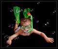
Into The Depthsby HipychikComment: Dropping out of the neutral third person mode for a moment, I have to quit speed voting, then returning to review for comments as I always end up changing my vote. :>) This is a great image - fun and whimsical, crisp and sharp, it is a very different entry into the challenge. Superlatives would not do this image justice. All things being equal, this should place very high in the challenge just for being so unique. Originally rated a 7, it's been rerated a 10 for it's technical and artistic excellance. Well done and good luck. |
 Photographer found comment helpful. Photographer found comment helpful. |
| 05/07/2009 09:12:54 PM |
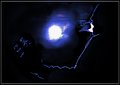
Moonlight Glowby Mark-AComment: Once again, the speed review to get a sense of what was being offered in this challenge did not do this image justice. A very minimalist construction, the moon lighting is perfectly controlled and exposed with the nice little highlights not over done which would have been a temptation in post processing. Effective in both an artistic sense and technically competant, this image is rerated from a 7 to a 9. While not to general taste, these simple and elegant compositions are greatly appreciated by this reviewer for their simple and elegant presentation. Well done. |
| Photographer found comment helpful. |
| 05/07/2009 09:05:40 PM |
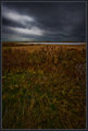
Lowering Storm, Dusk, Province Landsby Bear_MusicComment: The original review didn't reveal what became readily apparent on comment review - there are two images here and both are excellant post-impressionist images. Of the image was cropped to just aboe the mid-ground print, it's a perfect homage to Van Gogh and his post-impressionist style. On the other hand, if the bottom third of the image was cropped off, it would be another Van Gogh style post-impressionist image. In either case, this is a wonderful image and one that, by rights, should be recognised for both it's technical excellance and significant artistic impression. Originally rated a 7 on the first pass through due to a mistaken impression, it's rerated to a 10 and if a 11 could be issued, it would have been. A wonderful entry into the challenge and one of this reviewer's all time DPC favorites. Well done. |
| Photographer found comment helpful. |
| 05/07/2009 08:59:48 PM |
"Georgia On My Mind" a tribute to Rayby pastortimmrComment: A very different type of silhouette that is slightly affected by the slightly over the edge white spotlight. The spot draws the eye immediately which is not a positive effect given the very competant outline on the quitar player and mike. A difficult image to capture properly even with the best eqiupment and back lighting set up. If the light had been a little less intense or had a more blue cast to it rather than the hot white, it would have been perfect. |
| Photographer found comment helpful. |
| 05/07/2009 08:43:00 PM |
Before Darknessby MichaelsComment: The problem with these kind of images is that sometimes the "little" issues become "major" issues even at first glance. The birds in this image look like pixel "dead spots" in particularly located where they are in the ray of light. Additionally, the sky, while dramatic, could have used a little more processing to bring out the rays of light and form a more dramatic impression on the viewer. Given these two issues, it does have a sense of depth and dimension, it just fails to deal with them effectively. A little more exposure time and some post processing would have improved the image significantly. |
| Photographer found comment helpful. |
| 05/07/2009 08:38:58 PM |
I face dark and evilby swaroskjiComment: A very competant smoothing technique gives this image an almost computer generated feel. The impression is one of bravery and the very essence of "super hero". The rather vague details that are revealed with a longer look at the image could have done with more light to reveal thier presence better and give a more immediate wow factor or "pop". |
| Photographer found comment helpful. |
| 05/07/2009 08:34:59 PM |
The battle begins at first lightby jdixonsdComment: On the first ratings pass, this reviewer rated this much too low due to a mistaken impression. Simply perfect, there is nothing more that can be said that would properly convey the impression this image imparts. Originally rated a 7, it has been rerated a 10 because of it's technical and artistic excellance. Well done. |
| Photographer found comment helpful. |
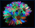
| 05/07/2009 08:32:57 PM |
Blacklight hand painted daisiesby DCrest01Comment: An interesting construction - very much in the genre of abstract impressionism and in particular in the style of Jane Frank a noted artist who worked in several modalities of this impressionist style. As this reviewer certainly appreciates the tonality and style of this image and while it doesn't appear to exactly match the challenge subject, who cares. Well done. |
| Photographer found comment helpful. |
| 05/07/2009 08:26:06 PM |
Out of the Darkness Comes a Lightby JimiRoseComment: There is an interesting effect here that can be viewed two ways. One, that it's a flaw and two, it's a direct reflection of the title vs the image. Given that the image is effective, if not overly powerful from an emotional or artistic standpoint, the second impression is more likely the right one. There is also a rather intriguing anomaly in this image - the right side forhead is squared off which is in direct contradiction to the rather nicely formed and exposed curve on the left. In one way, the rather squared forehead is very Frankenstein's monster in effect. Given that there are several ways to view this image, the fair thing is to rerate it from a 7 to an 8. |
| Photographer found comment helpful. |
| 05/07/2009 08:14:31 PM |
Silent darkby fionaComment: The impression given by the title does not equal the impression given by the image. The image itself is well lighted, there is a massive amount of detail available to look at in the marina and the sky is on the edge of night which is in direct contradiction to the concept of "dark". It's still a competant image, but not terrible effective given the title and the challenge subject. |
| Photographer found comment helpful. |
Home -
Challenges -
Community -
League -
Photos -
Cameras -
Lenses -
Learn -
Help -
Terms of Use -
Privacy -
Top ^
DPChallenge, and website content and design, Copyright © 2001-2025 Challenging Technologies, LLC.
All digital photo copyrights belong to the photographers and may not be used without permission.
Current Server Time: 06/27/2025 11:01:09 AM EDT.