| Image |
Comment |
| 05/07/2009 10:10:26 PM |
Into the Darkness Of the Unknownby JeffryZComment: Crisp, sharp with all technical aspects controlled and properly presented. From an artistic standpoint, the image feels overly tall and could have used a crop of the top - the large amount of blankspace detracts from the intent of the image as explained by the image's title. Under rated on the first ratings pass, this image is rerated from a 6 to a 7 for it's technical competance. |
 Photographer found comment helpful. Photographer found comment helpful. |
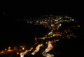
| 05/07/2009 10:01:47 PM |
Going Downby debapakaComment: Another image that took a while to "get", this is a good capture with all technicals in place. From an artistic standpoint, it lacks impact and, at least to this reviewer, doesn't quite fit the challenge. In cases like this, it's always better to give the benefit to the author and rate accordingly. Originally a 6, it has been rerated to a 7. |
| Photographer found comment helpful. |
| 05/07/2009 09:59:31 PM |
vaishno deviby gogs2000inComment: Haing been to this shrine (temple?) this image brings back some pleasant memories. The image, however, fails to really impress in direct comparison to the city itself. Perhaps a closer look or even a different angle would have helped the image because this is strictly of snapshot quality. |
| Photographer found comment helpful. |
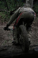
| 05/07/2009 09:54:38 PM |
Stalkers Backyardby power47Comment: Being open and honest with the author, I just didn't understand what this is about. It seemed overly plain even for an ordinary object and while it might have been an attempt to be dramatic, it just didn't work. Trying to be fair and objective, one can only assume that a review and closer look was needed. After five looks, it was revealed that it wasn't an "object" like a lantern against a wall but an alleyway lighted by a single street light. Once that was settled, a proper evaluation was possible. Taking all this into account, it has to be said that thers is too much blank space and a much too direct and much too long a look at the alley entrance. While the lights on either side of the alley give it some illumination, it doesn't help the sense of depth and dimension which is very much needed in images of this type. A slower fade from total black to exposed detail needed to be less abrupt - a little longer exposure time would have helped. There is a lot of potential here and the author should spend some time in post processing trying various exposure techniques (in addition to a slight side crop). One suggestion for future consideration would have been to take the image at a slight angle to provide a sense of dimension and lessen the optical illusion of a lantern against a wall that it orignally projected. Rerated from a 6 to a 7 if only because of a mistaken impression on initial review. |
| Photographer found comment helpful. |
| 05/07/2009 09:43:19 PM |
Iconby hesitantComment: The offset is a little strong. Having said that, the back lighting is very intriguing and the subject itself is an object that wants to be viewed and examined more closely. The heavy offset to the right disallows for this and thus impacts the image negatively. Additionally, the little extra something to the left of the statue is out of place even though it's a part of the object. What is exposed is excellant and technically competant. A little more time and thought in composition might have improved the image significantly. Originally rated a 6 because of it's immediate negatives, its been rerated a 7 for what is exposed is technically effective. |
| Photographer found comment helpful. |
| 05/07/2009 09:39:47 PM |
Dark cloudsby mimidComment: Normally, viewers will look at an image in two ways left to right and bottom to top. In this case, it's more of a top to bottom view as the darker part of the image fades to a lighter presentation at the bottom. From a technical standpoint, it could have used a little more post processing to bring out the blues in the sky and darken the clouds to create more dramatic tension and impact. Excellant green control which is difficult with digital cameras. A little more thought in capturing the image or post processing would have made a significant improvement. |
| Photographer found comment helpful. |
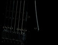
| 05/07/2009 09:35:48 PM |
black string mixby meyersComment: Sometimes images just dont' work for viewers. In this instance, it just seems like the author was attempting to convey a particular idea or concept that is just too subtle or perhaps way over the head of the viewer. A little more lighting on the subject would have helped from a technical standpoint and some context in terms of both image and title would have helped garner a higher rating. |
| Photographer found comment helpful. |
| 05/07/2009 09:29:41 PM |
Cadenby beekeeperComment: Better use of the zone system and a little more competant exposure would have pumped this image up and given it some pop and character. The use of grain and the ever so slight greenish blue cast to the image isn't as effective as it could be given the softer style focus. More post processing using curves and the histogram as a guide would have helped this image significantly. From an artistic standpoint, it is a very effective image and candid portrait. |
| Photographer found comment helpful. |
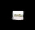
| 05/07/2009 09:26:03 PM |
One way out of the dark!by tmmac_9Comment: The abrupt transition from dark to light is jarring and the rather washed out color is not a positive from an artistic standpoint. This image might have worked better if a closer look at the entrance was used and the image exposed for color rather than the overly broad dark space. In camera light meters, in particular when in AE/AF mode don't work well in these conditions if spot metering is used. One way to avoid this issue would have been to meter the light in the opposite direction from the entrance, then set the camera to those criteria and move back into position to capture the image. |
| Photographer found comment helpful. |
| 05/07/2009 09:22:34 PM |
The Seventh Sealby fitz3000Comment: It's often the little things that can affect an image either positively or negatively. While not a major issue, the nit pick in this case is the little white spots on the shoulders of the subject - they are out of place and distracting to the eye. Effectively lighted, the impression is positive and while the little highlights akin to hot pixels are annoying, it is still an effective presentation. More attention to the little highlights would have made this a better image. The original rating of 7 was a little harsh given the other positive aspects, so it has been rerated to an 8. |
| Photographer found comment helpful. |
Home -
Challenges -
Community -
League -
Photos -
Cameras -
Lenses -
Learn -
Help -
Terms of Use -
Privacy -
Top ^
DPChallenge, and website content and design, Copyright © 2001-2025 Challenging Technologies, LLC.
All digital photo copyrights belong to the photographers and may not be used without permission.
Current Server Time: 06/27/2025 11:02:47 AM EDT.