| Image |
Comment |
| 04/23/2012 09:24:36 AM |
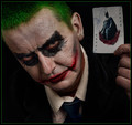
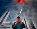
The Joker by Mark-AComment: Certainly different - nicely composed and the clever use of the joker card with Batman was a stroke of genius. Top ten image for sure - top five probably. |
 Photographer found comment helpful. Photographer found comment helpful. |
| 04/23/2012 09:23:07 AM |
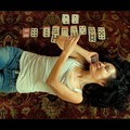
Time For 52 Card Pickupby goinskiingComment: This is so phreakin' phantastic I can't spell properly. What an idea - just terrific. Most excellent composition. Well done - definitely a top five image and a strong contender for Best of Challenge. |
| Photographer found comment helpful. |
| 04/23/2012 09:20:30 AM |
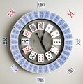
Royal Flush by JuliBocComment: Took me a couple of seconds, but I finally figured it out. Nice job - interesting blend of techniques and color. Well done - I'm in for a top ten on this one. |
| Photographer found comment helpful. |
| 04/23/2012 09:19:25 AM |
Beauty of a queenby hajekaComment: Now this is very good - I really like this. The whole thing just comes together perfectly. Well done. |
| Photographer found comment helpful. |
| 04/23/2012 09:18:01 AM |
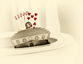
With a deck of fifty-oneby instepsComment: Think this would have been a little - I don't know humorous might be the word, if your model was smoking a cigarette and watching TV? With Captain Kangaroo? :>)
I love it - great title too. |
| Photographer found comment helpful. |
| 04/22/2012 12:05:54 PM |
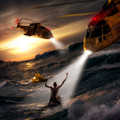
Saved by the Light by gyabanComment: There are two ways to look at this. One is acceptance of it as it is - a very good, no make that excellent, manufactured Photoshop image combining elements and creating a painting like impression. The other way is to really hit this hard because it just doesn't look like a real photograph, more like a painting which would more properly belong in a wholly different category other than "photograph". I honestly don't know what to do or how to rate it. My default position is give credit where credit is due and give this a ten just for the sheer ability and skill used in developing the image. I need to think about this and look at the remaining images before I rate it - comparison can sometimes help develop an opinion.
UPDATE: Well, this is clearly the class of the field in terms of editing skills. It also is the class of the field in terms of composition - the high drama is evident. Minor technical issue in that the two choppers would not be working that close together [sorry - former USAF Air Rescue (CSAR)], but that's not the point. I'm just not convinced that this qualifies as a "photograph". But that's really the point isn't it? You're depicting an emergency situation using photographic elements to make a coherent composition. However, there doesn't seem to be a dispute with regard to that issue so I'm giving credit where credit is due. Well done - I'm rating it a ten. Should win the contest. |
| Photographer found comment helpful. |
| 04/22/2012 12:00:25 PM |
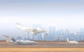
these are your best buds...by skewsmeComment: I'm missing the point - I don't get it. I'm not at all sure what this is about and how it relates to emergencies. Still, it is an entry and worthy of evaluation so - I think the image is a little grainy and the colors are much softer than they should be to have any sort of aesthetic impact. |
| Photographer found comment helpful. |
| 04/22/2012 11:58:14 AM |
Fog-Emergency Landingby LawtonComment: I have been interested for a long time in the fine line between "art" and photography - meaning that point to where a photograph is manipulated that it has the look and feel of a painting (or pencil drawing in this case) but you can still tell it was a photograph. This is a stellar example of that particular technique of imagery. I'm giving this a 10 - well done. |
| Photographer found comment helpful. |
| 04/22/2012 11:47:48 AM |
|
| Photographer found comment helpful. |
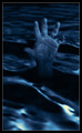
| 04/22/2012 11:47:10 AM |
nightswimmingby klkitchensComment: There is something wrong with the hand and I can't figure out what it is. It is distracting me from really giving a 10. After staring at this for five minutes (and getting the blue cast out of my retinas), I figured it out. The blue is over driven which gives the palm of the hand a spotty appearance and makes the fingers look like sausages. Plus the skin folds in the fingers look distorted and in one case, gone entirely. Still, I like it so a 9 it is. |
| Photographer found comment helpful. |
Home -
Challenges -
Community -
League -
Photos -
Cameras -
Lenses -
Learn -
Help -
Terms of Use -
Privacy -
Top ^
DPChallenge, and website content and design, Copyright © 2001-2025 Challenging Technologies, LLC.
All digital photo copyrights belong to the photographers and may not be used without permission.
Current Server Time: 06/26/2025 12:57:29 AM EDT.