|
|
|
Showing 921 - 930 of ~1311 |
| Image |
Comment |
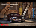
| 05/29/2009 09:18:40 PM | Toyota Supraby rob_smithComment: This is a great location, one of the best I've seen so far. There's a lot that right about this shot, the colours, the framing, the background which fits in well with the caption.
Something else you have done very well is the text, it makes it's point, it's clear, but it doesn't get in the way, so you leave the car as the main focus of the shot just as it should be.
My only minor complaint is the license plate! The rest of the car looks shiny and new, the background is all sharp and well exposed, but the license plate is a kind of dull off white colour. 9 from me. |  Photographer found comment helpful. Photographer found comment helpful. |
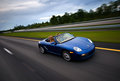
| 05/29/2009 09:09:41 PM | Porsche.....Every Ride Is An Adventureby senor_kasperComment: This is a very nice well taken shot. The location, framing and sense of motion are all good. I particularly like the way you have kept the car sharp but the wheels and the road give a real sense of speed.
My only minor complaint is that it's a touch underexposed. The near side of the car is almost in darkness, while the rest of it is just a touch dull. I think just a little more exposure and it would have been perfect. 8 from me. | | Photographer found comment helpful. |
| 05/29/2009 09:01:49 PM | Ford Taurusby XMountaineerComment: This is an interesting location you've shot this one it, in some way's it's a lot better than all the sunset / forest type ones so far. I also like the composition, this feels a lot like the closing shot you see in a TV add where they put all the small print along the bottom!
The text is good, it is small, out of the way but still readable, you've made the ad all about the car, which is exactly how it should be.
Unfortunately I think this one's let down in a big way by the exposure / lighting. The lower left hand side of the car and a large part of the front are in darkness. This is the area that defines the look of a lot of cars and distinguishes them from all the others, so you really want this part to be properly exposed.
I'm going to give this a 7, just because of all the aspects I like about it, I would probably have made it a 9 or 10 if it wasn't for the darkness along the front. | | Photographer found comment helpful. |
| 05/29/2009 08:53:36 PM | time for a new oneby goodnewsComment: Interesting alternate take on the theme, I can see this sort of idea being used for a second hand car dealer or something similar.
Going on that I would say it only sort of works. The colours are a bit off and it isn't particularly sharp, feels like it might have been taken with a phone camera or something similar. The poses also don't work, they should be in some way related to the car. I get that they are standing around waiting for perhaps recovery, but it doesn't particularly speak to me at all. 4 from me. | | Photographer found comment helpful. |
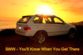
| 05/29/2009 08:45:25 PM | BMW - You'll Know When You Get Thereby k9logicComment: There's a lot that's right about this shot, the location, the framing, the strong colour of the background. Where it fails is that the setting sun sitting directly behind the car almost leave the car looking a little washed out.
This shot may have worked with a different coloured car, but with the white it might have been better to wait until the sun had actually set and just shoot it against the orange / red sky.
Still, it's otherwise a nice shot, giving it a 7. | | Photographer found comment helpful. |
| 05/29/2009 08:42:01 PM | Another Day in the Officeby scooter88Comment: Nice shot in a good location. It's a good message for the big off roader, but I don't think as an ad it stands out particularly, not really sure why I feel that, perhaps it's all the soft colours and lack of contrast, it doesn't have the feel of a strong, bold ad. 6 from me. | | Photographer found comment helpful. |
| 05/29/2009 08:21:07 PM | At the end of the the rainbowby GlanniComment: Great capture, I wonder if you had to do this a number of times to get that rainbow in just the right spot!
I like this shot, I think it accomplishes what you've set out to do. The landscape, the water, the mood of the fog are all great and the rainbow just tops it off. This is the sort of thing that would usually be put together using processing effects and computer graphics, so to have captured it all naturally is quite an accomplishment.
It's not the 'prettiest' of the shots, but I think it's definitely one of the best in relation to the challenge. This is exactly what I would expect to see in a magazine or billboard. 10 from me. | | Photographer found comment helpful. |
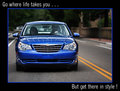
| 05/29/2009 08:03:09 PM | Get there in style!by vawendyComment: This a nice enough, well exposed shot, but there's nothing outstanding about it that would make me want to run out and buy this car. The text would indicate to me a drive out into the wilderness, but here they seem to be taking a drive down some suburban side street.
The framing of the car feels a little awkward, it's not quite filling the frame, but there's not really space either. I think for a shot like this it has to do one or the other. I find myself looking off to the right and running out of space before I find anything of interest there. Giving this a 5. | | Photographer found comment helpful. |
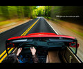
| 05/29/2009 07:56:58 PM | The Ultimate Driving Machine by bassboneComment: There is a lot about this I like. The location is great, I love the fact that despite all the motion blur you have that solid looking yellow line right down the middle leading away into the distance. The solid red colour of the car sits in nice contrast to the surroundings.
The text is just a tiny bit small for me, but it's far better that way than too large which it is in a lot of the others.
Overall, 8 from me. | | Photographer found comment helpful. |
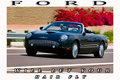
| 05/29/2009 07:50:53 PM | FORDby justineComment: Nice enough shot, but it doesn't "feel" like an auto ad. I'm not entirely sure why, I think it might be a combination of things.
Firstly I don't particularly like the text, this feels more like a postcard than an ad. Next is the very slight motion blur. You've done a great job of capturing the car but because the motion blur on the background is only very slight, it feels more like you did something wrong than it being something you were going for.
Lastly is the red bush thing in the background, it draws too much attention and doesn't leave the shiny black car to stand out on its own. Giving this a 5. | | Photographer found comment helpful. |
|
Showing 921 - 930 of ~1311 |
Home -
Challenges -
Community -
League -
Photos -
Cameras -
Lenses -
Learn -
Help -
Terms of Use -
Privacy -
Top ^
DPChallenge, and website content and design, Copyright © 2001-2025 Challenging Technologies, LLC.
All digital photo copyrights belong to the photographers and may not be used without permission.
Current Server Time: 08/10/2025 11:33:20 AM EDT.
|