| Image |
Comment |
| 11/13/2013 07:04:20 AM |
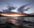
All that glitters...by digifotojoComment: Very intens photo. 9 because of that hugh bright area where the sun is. Don't think you could've done anything differently, but it ruins it a bit. |
 Photographer found comment helpful. Photographer found comment helpful. |
| 11/13/2013 07:03:35 AM |
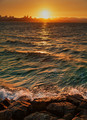
Shorelineby rodfulkComment: Even though this might be the color mother nature gave you, it comes across as a bit unreel, mainly becauste it's a bit flat. Darken dark areas and lighten light areas would create more pop and a more realistic look I think. 6 |
| Photographer found comment helpful. |
| 11/13/2013 07:01:59 AM |
crestby FourPointXComment: Abstractions on dpc usually doesn't fare well, and there's another one that outshines this one in this contest, so this gets a bit boring. The beauty of abstractions are that there are noe limits; it's a dream world. This would look nice on any wall, but it lacks intensity and mystery for me. 5 |
| Photographer found comment helpful. |
| 11/13/2013 06:59:21 AM |
|
| Photographer found comment helpful. |
| 11/13/2013 06:58:49 AM |
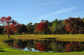
Reflecting-Pondby npaselComment: Even though it's red against green and blue it doesn't stand out properly. I would've changed up this scene and gone for the reflections in the pond and left everything else. 5 |
| Photographer found comment helpful. |
| 11/13/2013 06:56:50 AM |
Winter's Breathby cryanComment: I would try to drag the shutter even more to create more blur, but that's playing it safe. I like what you have done here. 9 |
| Photographer found comment helpful. |
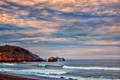
| 11/13/2013 06:56:06 AM |
Quiet Eveningby sfaliceComment: I don't like clouds that looks like they're moving much. They should be 100% blurred by the shutter or standing still. But that's me! Apart from that I like this. 7 |
| Photographer found comment helpful. |
| 11/13/2013 06:54:10 AM |
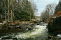
Frozen Motionby hahn23Comment: The color and composition is very good, and I can see this being published as a photo to build up the better ones in a series. It's a bit boring as a "stand alone photograph" because it's to much of a documentation of what nature has done here, but I guess that is well within the challenge description. 8 |
| Photographer found comment helpful. |
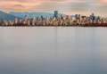
| 11/13/2013 06:50:50 AM |
English Bayby neilmwilsonComment: A full worthy PUBLISHED photograph would have more punch in it, which this lacks, but that doesn't meen this is not a full worthy photograph. I would go in and brightened the high lights and darkened the shadows where possible to add more punch. 9 |
| Photographer found comment helpful. |
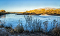
| 11/13/2013 06:48:45 AM |
Along the Rio Grandeby franktheyankComment: This is a 5 because of the color. the shiny trees takes to much attention a bad way for me. They should've been darker, if possible. These kinds of shots are a killer to retouch tho, so don't let me break you down. At school we had a color correction master as a guest teacher once, and he would spend up to 4 days color correction his photos. Not 4 days straight, but he would check in every other day to see if he still agreed with his corrections. Check him out, his name is Joakim Eskildsen. |
| Photographer found comment helpful. |
Home -
Challenges -
Community -
League -
Photos -
Cameras -
Lenses -
Learn -
Help -
Terms of Use -
Privacy -
Top ^
DPChallenge, and website content and design, Copyright © 2001-2025 Challenging Technologies, LLC.
All digital photo copyrights belong to the photographers and may not be used without permission.
Current Server Time: 08/20/2025 08:13:10 AM EDT.