| Image |
Comment |
| 11/12/2008 09:15:06 PM |
UPSIDE DOWNby taylorpageComment by FocusPoint: Hello from Critique Club,
(Composition) Your composition is pretty good. I like the way you have negative space there with rule of thirds... the blue color that covers the top of the image... Idea is good and well executed. I am not sure you were planning to use this photo for this challenge; the tip of the boat is almost touching to the frame of your photo, that's bothering me in this whole picture. It's not bad thing, but it takes a bit attention from overall.
(Technical) Some might think the overexposed area on the bottom a bit lighter than it should, but I don't think so. It looks good too. Seems like two boat attached, or stick each other and hanging in the air via a wooden lifter or something.
(Final) If you had a bit more space between the tip of the boat and the frame, I would say you would be taking it to the "6-land"... I think the over exposed area on your photo and being to close to the frame get your votes a little downwards.
(Personal) I checked your other photos. You seem like in right direction, just need some practice and that's it :)
Keep up the good work
Leo |
 Photographer found comment helpful. Photographer found comment helpful. |
| 11/09/2008 04:41:54 PM |
UPSIDE DOWNby taylorpageComment by peter: Great idea and an excellent reflection. This would have done very good in the upside down contest. |
| Photographer found comment helpful. |
| 11/07/2008 09:05:52 AM |
|
| Photographer found comment helpful. |
| 11/03/2008 04:39:42 PM |
UPSIDE DOWNby taylorpageComment by rlewis: I think it would have been better right side up, but then there would not be a place for the nose to go. |
| Photographer found comment helpful. |
| 11/02/2008 09:03:25 AM |
|
| Photographer found comment helpful. |
| 11/02/2008 12:19:15 AM |
|
| Photographer found comment helpful. |
| 11/01/2008 08:34:37 AM |
|
| Photographer found comment helpful. |
| 10/30/2008 10:54:55 AM |
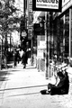
The Streets of Toronto Ontarioby taylorpageComment by crabappl3: Seems I've been commenting most about this... crop crop crop. I'm feeling a lot of people are afraid to crop out distractions from their image. First thing my eye goes to in your shot is the top of the shot where the signs are. Do we need these in order to feel the emotion toward the guy at the bottom. The two elements compete and I barely notice him down in the shadow. |
| Photographer found comment helpful. |
| 10/03/2008 12:38:15 AM |
|
| Photographer found comment helpful. |
| 10/01/2008 09:10:12 PM |
|
| Photographer found comment helpful. |
Home -
Challenges -
Community -
League -
Photos -
Cameras -
Lenses -
Learn -
Help -
Terms of Use -
Privacy -
Top ^
DPChallenge, and website content and design, Copyright © 2001-2026 Challenging Technologies, LLC.
All digital photo copyrights belong to the photographers and may not be used without permission.
Current Server Time: 07/16/2026 10:17:45 PM EDT.