| Image |
Comment |
| 08/05/2003 06:00:44 PM |
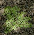
HM: Light and Shadowby eloiseComment by rickhd13: i can see how this fits the challenge, the composition is good, and the coloring and light are good, however as a photo i just don't find it overly interesting to look at |
 Photographer found comment helpful. Photographer found comment helpful. |
| 08/02/2003 04:36:29 PM |
HM: Light and Shadowby eloiseComment by Konador: This photo doesnt look interesting to me at all. It needs some post processing to stop the colours looking so flat and dull, maybe increasing the contrast. Its also a bit blurry, and really the subject matter isnt very appealing. Also, the composition is too centered imo, and the angle isnt very creative or interesting either. |
| Photographer found comment helpful. |
| 07/26/2003 02:29:35 PM |
|
| Photographer found comment helpful. |
| 07/25/2003 08:40:22 PM |
HM: Art Deco in architecture and decorationby eloiseComment by Marjo: I like your composition. I think it might look even better straight on. ( I usually shoot at an angle to add depth. But, in this case with everything left and right being equal, I think it should be shot straight at it.) Love the wings! Would love to see a close up.. |
| Photographer found comment helpful. |
| 07/25/2003 10:59:18 AM |
Hidden Foundationsby eloiseComment by mbardeen: Eloise,
This picture could have been better with a miniumum of post processing. First, a crop is definitely in order. The trash and the little bit of the work area flag in this picture are much more distracting than losing the base of the of the structure. Also, I'm not convinced of the need for color here. There are many distinct textures present, but the color feels washed out. Perhaps a bit more contrast and/or a conversion to B&W would help?
These are all things you should think about before the submission stage. Sit down and look at your picture carefully. Think about what's needed in the shot and what isn't. Setzler gave this bit of advice - go through your picture with a fine tooth comb and ask yourself "why" about each of the elements. If you can't answer that question, you need to think about if that element is really necessary.
I hope this makes sense and best of luck in future challenges!
-Matt
p.s. I took the liberty of performing some of the things I suggested. You can see the result here: //www.dpchallenge.com/image.php?IMAGE_ID=30374Message edited by author 2003-07-25 11:03:35. |
| Photographer found comment helpful. |
| 07/24/2003 11:25:35 PM |
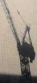
Cranes at Sunsetby eloiseComment by karmat: Cropping off the shadow at the bottom may have made the crane's shadow stand out even more, perhaps. Overall, the shot is a bit "flat" to me. |
| Photographer found comment helpful. |
| 07/23/2003 11:20:17 PM |
|
| Photographer found comment helpful. |
| 07/23/2003 06:57:27 PM |
Cranes at Sunsetby eloiseComment by ellamay: I am trying to comment on all the shots this time, this one is hard, to be honest I did not score it too high, but I think in fairness I need to tell you why. I think it is nothing screams out at me of interest, the shadow itself I think needs to pushed more-- i.e. darkened or more contrast to make the image stronger. I also don't think the bottom shadow does much but to distract from the more interesting crane part. keep up the efforts. (just my opinion) |
| Photographer found comment helpful. |
| 07/23/2003 11:21:21 AM |
|
| Photographer found comment helpful. |
| 07/20/2003 03:35:39 PM |
|
| Photographer found comment helpful. |
Home -
Challenges -
Community -
League -
Photos -
Cameras -
Lenses -
Learn -
Help -
Terms of Use -
Privacy -
Top ^
DPChallenge, and website content and design, Copyright © 2001-2026 Challenging Technologies, LLC.
All digital photo copyrights belong to the photographers and may not be used without permission.
Current Server Time: 07/26/2026 06:48:51 PM EDT.