| Image |
Comment |
| 07/24/2007 06:26:04 PM |
|
 Photographer found comment helpful. Photographer found comment helpful. |
| 07/24/2007 04:49:56 AM |
|
| Photographer found comment helpful. |
| 07/23/2007 12:58:52 AM |
Readingby LahnetComment by RulerZigzag: I like this, it envokes a feeling of bordom. Just browsing through magazines, blasting some music, window open, tea on the side, maybe a cigarette of some sort, very emotive image. Light is not strong, and the subject is very dark, but good crop. |
| Photographer found comment helpful. |
| 07/20/2007 08:21:15 AM |
|
| Photographer found comment helpful. |
| 07/18/2007 04:52:51 PM |
Readingby LahnetComment by xodiak: The composition of this shot is nice but it's a little dark and (I've been asking this a lot in judging this challenge), why did you use black and white? It doesn't seem to add anything to the image. It seems that this shot, portraying a relaxed feeling of comfort, would have been nice in muted/softened colors. |
| Photographer found comment helpful. |
| 07/18/2007 01:59:00 PM |
Readingby LahnetComment by kevip6: I like the lighting on the face, I'm not so keen on the composotion though, I think a much closer shot would have been better here |
| Photographer found comment helpful. |
| 07/18/2007 10:29:46 AM |
Readingby LahnetComment by jaymody: The window and the title tends to distract me from the subject... |
| Photographer found comment helpful. |
| 05/27/2007 11:28:46 PM |
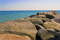
Pier of Stoneby LahnetComment by dr rick: Greetings from the Critique Club
I love the shapes, forms, and textures of the boulders here. And the very different texture of the sea makes a great contrast. Good point of view; not too high and not too low. And the composition works well, although a touch of life would be nice. (I wish you could have coaxed a seagull to pose on that nearest piling!)
The colors here are great as well. I was wondering if black and white would be better since you then wouldn't expect the sky to be blue. And it might (although a good conversion that separates the rocks and water won't be easy), but the color adds so much here that it wouldn't have the same impact.
Yeah, the lighting is really tough here. Too bad you couldn't have come at a different time when the sun was lower and the light better. It would have made a huge difference here.
Also, there seems to be a lot of noise here that is dulling the sharpness this photo should have. A DLSR at ISO 100 shouldn't have this problem. I'm going to take a guess and say that it's from the slight rotate you did to get the horizon straight. (I can tell you did this from the white strips at the corners. And you didn't quite go far enough, although the slanted horizon isn't really apparent so it isn't a big deal.) Rotation has to interpolate, and with the textures here, the interpolation may have generated the noise. (Another possibility is that you don't have your camera set to save the highest quality possible and the noise is caused by JPEG compression artifacts.)
Overall, a nice photo. Not great, but certainly peaceful and enjoyable to look at. |
| Photographer found comment helpful. |
| 05/20/2007 07:55:49 PM |
|
| Photographer found comment helpful. |
| 05/18/2007 03:28:53 AM |
Pier of Stoneby LahnetComment by JunieMoon: Nice crop. This one suffers, unfortunately, from the sky. That would have made the image sing,though we have no control over that. |
| Photographer found comment helpful. |
Home -
Challenges -
Community -
League -
Photos -
Cameras -
Lenses -
Learn -
Help -
Terms of Use -
Privacy -
Top ^
DPChallenge, and website content and design, Copyright © 2001-2026 Challenging Technologies, LLC.
All digital photo copyrights belong to the photographers and may not be used without permission.
Current Server Time: 07/17/2026 12:08:05 AM EDT.