| Image |
Comment |
| 04/13/2003 09:16:08 AM |
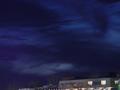
Colors of the Nightby hauntedcrimsonComment by inspzil: This would've been better if the building was not there at all. Or if the building was actually true to the horizon and the whole thing was included and not just a piece of it. |
 Photographer found comment helpful. Photographer found comment helpful. |
| 04/12/2003 11:16:44 PM |
Colors of the Nightby hauntedcrimsonComment by chickadee: Great shot of the sky. But I don't like the inclusion of the building - its messy, blury, and gives a crooked line to the bottom of the photo. Perhaps a Tree-top Line would have been better. |
| Photographer found comment helpful. |
| 04/11/2003 02:53:48 PM |
Colors of the Nightby hauntedcrimsonComment by wewillexplore: Nice rich blue color in the top third of the photo - but....what's the shot of exactly? Just the sky when it's dark blue? I like the color - what if you'd had something in the frame - a single tree, a closer building, a car, anything - to provide some foreground? |
| Photographer found comment helpful. |
| 04/10/2003 08:17:08 AM |
|
| Photographer found comment helpful. |
| 04/08/2003 11:21:57 PM |
Colors of the Nightby hauntedcrimsonComment by dadas115: I like the color in this picture. This one is a pretty tough one to pull off because there isn’t a lot going on to keep the viewer’s attention but the lighting makes the picture. The thing that weakens the picture for me the most is the small amount of the lower windows that are showing at the bottom right side of the frame. The thing that really makes me like this picture is the play of color between the yellow light in the upper windows with the gray of the roof and the deep blue of the sky. I would definitely crop some off the bottom and maybe rotate the picture some to get the top of the roof parallel to the bottom of the frame. I like this picture because of the color and lighting so I gave it a 5.
Greg
|
| Photographer found comment helpful. |
| 04/08/2003 10:49:48 AM |
|
| Photographer found comment helpful. |
| 04/08/2003 02:54:18 AM |
|
| Photographer found comment helpful. |
| 04/07/2003 10:12:36 PM |
|
| Photographer found comment helpful. |
| 04/07/2003 06:45:14 AM |
|
| Photographer found comment helpful. |
Home -
Challenges -
Community -
League -
Photos -
Cameras -
Lenses -
Learn -
Help -
Terms of Use -
Privacy -
Top ^
DPChallenge, and website content and design, Copyright © 2001-2026 Challenging Technologies, LLC.
All digital photo copyrights belong to the photographers and may not be used without permission.
Current Server Time: 07/16/2026 10:52:33 PM EDT.