| Image |
Comment |
| 03/06/2006 09:39:09 AM |
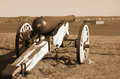
Port of Portland, 1861by bmoraComment by DustDevil: From the Critique Club:
Overall a decent image. But compositionally it just seems wrong. Their is background "clutter" right in like with the main subject. The barrle is positioned 2/3rd's the way up which normally might be good. But with an uninteresting sky with no detail it just makes it less uninteresting. The raking light from right to left makes the texture on the wood dull and flat. No pop to the weathered and beaten wood. I think a lower point of view with the cannon sticking more into the sky (even it it is a cloudless sky) would have worked alot better. The tones are not all that bad but the lighting from righ tot left make long shadows that trail off the image. |
 Photographer found comment helpful. Photographer found comment helpful. |
| 01/18/2006 05:34:15 PM |
The First "SIGN" of Freedomby bmoraComment by GrayGhost: Nice idea, and pretty good execution. Overall image seems too yellow, whiter pen would be better, and desaturate for an older instead of yellower feeling. |
| Photographer found comment helpful. |
| 01/18/2006 02:05:19 AM |
|
| Photographer found comment helpful. |
| 01/04/2006 06:50:19 PM |
Half Heartedby bmoraComment by behindthescenes: wow very cool. i like the light coming from the inside of the cups. i think i would like it better if the heart was on the top of the image and the base on the bottom.. |
| Photographer found comment helpful. |
| 12/28/2005 05:32:58 AM |
|
| Photographer found comment helpful. |
Home -
Challenges -
Community -
League -
Photos -
Cameras -
Lenses -
Learn -
Help -
Terms of Use -
Privacy -
Top ^
DPChallenge, and website content and design, Copyright © 2001-2026 Challenging Technologies, LLC.
All digital photo copyrights belong to the photographers and may not be used without permission.
Current Server Time: 07/18/2026 02:45:56 AM EDT.