| Image |
Comment |
| 03/05/2005 12:01:13 PM |
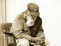
Nearly Out Of Timeby realdealphotoComment by LucidLotus: What an interesting subject!
The man is definitely the whole of this image, he has quite a few details about him that just draws you in to look deeper. I'm not sure if the title does the image justice or not, but nevertheless it still fits the challenge.
The focus is pretty good, and the use of natural light is decent, though the whites are in danger of being blown out. There is a soft area just above the left shoulder that draws my eye away from the focus of the subject. I'm not sure if a shift in position would have helped combat that or not.
I don't know if I like the use of sepia for this image, I'd have to see the original color. The tones are very warm and for some reason I see this as a more melancholy image, suitable for black and white or a slightly blued tone, rather than sepia. Might be worth checking out.
The one thing that REALLY draws my eye are the man's hands. The back of his hands seems so wrinkled and old, but the tips of them look quite youthful, its a strange paradox and I think that little detail is what keeps my interest in this image.
Overall a VERY strong photo. A slight tone change and something to control the white in the photo could make it better. Very nicely done. I gave a 6. |
 Photographer found comment helpful. Photographer found comment helpful. |
| 03/05/2005 08:31:42 AM |
Nearly Out Of Timeby realdealphotoComment by Koriyama: The skin textures on the hand are very powerful. The duotoning was a good choice to emphasise the age of the subject. I also like the pose. What surprises me is that I like the negative space on the right. Its emptiness really supports the meaning here. |
| Photographer found comment helpful. |
| 03/04/2005 04:59:21 PM |
Nearly Out Of Timeby realdealphotoComment by ClickNSee: Its unfortunate that a great idea comes up more than once in a challenge. I must be honest, that detracts slightly from an image in my voting when I see the same idea more than once. This is a great image. I love how detail and sharpness in ghe photo, and the scence of intimacy. Very nicely done. It's not your fault, but like all the other dups, I must subtract 1 point from its overall grade. Good luck on a a great image. <8> |
| Photographer found comment helpful. |
| 03/02/2005 11:26:35 PM |
|
| Photographer found comment helpful. |
| 03/01/2005 09:31:47 PM |
|
| Photographer found comment helpful. |
| 03/01/2005 07:07:12 PM |
|
| Photographer found comment helpful. |
| 03/01/2005 04:33:01 PM |
|
| Photographer found comment helpful. |
| 03/01/2005 01:44:37 PM |
|
| Photographer found comment helpful. |
| 02/28/2005 09:28:51 PM |
Nearly Out Of Timeby realdealphotoComment by 4score: Great shot....I would recommend cropping the curtain off the left, as that would make your subject a little more left of center too. Nice job. |
| Photographer found comment helpful. |
| 02/28/2005 07:50:40 PM |
Smiles Are Contagious When You Adopt A Petby realdealphotoComment by Skip: ok, i am voting this challenge in 2 passes. in this pass, you will get a partial comment and a score. then i will come back to comment again. if you have any problem whatsoever with this comment, pm me and let me know. otherwise, take it with a grain of salt...i'm not trying to be a know-it-all, i'm just explaining where i'm coming from in voting this challenge. and, if this comment is NOT helpful (of if you think i'm full of $#!+), don't mark it helpful.
billboards are a science unto themselves. a lot of research has gone into determining just how much information a person can digest and retain in specific time spans. they use this information to develop formulas for determining the number of words and letters to use on billboards, as well as their sizes. they also determine the size and number of visual elements to include.
the graphics/photograph on a billboard are designed to get the point across in a moment. on the road, a driver will have less time with a billboard than a voter will give your image. this is a key element in the challenge: composing a shot that will get its point across quickly and succintly. along those lines, a strong composition will probably have few details and make strong use of negative space. |
| Photographer found comment helpful. |
Home -
Challenges -
Community -
League -
Photos -
Cameras -
Lenses -
Learn -
Help -
Terms of Use -
Privacy -
Top ^
DPChallenge, and website content and design, Copyright © 2001-2026 Challenging Technologies, LLC.
All digital photo copyrights belong to the photographers and may not be used without permission.
Current Server Time: 07/17/2026 01:54:26 AM EDT.