| Image |
Comment |
| 10/07/2013 09:50:04 AM |
|
 Photographer found comment helpful. Photographer found comment helpful. |
| 10/03/2013 01:44:38 PM |
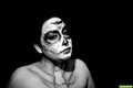
Day of the Dead Face Paintby CtuiteleComment by BrennanOB: Did you use a second flash in this? Classically the second flash in such a setup is back left as a hair light or rim light to separate the subject from the background, and with the amount of inky background that would have been a big help.
Or it would be used front right as a fill light to lighten up the big shadows thrown by the main light, particularly that thrown by the models chin and nose which have become strong compositional elements.
If I was diagramming this shot I would want both secondary lights in the shot, and since I only have 2 flashes I would have used a constant light like a cheap clamp lamp to provide the rim light, and used my flashes as key and fill, with some sort of modifier on the key light to soften the shadow edge, be it an umbrella, a Stofen(which rarely comes off my main flash) or a piece of paper towel draped over the flash. Anything you can do to diffuse the flash is good in this setting to keep the viewer's eye on the subject and not get them thinking about how you lit the scene. Message edited by author 2013-10-03 13:45:53. |
| Photographer found comment helpful. |
| 09/30/2013 12:29:22 PM |
Day of the Dead Face Paintby CtuiteleComment by tanguera: The basics of this image are really great - the pose, the attitude, the face paint. I feel the technicals need some tweaking, but for a first attempt at lighting, this is really great.
My biggest issue is the lack of separation between the bg and the subject, especially the head. Her face just seems to be sticking out of the bg at her hairline. The other bit is the really hot spot around her nose. I can't tell if it's because of the lighting or if the make-up is brighter at that point. I can see that you have one light above her, camera left, and perhaps it's too close, which is why it's so bright in just the one spot, and the shadow so sharp. I don't see where you used the 2nd light, and I would have used that as a hair light.
Other things to consider might be the crop. I'm not convinced this is the best option for the image, as I don't think it needs all that negative space. The interesting part is the face. The chest is not as interesting nor as well lit, so that might also merit a crop. |
| Photographer found comment helpful. |
| 09/30/2013 05:01:45 AM |
Day of the Dead Face Paintby CtuiteleComment by Tiberius: Lighting seems OK but is a bit dark (underexposed). I know might be relative to the monitor. I am not keen on the large part of the bust shown in the picture. It somehow distracts. Could be that he focus plane includes the shoulder as well.
Overall a good try. Good luck |
| Photographer found comment helpful. |
Home -
Challenges -
Community -
League -
Photos -
Cameras -
Lenses -
Learn -
Help -
Terms of Use -
Privacy -
Top ^
DPChallenge, and website content and design, Copyright © 2001-2026 Challenging Technologies, LLC.
All digital photo copyrights belong to the photographers and may not be used without permission.
Current Server Time: 07/17/2026 07:44:18 PM EDT.