| Image |
Comment |
| 02/23/2016 10:29:37 PM |
|
 Photographer found comment helpful. Photographer found comment helpful. |
| 02/23/2016 04:37:49 AM |
|
| Photographer found comment helpful. |
| 02/17/2016 08:01:22 PM |
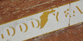
Good Yearby jayzundelComment by snaffles: Greetings from the Critique Club!
Hmmm this image is a very good try at the challenge, it is a truncated sign, and I don't mind the angle as I feel it adds interest. I think the main problem is twofold: a lack of colour, this could have used a hit of saturation to make the image pop a little more. Second, lack of a dominant element here; no one aspect stands head and shoulders above the rest demanding your attention. The winged foot is also somewhat centred, maybe a closer crop in to it would have helped draw more attention to it.
Hope this helps! Feel free to PM me with any questions.
Susan |
| Photographer found comment helpful. |
| 02/11/2016 08:35:16 PM |
|
| Photographer found comment helpful. |
| 07/29/2015 03:47:39 PM |
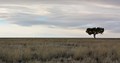
"You Name It"by jayzundelComment by sidpixel: *Hello from Sid and the Critique Club*
A straightforward landscape image that meets the challenge.
Thank goodness for your tree! Given the featureless landscape and the flat lighting without your tree it would have been difficult to inject an element of interest into it. I like your placing of the tree and the stretched landscape, though perhaps you had an opportunity to create something a bit different by creating a true panoramic broken up by a single solitary tree thus creating a real sense of the isolation of this one tree against the wide open landscape?
I'm looking at the balance of tree, sky, landscape and wishing that the tree was on the left where the higher clouds would have accommodated it as though they were wind blown over it settling to a lower level as they do on the right, it may have looked more harmonious.
So, title time, how about;
defiance
Thank you for your submission, Sid |
| Photographer found comment helpful. |
| 07/20/2015 01:39:20 PM |
Buckle, Button & Zipperby jayzundelComment by sidpixel: *Hello from Sid and the Critique Club*
First impressions, a well executed image that meets the challenge well.
You have produced a simple very pleasing image from an everyday item in such a way that it has impact and appeal, well done. The lighting and exposure are very good with sufficeint detail throughout.
The jeans and belt have a used look that enhances the effect it doesn't feel like a fashion shoot for a magazine intended to sell the goods. Probably the only minor irritant is the black label I feel it is very slightly distracting and might have been better to cover it up but I am sure there are many who would equally argue against such a move.
All in all a pleasing image that probably ought to have scored a little higher, well done, Sid |
| Photographer found comment helpful. |
| 04/02/2015 11:34:20 AM |
|
| Photographer found comment helpful. |
| 03/24/2015 09:03:31 PM |
|
| Photographer found comment helpful. |
| 03/24/2015 05:40:42 PM |
|
| Photographer found comment helpful. |
| 03/24/2015 11:19:13 AM |
|
| Photographer found comment helpful. |
Home -
Challenges -
Community -
League -
Photos -
Cameras -
Lenses -
Learn -
Help -
Terms of Use -
Privacy -
Top ^
DPChallenge, and website content and design, Copyright © 2001-2026 Challenging Technologies, LLC.
All digital photo copyrights belong to the photographers and may not be used without permission.
Current Server Time: 07/18/2026 05:02:36 AM EDT.