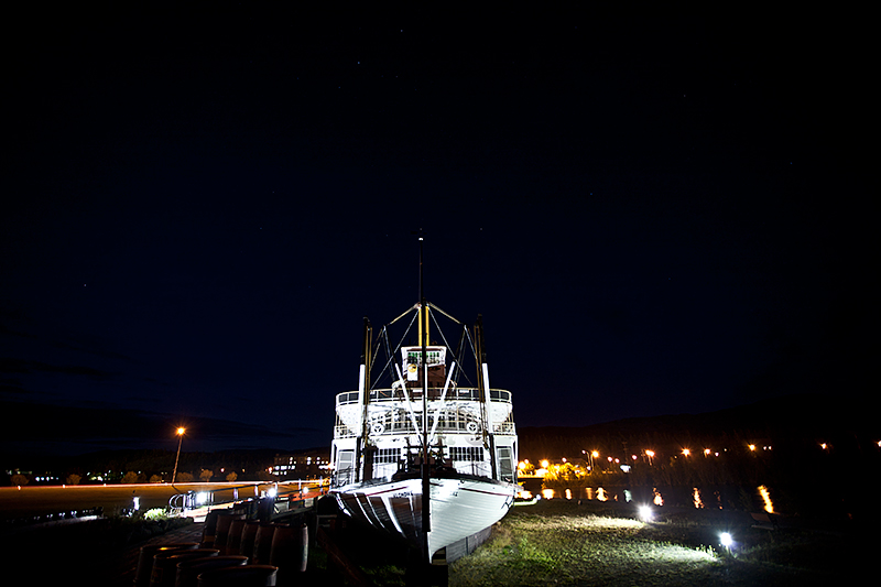
I see a couple of things here that I woul dhave changed.
First, the good. I like the use of negative space here. The centre composition works very well for this subject.
Next... the ship (or is it a boat?) is too bright. It should be bright, yes, to stand out. But in my viewing I think it's so bright that we lose some nice details on it. There are two ways I might have tried to address this. 1) use a lower exposure value on the camera. 2) make a HDR image of the thing. I would have chosen the latter because if treated moderately it would still retain the authentic feel of the image you have here, while boasting more textures, details and depth that the eye can see, but that the camera cannot.
Lastly, you used a wide angle lens for this, I take it. The light on the left is tilted, where it should be vertical. You might have been able to use lens distortion removal software to reduce this. This kind of distortion can add a lot to images now and then, but I don't think the ship/boat is big enough to deserve the sense of scale that might bring.
5
Just some thoughts. |