| Photograph Information |
Photographer's Comments |
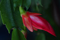
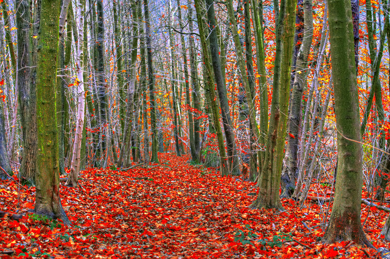
Challenge: Complementary Colors V (Basic Editing)
Collection: Portfolio
Camera: Nikon D700
Lens: Nikon AF-S Zoom-Nikkor 70-300mm f/4.5-5.6G IF-ED VR
Location: Neustadt an der Weinstra�e
Date: Nov 7, 2010
Aperture: f/4.5
ISO: 2000
Shutter: 1/100s
Date Uploaded: Nov 9, 2010
|
Well, one of these days I won't be rushed, and I'll be able to set up my tripod and take the shot I want to without rolled eyes and impatience from my lovely wife.
Now that I've gotten that off my chest, this should have a deeper depth of field, it should have been manually focused to a hyperfocal point that allowed all the leaves to be sharp, and the iso should be at 200, not 2000.
But it doesn't have any of those things I wish it did, so I'm expecting a 5.3, especially considering all the razor sharp wine glasses with colored fluids as well as colored water drops this challenge will pull in.
I'm here to learn, so I suppose it's a good thing when I've already figured out how to improve it before I even submit. But I will anyway, because I want it to hurt. That way I WILL pull out my tripod next time.
Post challenge: Thank you, Donald! That one comment made this entry worth it. Not because it was positive, but because that's exactly what I was going for. The red vs. green and the white vs. black.
Additionally, I really wanted to find these complimentary colors in a natural scene. Not create them with store-bought items in a fabricated set. No offense to the winners. They're professional-grade, but not to my taste.
I didn't boost saturation at all in this shot, believe it or not. I did play with the black and magenta levels in the red and green tones in selective color, but that's about it color-wise. I suppose "over-saturated" is the catch-all phrase for over-the-top, overly rich colors.
I do appreciate all the comments. I've received fewer comments that have received much better results. Thanks a lot for the advice and time to share it. |
| Author | Thread |
Comments Made During the Challenge  |
|
|
11/16/2010 10:02:28 PM |
| I see a variety of complementary colors and believe this to be the best of the best for nailing the challenge. Top ten and added to favorite. Congratulations. |
|
 Photographer found comment helpful. Photographer found comment helpful. |
|
|
11/13/2010 07:53:56 PM |
|
| Photographer found comment helpful. |
|
|
11/12/2010 10:35:00 AM |
| Well take picture but damaged in post processing, it seems. |
|
| Photographer found comment helpful. |
|
|
11/12/2010 10:00:39 AM |
| way oversaturated and oversharpened |
|
| Photographer found comment helpful. |
|
|
11/11/2010 06:43:33 PM |
|
| Photographer found comment helpful. |
|
|
11/11/2010 03:07:19 PM |
| Too much selective saturation. |
|
| Photographer found comment helpful. |
|
|
11/10/2010 07:52:12 PM |
|
| Photographer found comment helpful. |
|
|
11/10/2010 02:46:52 PM |
| Certainly eye catching, but i find it hurts my eyes after a while. |
|
| Photographer found comment helpful. |
Home -
Challenges -
Community -
League -
Photos -
Cameras -
Lenses -
Learn -
Prints! -
Help -
Terms of Use -
Privacy -
Top ^
DPChallenge, and website content and design, Copyright © 2001-2024 Challenging Technologies, LLC.
All digital photo copyrights belong to the photographers and may not be used without permission.
Current Server Time: 04/28/2024 10:19:02 AM EDT.