| Author | Thread |
Comments Made During the Challenge  |
|
|
03/01/2009 08:14:22 PM |
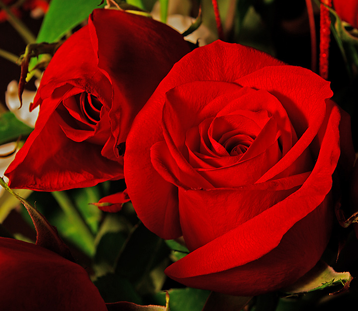
| Good work processing this. I feel like I could reach right into the monitor and touch the rose on the right. |
|
 Photographer found comment helpful. Photographer found comment helpful. |
|
|
02/28/2009 11:23:09 PM |
| this is a technically good shot, that i could see in a calendar, but it doesnt keep my interest. (7) |
|
| Photographer found comment helpful. |
|
|
02/28/2009 08:19:08 AM |
| nice lighting on the rose. I would have bent the flower in the lower left so that it was out of the frame. I tends to draw your eye. Anyway, the lighting is very nice--it give nice detail to the flower. |
|
| Photographer found comment helpful. |
|
|
02/27/2009 05:48:06 PM |
|
| Photographer found comment helpful. |
|
|
02/26/2009 11:05:48 PM |
| I'm not a huge fan of floral shots, so one really has to be excellent to appeal to me. Great job here, lots of fine veins showing in the petals. |
|
| Photographer found comment helpful. |
|
|
02/26/2009 08:51:00 AM |
| Lovely roses - vibrant colors. |
|
| Photographer found comment helpful. |
|
|
02/25/2009 05:04:06 PM |
| This is very red. Almost TOO red. I like the detail in the flower petals. |
|
| Photographer found comment helpful. |
|
|
02/25/2009 01:55:39 AM |
| Harsh editing here. The reds are over saturated in my opinion. I do like the composition / perspective. |
|
| Photographer found comment helpful. |
|
|
02/23/2009 09:42:41 PM |
| Though beautiful flowers, the color is just too oversaturated for my taste. |
|
| Photographer found comment helpful. |
|
|
02/23/2009 01:23:19 PM |
| the flower behind to the right is a little to "droopy"...should have re-arranged that...colors are brilliant, really like the tones otherwise |
|
| Photographer found comment helpful. |
|
|
02/23/2009 02:52:17 AM |
An extremely well framed picture meant to capture a wonderful sense of realism with the lighting, but overdoes it a little too much in the Color Saturation. A great picture.
I just wish I will seeing a little more natural color out of the roses. |
|
| Photographer found comment helpful. |
|
|
02/23/2009 02:25:21 AM |
| Good texture, lighting is ok. |
|
| Photographer found comment helpful. |
Home -
Challenges -
Community -
League -
Photos -
Cameras -
Lenses -
Learn -
Prints! -
Help -
Terms of Use -
Privacy -
Top ^
DPChallenge, and website content and design, Copyright © 2001-2024 Challenging Technologies, LLC.
All digital photo copyrights belong to the photographers and may not be used without permission.
Current Server Time: 04/25/2024 11:59:35 PM EDT.