| Author | Thread |
|
|
08/04/2008 01:28:18 AM |
| Good idea here, and it is a shame it did not do better. |
|
 Photographer found comment helpful. Photographer found comment helpful. |
Comments Made During the Challenge  |
|
|
08/02/2008 06:27:06 PM |
|
| Photographer found comment helpful. |
|
|
08/02/2008 02:31:56 PM |
| Nice complimentary colors. |
|
| Photographer found comment helpful. |
|
|
07/31/2008 12:07:30 PM |
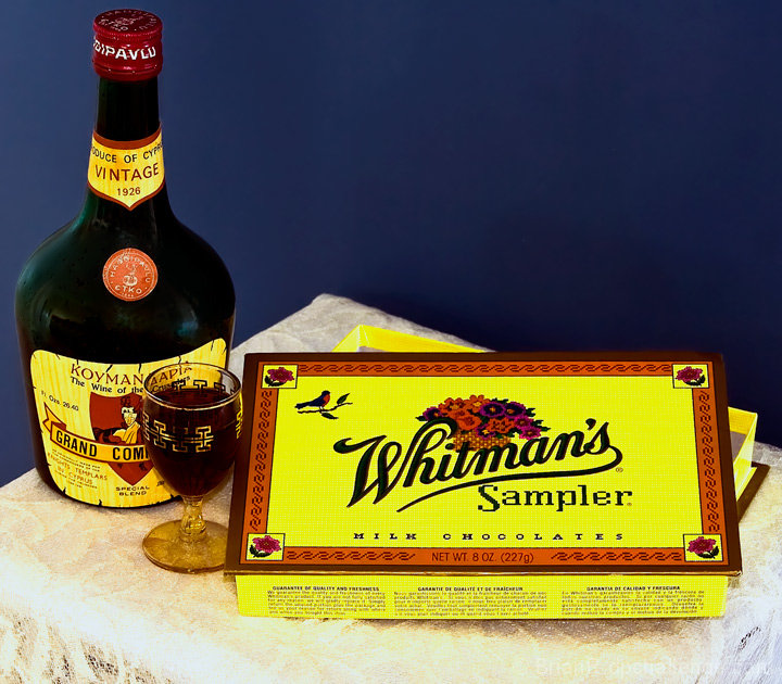
| I really like that the yellow of labels is pretty much the same hue. It adds visual continuity. |
|
| Photographer found comment helpful. |
|
|
07/30/2008 11:46:12 PM |
| The yellow seems a bit over saturated. |
|
| Photographer found comment helpful. |
|
|
07/29/2008 07:59:29 PM |
| I think that this image is very oversaturated. I know what that candy box looks like and it is not that bright. That would be okay, if you wanted to brighten it, but there seem to be these little yellow dots on the table area and I think *overall* there is too much yellow. However, I DO like what you did with matching the colors of the box to the colors on the bottle. That is what I noticed first and I think it was very nicely done. So to sum up, I think the colors and color combination are good, just overall they are overpowering. |
|
| Photographer found comment helpful. |
|
|
07/28/2008 11:41:00 PM |
| Seems like a lot of empty blue space in the upper right. Maybe if you taken this vertically and maybe cut off half the chocolate box and half the bottle, this would have been more interesting. |
|
| Photographer found comment helpful. |
Home -
Challenges -
Community -
League -
Photos -
Cameras -
Lenses -
Learn -
Prints! -
Help -
Terms of Use -
Privacy -
Top ^
DPChallenge, and website content and design, Copyright © 2001-2024 Challenging Technologies, LLC.
All digital photo copyrights belong to the photographers and may not be used without permission.
Current Server Time: 04/28/2024 06:13:23 PM EDT.