| Author | Thread |
|
|
07/08/2008 04:31:14 AM |
Originally posted by -Bec-:
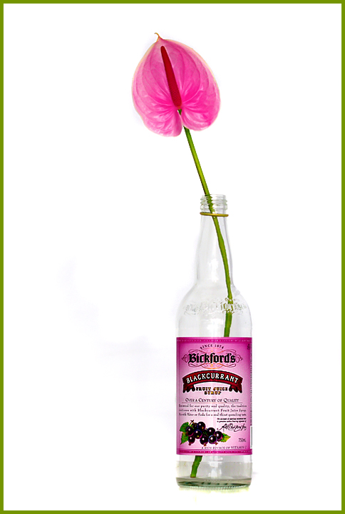
Nice and simple..Not sure if you can see it on your screen, but I can see some dark spots to the left of the bottle, where it looks like the white hasn't been brightened enough maybe?.. |
I see it too and it likely did hurt your score a bit. If I crank the brightness all the way down, it looks like this. I use the brightness extremes to test for stuff like that since I have been hit by th same issues in past challenges.
Aside from that, Lisa - GREAT job!
Message edited by author 2008-07-08 04:32:15. |
|
 Photographer found comment helpful. Photographer found comment helpful. |
|
|
07/07/2008 11:52:15 PM |
| Ooooo.... this is so pretty! I love the colors and lighting. Nicely done :) |
|
| Photographer found comment helpful. |
|
|
07/07/2008 02:16:11 PM |
Lisa, you're awesome! I love this photo! CONGRATULATIONS!
|
|
| Photographer found comment helpful. |
|
|
07/07/2008 03:46:07 AM |
Yaaaay Lisa you are back in challenges...amd what a way to come back.
Love this high contrast image and the nice subtle take on the challenge. Great colours and I love the way the flower and the bottle label 'match'. Equally good is the way you match the border and the stem
Bright and powerful |
|
| Photographer found comment helpful. |
Comments Made During the Challenge  |
|
|
07/06/2008 09:02:28 PM |
| Focus, lighting, and composition is good. Nice photograph and the colors complement each other. Nice stock shot |
|
| Photographer found comment helpful. |
|
|
07/06/2008 04:40:54 PM |
| Great lighting and colors. |
|
| Photographer found comment helpful. |
|
|
07/05/2008 10:07:15 AM |
| Interesting use of colour. |
|
| Photographer found comment helpful. |
|
|
07/04/2008 10:02:40 AM |
| Among the better entries of this challenge. - 6 |
|
| Photographer found comment helpful. |
|
|
07/04/2008 04:47:38 AM |
Just a touch more dodging in the left side an you nailed it.
(the downside of having a calibrated monitor here)
Not sure I care for the border on this, but I don't vote on the borders. |
|
| Photographer found comment helpful. |
|
|
07/02/2008 08:46:40 PM |
| good color and composition |
|
| Photographer found comment helpful. |
|
|
07/02/2008 06:52:09 PM |
| Nice simple concept. I really like the color coordination between the label and the flower. 8 |
|
| Photographer found comment helpful. |
|
|
07/02/2008 06:44:03 PM |
| The pinks against the greens make this a simple, yet effective shot. This could find it's way into kind of challenge or still-life. Thank you. |
|
| Photographer found comment helpful. |
|
|
07/02/2008 05:09:04 PM |
| Love the simplicity and colours of this. |
|
| Photographer found comment helpful. |
|
|
07/01/2008 09:12:38 AM |
| Nice and simple..Not sure if you can see it on your screen, but I can see some dark spots to the left of the bottle, where it looks like the white hasn't been brightened enough maybe?.. |
|
| Photographer found comment helpful. |
|
|
06/30/2008 10:25:40 PM |
| Clean and perfect! I love this photo! |
|
| Photographer found comment helpful. |
|
|
06/30/2008 06:24:51 PM |
| I love the colours :) Ten from me! |
|
| Photographer found comment helpful. |
|
|
06/30/2008 05:38:57 PM |
| excellent studio still life - the choice of bottles to create some much needed color contrast to the shot really works well here |
|
| Photographer found comment helpful. |
|
|
06/30/2008 12:11:21 AM |
| Technically great - not wild about the lime border.7 |
|
| Photographer found comment helpful. |
Home -
Challenges -
Community -
League -
Photos -
Cameras -
Lenses -
Learn -
Prints! -
Help -
Terms of Use -
Privacy -
Top ^
DPChallenge, and website content and design, Copyright © 2001-2024 Challenging Technologies, LLC.
All digital photo copyrights belong to the photographers and may not be used without permission.
Current Server Time: 04/29/2024 05:21:03 AM EDT.