| Author | Thread |
|
|
09/17/2006 01:34:07 PM |
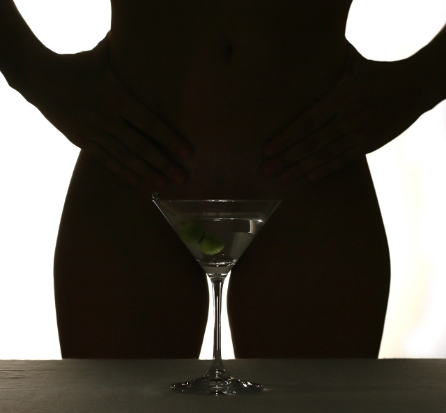
| Nice lighting, I thought this was tastefully done, although more feminine hands (or a nicer manicure ) would have made a nicer look overall ( sorry to be so catty) |
|
 Photographer found comment helpful. Photographer found comment helpful. |
|
|
09/12/2006 09:55:00 PM |
Greetings from the Critique Club.
Hi Tali,
Great to draw you as I've been admiring your work recently. That said this is a difficult one to critique.
I'll start with the obvious - it is overtly sexual, which seems to have divided the voters. Your vote distribution curve being a clear indication that you have not been judged on art alone. That said the divide is not as stark as I would expect. You core composition is fantastic - it draws the eyes in and keeps them there, trying to work out exactly what is being seen. The direction of the edges of both the arms and the thighs seem to help this, and the slightest tint of light on the Martini glass provide just enough detail to keep it interesting. Well done.
Now for what I don't like. The vast majority of the image really lacks depth. Yes I know its a silhouette, but with the silhouette flat (as it needs to be) and the background flat the combination makes it seem as it the image is just a piece of cut-out cardboard. I am also not a fan of the relatively mundane foreground tablecloth and lens flare to the right. Both of which don't add anythign to the image so would best be left out.
I hope my comments help and Good Luck in future Challenges!
Cheers
Paul |
|
| Photographer found comment helpful. |
|
|
09/08/2006 08:18:01 PM |
| Well 9 or 92, missed only by 2 :-) |
|
| Photographer found comment helpful. |
|
|
09/06/2006 05:02:55 AM |
| This photo should be in the first 40, but "de gustibus et coloris non disputatum". if you have used some light on the glass would have been perrrfect. |
|
| Photographer found comment helpful. |
Comments Made During the Challenge  |
|
|
09/05/2006 06:46:57 PM |
|
| Photographer found comment helpful. |
|
|
09/05/2006 04:50:21 PM |
| Creative, next time shine some light on the martini (difficult, I know, to keep the model in a silhoutte that way) |
|
| Photographer found comment helpful. |
|
|
09/04/2006 03:21:35 PM |
| Love the title. Great idea. Just the right amount of lighting for me. |
|
| Photographer found comment helpful. |
|
|
09/04/2006 12:35:21 AM |
|
| Photographer found comment helpful. |
|
|
09/03/2006 07:02:36 PM |
| Very cute. I wish the glass had a little more light on it. |
|
| Photographer found comment helpful. |
|
|
09/03/2006 04:47:05 PM |
|
| Photographer found comment helpful. |
|
|
09/03/2006 01:44:19 AM |
| Very clever and a great concept. |
|
| Photographer found comment helpful. |
|
|
09/02/2006 05:56:48 PM |
| Nice composition, it is very balanced. |
|
| Photographer found comment helpful. |
|
|
09/02/2006 10:18:24 AM |
|
| Photographer found comment helpful. |
|
|
08/31/2006 10:52:37 PM |
|
| Photographer found comment helpful. |
|
|
08/31/2006 09:38:40 PM |
|
| Photographer found comment helpful. |
|
|
08/31/2006 04:47:48 PM |
| He he he! Of course, the positioning of that glass is just inspired, especially with it's triangular shape! And I like the way that you've retained just the merest hint of detail in the silhouetted body showing the hands leading the eye to the... glass. |
|
| Photographer found comment helpful. |
|
|
08/31/2006 09:45:23 AM |
| Love the concept! Things I would like to see are: crop the table and the bottom of the glass, A color background, red maybe? |
|
| Photographer found comment helpful. |
|
|
08/31/2006 09:07:12 AM |
|
|
|
08/30/2006 09:21:32 PM |
|
| Photographer found comment helpful. |
|
|
08/30/2006 08:40:32 PM |
| hehe, very creative. My husband liked it too ;-) |
|
| Photographer found comment helpful. |
|
|
08/30/2006 08:16:12 PM |
Nicely creative. I like the idea.
Execution of post process failed a bit though. I'm still seeing detail on the woman, and for a true silouette I shouldn't be able to.
Would have been an easy fix with levels or curves. |
|
| Photographer found comment helpful. |
|
|
08/30/2006 05:01:52 PM |
| LOL Thats interesting! What on earth made you think of that? |
|
| Photographer found comment helpful. |
|
|
08/30/2006 12:27:45 PM |
| Heh, nice concept. I like that you can still see the navel of your subject, all detail isn't -completely- lost. Good work! |
|
| Photographer found comment helpful. |
|
|
08/30/2006 10:59:41 AM |
| OOOOOOOOO some may find this offensive!!!! lol |
|
| Photographer found comment helpful. |
|
|
08/30/2006 10:32:24 AM |
| Great idea, my guess you will end up in 9th place :-) |
|
| Photographer found comment helpful. |
Home -
Challenges -
Community -
League -
Photos -
Cameras -
Lenses -
Learn -
Prints! -
Help -
Terms of Use -
Privacy -
Top ^
DPChallenge, and website content and design, Copyright © 2001-2024 Challenging Technologies, LLC.
All digital photo copyrights belong to the photographers and may not be used without permission.
Current Server Time: 04/27/2024 07:15:51 AM EDT.