| Author | Thread |
|
|
01/27/2006 06:59:35 AM |
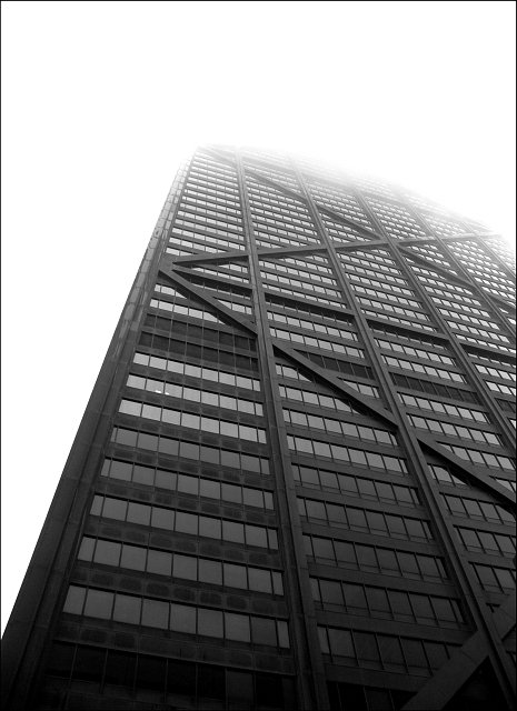
| A second look: get rid of the border! There's no limit, now is there? The more I look at this photo, the more I like it. It gets better with time, like a good wine. |
|
 Photographer found comment helpful. Photographer found comment helpful. |
|
|
01/21/2006 09:50:00 AM |
| This is a very interesting photo: a mechanical, sharp and dark building melting into the soft, white and etherial sky. We've moved quite a long way from the caves now, haven't we? |
|
| Photographer found comment helpful. |
|
|
01/15/2006 12:48:04 AM |
::: Critique Club :::
Hi, my name is Kari and from the critique club.
The critique I am doing is for "The sky is not the limit"
First Impression - the most important one:
Wow, the weather is crappy over there, but hey an offset .. there are lights on in the building and they have been caught in the picture... this means there is "life" Glad to have you back in the fold and entering more challenges.
Composition:
I think the composistion is fantastic ... looking at the comments you have received most people think the same.
Subject:
This may be where some of the issues were. Some people (my partner included) felt it didn't truely fit the challenge ... but guess what it doesn't matter as more people felt that it did.
Technical (Colour and light):
Hard to improve on this. You did well with the natural elements.
To grow its vote?:
Its not about always growing the vote ...
Summary:
This is a great picture. Congratulations on the good finish. I hope to see more of your shots around.
If you've got any questions about this critique, please feel free to contact me via the PM system.
Cheers
Kari |
|
| Photographer found comment helpful. |
|
|
01/11/2006 09:10:25 AM |
Originally posted by MacT:
ditch the trees and its a winner |
Trees? Where? |
|
| Photographer found comment helpful. |
Comments Made During the Challenge  |
|
|
01/10/2006 11:30:46 PM |
| Yea, that is my city! Nice pic. Others might not appreciate or realize that the rest of the building is lost in the clouds. They might just think it was overexposed. |
|
| Photographer found comment helpful. |
|
|
01/10/2006 11:16:23 PM |
| I can't give you a high score because it's a bit shy of 'life' but it is a damned fine photograph so well done. |
|
| Photographer found comment helpful. |
|
|
01/10/2006 10:15:01 PM |
| I want to see how far up it goes! |
|
| Photographer found comment helpful. |
|
|
01/10/2006 07:40:28 AM |
| ditch the trees and its a winner |
|
| Photographer found comment helpful. |
|
|
01/10/2006 12:32:11 AM |
|
| Photographer found comment helpful. |
|
|
01/09/2006 05:14:09 PM |
| Theres quite alot of technically bad qualities and I cant see much of a photographic or artistical idea behind it. With well-thought cropping I would assume this would get better grade from me. |
|
| Photographer found comment helpful. |
|
|
01/09/2006 08:23:29 AM |
|
| Photographer found comment helpful. |
|
|
01/08/2006 10:04:18 PM |
|
| Photographer found comment helpful. |
|
|
01/08/2006 07:27:50 PM |
|
| Photographer found comment helpful. |
|
|
01/08/2006 12:42:16 AM |
| I love the transition from dark to light. I'm also a sucker for architecture and symmetry, so I think this shot is wonderful. The way it disappears into the cloud is great. Finally, your choice of black+white is brilliant - it really simplifies the shot and let's the viewer focus on the building and it's patterns. Great work! PS: Composition is also particularly good. |
|
| Photographer found comment helpful. |
|
|
01/06/2006 03:16:33 PM |
|
| Photographer found comment helpful. |
|
|
01/06/2006 12:20:21 PM |
| Excellent black and white. Love the crop/composition. 9 - good luck in the challenge! |
|
| Photographer found comment helpful. |
|
|
01/06/2006 11:33:49 AM |
| Interesting perspective and dissolution effect at top, but photo isolates building from its environment (the city) |
|
| Photographer found comment helpful. |
|
|
01/05/2006 02:39:50 PM |
| i like the black and white and i see what u are going for here but that briight white is not very visually appealing in my opinion |
|
| Photographer found comment helpful. |
|
|
01/05/2006 08:46:07 AM |
| Good choice for B&W, and I like the washout effect at the top. 9 |
|
| Photographer found comment helpful. |
|
|
01/05/2006 12:34:03 AM |
|
| Photographer found comment helpful. |
|
|
01/04/2006 03:21:08 PM |
| I tried to take a similar photo and it did not turn out this well. Great job 9 |
|
| Photographer found comment helpful. |
|
|
01/04/2006 02:24:15 AM |
| That's a building (It's a beautiful one, at that). Where's the citylife? |
|
| Photographer found comment helpful. |
|
|
01/04/2006 12:40:24 AM |
| I love the feel of how the building goes up into the sky, really lovely well taken picture. Talk aabout right place right time! |
|
| Photographer found comment helpful. |
Home -
Challenges -
Community -
League -
Photos -
Cameras -
Lenses -
Learn -
Prints! -
Help -
Terms of Use -
Privacy -
Top ^
DPChallenge, and website content and design, Copyright © 2001-2024 Challenging Technologies, LLC.
All digital photo copyrights belong to the photographers and may not be used without permission.
Current Server Time: 04/29/2024 01:21:20 PM EDT.