There's so much to love about this image. The composition is excellent. The tonal range is mostly spot-on IF it were B/W, which the foreground actually seems to be. But the slight hint of color is off-putting to me; from my perspective, there should be NO color or, if you do choose selective desaturation (it wouldn't be my choice, but...), then it should be a little more obvious. Finally, and this is what keeps me coming back, the way you've darkened in the sky upper right and given it a hint of color is just way off. I feel like the sky WANTS to be paler, and this fill-in isn't ding you any favors.
So, to recap my own, personal feelings on the image, it's crying out to be a fine B/W print and I'm disappointed you didn't take it in that direction. I'm just commenting now: I already gave the image a 7 a few days ago. I expect you're probably scoring reasonably well, and I hope you are :-) |


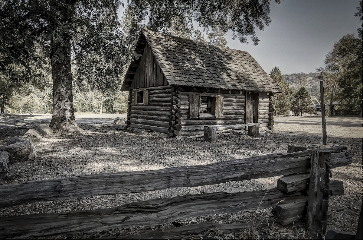
 Uncle Toms Cabin


