| Author | Thread |
Comments Made During the Challenge  |
|
|
12/11/2004 07:01:41 PM |
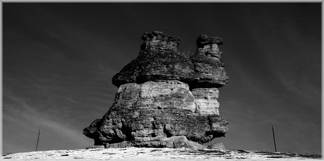
| too bad the poles (?) had to be there... |
|
|
|
12/10/2004 11:06:59 PM |
| Color would have really improved this photo. |
|
|
|
12/10/2004 11:14:58 AM |
| Very intersting subject. I like the greay scale. The sky has nice texture to it. |
|
|
|
12/10/2004 10:29:54 AM |
| Great B&W, nice framing, great sky. |
|
|
|
12/09/2004 10:27:41 PM |
|
|
|
12/09/2004 01:44:33 AM |
| It's too hard to see your subject |
|
|
|
12/08/2004 08:58:11 PM |
| Wow, best one I've seen so far. Stark, powerful, technically excellent - 9 |
|
|
|
12/08/2004 02:20:29 PM |
| I like this, but like to have more contrast between the top of the rocks and the sky. The off-center feel (though it isn't off center) is cool, too. |
|
|
|
12/08/2004 11:37:29 AM |
| I think that it's too dark on the top of the picture. |
|
|
|
12/06/2004 09:48:00 PM |
| Very nice black and white. 7 |
|
|
|
12/06/2004 08:34:58 AM |
| I really like the b/w for this shot. I think it brings out the texture of the structure. I think I would have cloned out the two poles or whatever they are on each side. I would like to also see the color version of this. Still, nicely done! |
|
|
|
12/06/2004 01:32:47 AM |
| Nice textures on the rock. Photo looks a bit too dark - details are lost. Also, I think this would benefit from an off center composition. |
|
|
|
12/06/2004 01:26:08 AM |
| the gray scale in this image is great the shot and subject are great too... a diffrent angle might be nice but its great the way it is now...-GL |
|
Home -
Challenges -
Community -
League -
Photos -
Cameras -
Lenses -
Learn -
Prints! -
Help -
Terms of Use -
Privacy -
Top ^
DPChallenge, and website content and design, Copyright © 2001-2024 Challenging Technologies, LLC.
All digital photo copyrights belong to the photographers and may not be used without permission.
Current Server Time: 04/28/2024 04:12:50 AM EDT.