| Author | Thread |
|
|
12/13/2008 11:41:17 PM · #26 |
| WHY do you think these shots are underrated? I mean, specifically why. What part of the shot do you think the voters missed, and why do you think they missed it? |
|
|
|
12/13/2008 11:52:48 PM · #27 |
| Yanko's shot is all about the story, the expression, and the perfect composition of the black birds in the painting. Lovethelight's shot is such a wonderful blend of browns and subtlety. |
|
|
|
12/13/2008 11:54:17 PM · #28 |
Originally posted by L2:
WHY do you think these shots are underrated? I mean, specifically why. What part of the shot do you think the voters missed, and why do you think they missed it? |
No one missed anything. These are all very subjective personal opinions. Final score is Objective, IMO. |
|
|
|
12/13/2008 11:55:03 PM · #29 |
Whatever...
Message edited by author 2008-12-14 00:06:23. |
|
|
|
12/14/2008 12:01:04 AM · #30 |
L2 asks a perfectly reasonable question. I, for one, do want to know why people like (or don't) a photo. It helps me understand my own photography better as well as to appreciate others. One person's gem is another person's coal, but some (i.e. me) want to know what makes it a gem. People posting photos and then explaining why they did or did not like them is an excellent exercise for anyone who bothers to take the time to notice.
I have an appreciation for many things that I wouldn't if someone had not bothered to explain why they like it.
Is it such a bad thing to try and broaden one's perception of what they like and don't like? |
|
|
|
12/14/2008 12:06:02 AM · #31 |
| Easy Leo. She was just asking what people liked about the "underrated" shots. Wouldn't that be a good thing to discuss? |
|
|
|
12/14/2008 12:06:20 AM · #32 |
Originally posted by L2:
WHY do you think these shots are underrated? I mean, specifically why. What part of the shot do you think the voters missed, and why do you think they missed it? |
Everything? Nothing? It sort of depends. Lets see, the blurry photos are probably dismissed by default because they don't look as if they were shot with professional equipment therefore it can't be good. All it takes is about a dozen or so voters to think that to ruin a photo's chances of doing well. Complex photos almost never look as good as a simple one when you are speed voting. It is the subtle detail that gets lost that makes those photos. All it takes is a dozen or so speed voters to ruin a photo's chances of doing well.
So what you have left are the easy to absorb simple images (i.e. what you find in the top ten most if not all of the time). Occassionally, you'll see a complex photo like De Sousa's win but lets not kid ourselves. It most likely won because it was deemed VERY professional so it MUST be good. Now it may very well be but I wouldn't go by these voters. Sorry, I just don't have a high opinion of the average voter as a judge. Don't get me wrong, there are a lot of good ones out there it's the lousy ones we have that tend to ruin things. Also, don't assume that I'm saying complex blurry photos are great by default. I'm just saying they stand little chance when up against the usual simple and sharp images.
Just my opinion of course.
Message edited by author 2008-12-14 00:31:59.
|
|
|
|
12/14/2008 12:13:22 AM · #33 |
Originally posted by joynim:

I really liked this one
|
Well, thanks for the kind words, but although I also really like this photo [;-)] I don't find it underrated, actually I was surprised that it did so well on DPC cause, you see, it's partially blurry :-)
|
|
|
|
12/14/2008 12:16:02 AM · #34 |
|
|
|
12/14/2008 12:17:52 AM · #35 |
Originally posted by Zigomar:
Originally posted by joynim:
I really liked this one
|
Well, thanks for the kind words, but although I also really like this photo [;-)] I don't find it underrated, actually I was surprised that it did so well on DPC cause, you see, it's partially blurry :-) |
Cool image. My first thought when I saw it was this is what it must look like if you're on acid. :P Btw, it's a good thing the guy's face was razor sharp otherwise your score would have been in the mid 5s.
|
|
|
|
12/14/2008 12:30:03 AM · #36 |
aaand, the most underrated photo of all (Personal note) :P

By the book, i should have kept the other eye visible but out of the box, what you "feel" when you see it first. I think this lion is one of the uniquest regular shot ever. I have researched and could not find anything with "Studio" feel shot of a lion, so I posted.
my second disappointment, and this was the first...
 |
|
|
|
12/14/2008 12:34:44 AM · #37 |
This one is outstanding.
 |
|
|
|
12/14/2008 01:00:30 AM · #38 |
Originally posted by yanko:
Originally posted by Zigomar:
Originally posted by joynim:
I really liked this one
|
Well, thanks for the kind words, but although I also really like this photo [;-)] I don't find it underrated, actually I was surprised that it did so well on DPC cause, you see, it's partially blurry :-) |
Cool image. My first thought when I saw it was this is what it must look like if you're on acid. :P Btw, it's a good thing the guy's face was razor sharp otherwise your score would have been in the mid 5s. |
Zigomar, I gave your shot a pretty high score. I could tell you used a Lensbaby, but it didn't occur to me that that's what things look like when you are on hallucinogenic so I didn't quite "get" it.
What made you think to do that? The hat? :) |
|
|
|
12/14/2008 01:13:50 AM · #39 |
Leo, I'll answer your earlier PM here-
It's really not that difficult to understand the results. Consider the nature of DPC... this is a learning site open to all. In any given challenge, we've got hundreds of people voting and most of them are amateurs, if not outright beginners. We're just not all judging from the same perspective here. Assuming it meets the challenge, there are three factors in play with every photo submitted: technicals, beauty and concept. It's tough to score high with one of those, and a blue ribbon almost always requires all three. Perceived technical problems (even if intentional) will get low votes, strong concepts get high votes, and beauty is in the eye of the beholder. If there's nothing in focus, the newbies are going to kill that entry every time, which is why blurry shots rarely score high, but a pretty shot with no technical problems will always score well, especially in a Free Study where concept carries less weight. That's why people say the winners tend to be "eye candy."
DeSousa nailed the blue because it was technically flawless, it was cool to look at, and it was steeped in concept. The red ribbon was riding mostly on beauty and technicals. Likewise, Bassbone's yellow ribbon (and my own tiger) were on the low end of the concept scale, but they're cool things to look at, so strong technicals and beauty were enough. Scarbrd's "Circuit City" was conceptually brilliant and technically very good, but it lacked beauty, which made it FEEL like a cold, technical setup (which is hard to explain).
In reality, most of the shots that placed in the top 100 in this challenge could have been ribbon winners in 2002, and those high scores would have come from us. Anyone who's been here long enough will tend to get jaded and look for something fresh, new, artsy... different, but that doesn't mean the other shots aren't fine photos, too. Most of my 10 votes didn't reach the top 20, yet I didn't score any of the top 40 lower than 7. We've seen a lot over the years, and the more experienced photographers will appreciate more advanced photographs. It's only natural.
|
|
|
|
12/14/2008 02:23:09 AM · #40 |
Originally posted by scalvert:
Assuming it meets the challenge, there are three factors in play with every photo submitted: technicals, beauty and concept. It's tough to score high with one of those, and a blue ribbon almost always requires all three. Perceived technical problems (even if intentional) will get low votes, strong concepts get high votes, and beauty is in the eye of the beholder. If there's nothing in focus, the newbies are going to kill that entry every time, which is why blurry shots rarely score high, but a pretty shot with no technical problems will always score well, especially in a Free Study where concept carries less weight. That's why people say the winners tend to be "eye candy."
DeSousa nailed the blue because it was technically flawless, it was cool to look at, and it was steeped in concept. The red ribbon was riding mostly on beauty and technicals. Likewise, Bassbone's yellow ribbon (and my own tiger) were on the low end of the concept scale, but they're cool things to look at, so strong technicals and beauty were enough. Scarbrd's "Circuit City" was conceptually brilliant and technically very good, but it lacked beauty, which made it FEEL like a cold, technical setup (which is hard to explain). |
Since you've never won a free study ribbon allow me to chime in. :P Seriously though, I agree with what you're saying but subject matter is also key. You'll never see a pigeon photo outscore an eagle photo with all else being equal. It simply doesn't happen. There are not enough voters that consider pigeons as worthy subjects at least on par with birds of prey or other subjects deemed "cool". In addition to cool factor, subjects that are benign in nature, that is poses little to no risk in offending will almost always do better than ones that do. Jorge's Descent from the Cross is the exception but we should all know that had it not offended some it would have scored well over 8, and considering some of the photos that did score over 8 his more than deserved to be up there. That said, DPC has made some progress. Last year Jorge's shot probably would have scored around where his Last Supper shot finished which was low 7s I believe. There has also been a little loosening of the collar in regards to meeting the challenge theme.
Message edited by author 2008-12-14 02:33:25.
|
|
|
|
12/14/2008 02:30:55 AM · #41 |

I sat and looked at this shot for a very long time. For me it was a powerful, haunting image. |
|
|
|
12/14/2008 04:57:20 AM · #42 |
Originally posted by L2:
Originally posted by yanko:
Originally posted by Zigomar:
Originally posted by joynim:
I really liked this one
|
Well, thanks for the kind words, but although I also really like this photo [;-)] I don't find it underrated, actually I was surprised that it did so well on DPC cause, you see, it's partially blurry :-) |
Cool image. My first thought when I saw it was this is what it must look like if you're on acid. :P Btw, it's a good thing the guy's face was razor sharp otherwise your score would have been in the mid 5s. |
Zigomar, I gave your shot a pretty high score. I could tell you used a Lensbaby, but it didn't occur to me that that's what things look like when you are on hallucinogenic so I didn't quite "get" it.
What made you think to do that? The hat? :) |
Hallucinogenic feel was not my main point :-) It just occured to me that this might associate some people with some sort of distorted perception. The hat was quite funny :-) but as  Gordon pointed out in his wonderful comment on this photo, it's the combination and relashionship of different little things in the shot that make you bounce left/right/up/down through the photo - like the red on the hat-the spot on the bad, green on the hat-green background, the trinity of yellow spots-the lamp shades and reddish spot on the bed... All in all, pretty scattered focal points which don't immediatelly settle you sight, thus the feel of "hallucination". Gordon pointed out in his wonderful comment on this photo, it's the combination and relashionship of different little things in the shot that make you bounce left/right/up/down through the photo - like the red on the hat-the spot on the bad, green on the hat-green background, the trinity of yellow spots-the lamp shades and reddish spot on the bed... All in all, pretty scattered focal points which don't immediatelly settle you sight, thus the feel of "hallucination". |
|
|
|
12/14/2008 06:44:31 AM · #43 |

through my eyes this was a bit under rated... beyond the usual oohs and ahhs this one has a sense of feeling for me. It oozes energy. maybe one needs be a fan of the slightly more ruckus music to relate?
ETA: my vote was a 10... top 3 imo.
Message edited by author 2008-12-14 10:04:33. |
|
|
|
12/14/2008 06:52:51 AM · #44 |
Originally posted by xakpeet:
through my eyes this was a bit under rated... beyond the usual oohs and ahhs this one has a sense of feeling for me. It oozes energy. maybe one needs be a fan of the slightly more ruckus music to relate? |
I totally agree and rated this an 8 myself. It really conveys the atmosphere and there is a lot to look at. |
|
|
|
12/14/2008 07:53:44 AM · #45 |
Originally posted by xakpeet:
through my eyes this was a bit under rated... beyond the usual oohs and ahhs this one has a sense of feeling for me. It oozes energy. maybe one needs be a fan of the slightly more ruckus music to relate? |
It was one of my top picks from that challenge. Perfectly captured the energy of a concert and maintained an excellent sense of balance. 'Twas also a wonderful B&W conversion. |
|
|
|
12/14/2008 07:54:38 AM · #46 |
Originally posted by yanko:
You'll never see a pigeon photo outscore an eagle photo with all else being equal. It simply doesn't happen. There are not enough voters that consider pigeons as worthy subjects at least on par with birds of prey or other subjects deemed "cool". |
So you're saying I haven't a chance in hell at a FS ribbon, eh? :-) |
|
|
|
12/14/2008 08:19:18 AM · #47 |
Originally posted by Zigomar:
Originally posted by L2:
Originally posted by yanko:
Originally posted by Zigomar:
Originally posted by joynim:
I really liked this one
|
Well, thanks for the kind words, but although I also really like this photo [;-)] I don't find it underrated, actually I was surprised that it did so well on DPC cause, you see, it's partially blurry :-) |
Cool image. My first thought when I saw it was this is what it must look like if you're on acid. :P Btw, it's a good thing the guy's face was razor sharp otherwise your score would have been in the mid 5s. |
Zigomar, I gave your shot a pretty high score. I could tell you used a Lensbaby, but it didn't occur to me that that's what things look like when you are on hallucinogenic so I didn't quite "get" it.
What made you think to do that? The hat? :) |
Hallucinogenic feel was not my main point :-) It just occured to me that this might associate some people with some sort of distorted perception. The hat was quite funny :-) but as Gordon pointed out in his wonderful comment on this photo, it's the combination and relashionship of different little things in the shot that make you bounce left/right/up/down through the photo - like the red on the hat-the spot on the bad, green on the hat-green background, the trinity of yellow spots-the lamp shades and reddish spot on the bed... All in all, pretty scattered focal points which don't immediatelly settle you sight, thus the feel of "hallucination". |
Thanks, Zigomar. After I read all the comments, I did understand the points Gordon was making. I guess what I meant was: your in this lovely setting, perfect strangers comes by and agrees to be photographed. Was it a Lensbaby day, and that lens was already on your camera? Or was there something about the scene and the guy with his hat that made you think to yourself, OMG, I so need the Lensbaby for this? |
|
|
|
12/14/2008 08:35:14 AM · #48 |
Originally posted by xakpeet:
through my eyes this was a bit under rated... beyond the usual oohs and ahhs this one has a sense of feeling for me. It oozes energy. maybe one needs be a fan of the slightly more ruckus music to relate? |
Not under rated from me! I gave it a 9. I thought the composition was pretty masterful - the light beams were perfectly balanced. The way they meet in the crowd with their hands wildly waiting shows off the wild excitement of the crowd. Additionally, the image has a natural border that "contains" the frame.
Using Shannon's triad of technicals, beauty, and concept: Technicals were spot on - extremely sharp definition in low light shows skill. Beauty - back to eye of the beholder on this. I wouldn't call this a "beautiful" image, oh probably because it's black and white and there is nothing to connect me with the scene (ie, a face in the crowd that's grabbing me, or an iconic body position from the people on stage). Concept isn't weak, but maybe not enough for "Wow." Without the title, I wouldn't have known who the band was.
Like I said, I gave it a 9, but for those who connected with it emotionally - what element of the shot evoked a reaction? |
|
|
|
12/14/2008 09:45:08 AM · #49 |
Originally posted by xakpeet:
through my eyes this was a bit under rated... beyond the usual oohs and ahhs this one has a sense of feeling for me. It oozes energy. maybe one needs be a fan of the slightly more ruckus music to relate? |
I too voted this a 9, as one of the best concert/theatrical shots I've seen in years.
I was impressed not only by the staged symmetry of the lighting, but waves of energy flowing through the audience.
The result was a true sense of being a part of the concert, effective enough for me to imagine the sound track.
On a different note, I once again found myself humbled by jj's talent, capturing images that touch your heart and mind.
|
|
|
|
12/14/2008 09:51:48 AM · #50 |
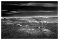
Literally every image at DPC is underrated; so in that regard this one is no exception.
What is exceptional about this image is that Jason presents an astounding interpretation of one of Oregon's most famous and least known truly World Class photo opportunities - The Painted Hills of John Day.
The Painted Hills are justly famous for their brilliant, calico colors and incredible lines and curves. Those are the photographs you always see published in glossy coffee book volumes or displayed in art galleries and they usually look like this:
Traditional Painted Hills View
I knew Jason's over sharpened image was something exceptional the instant it appeared on my screen while reviewing the Master's images during the challenge. After finding out it was Jason's this is what I immediately wrote to him:
"Your picture made three deep impressions on me.
First, it is B/W. For the Painted Hills I thought that a brave and very appropriate presentation. Second, you included foreground interest. Sounds kinda funny to be impressed by such a standard thing but there isn't much foreground interest to be found there and photographs don't usually have any since photographers are always attracted to presenting its renowned lines. Lastly, it is taken from a distance. You don't see that often. (Though last summer another photographer that I know did just that... his was a very wide angled color interpretation of the area)
All those things combined makes yours a very unique creation. That knocked my socks off. I'd like to see that one in a gallery showing somewhere though I suspect it might not make the top 10 at DPC. Hope I'm wrong about that!"
Btw, Jason, in my personal opinion your image captures the look and feel of this Ansel Adams photograph:
Moonrise, Hernandez, New Mexico, 1941
However, Bear_Music is far more qualified to comment on that than I. |
|