| Image |
Comment |
| 04/26/2013 10:45:22 AM |
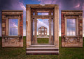
An Illusion of Grandeurby YandrosxxComment: Originally posted by blindjustice:
I second the fact it was a great idea. I think Allesandro is correct, if there was a better feeling that these pieces were in the same space as the ground, either through use of shadow or better light work, this idea would have taken you to high places. |
Had the same thoughts prior to entry. Went back and forth between beveled edging and drop shadows. The problem wit the drop shadows was I couldn't figure out how to position them so they looked natural on the ground. Ended up going with the beveled edges to keep the separation from the background. Not sure I'll revisit it though. |
| 04/24/2013 10:18:29 AM |
|
 Photographer found comment helpful. Photographer found comment helpful. |
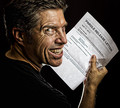
| 04/24/2013 10:13:54 AM |
Don't by angkokwengComment: This is a brilliant image. Powerful, disturbing image. The title is exceptional as well. All around excellent image. Definitely a cut above. |
| Photographer found comment helpful. |
| 04/22/2013 10:55:57 AM |
The Last Ice Shackby WorfComment: It appears too dark. Would have liked it much more if the ice and snow had been true white. |
| 04/17/2013 12:04:09 AM |
|
| Photographer found comment helpful. |
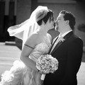
| 04/16/2013 11:07:47 AM |
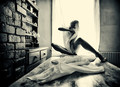
Intimateby colorcarnivalComment: I agree with the comment below. It looks like the vertical is off. If you look at the brick wall in the back, its off center.
I'd add more contrast. BW conversion seems flat to me and I'd see how a vignette looks as well. |
| Photographer found comment helpful. |
| 04/10/2013 03:20:02 PM |
Kitchen Table by PaulComment: This is the smokin-est hottest smokin-est thing ever. Wooh. |
| Photographer found comment helpful. |
| 04/10/2013 01:21:11 PM |
A Ride Through Time by jagarComment: Can't imagine this isn't doing well. It's wonderful. Beautiful place, simple elements, excellent post processing. Very well done. |
| Photographer found comment helpful. |
| 04/10/2013 09:20:19 AM |
|
| Photographer found comment helpful. |
| 04/10/2013 09:19:04 AM |
Sunset Carrierby SonicasmileComment: Really feel like this would have benefited from a different placement of the bike. More to the right and placed higher up in the scene. Pretty dramatic though. |
Home -
Challenges -
Community -
League -
Photos -
Cameras -
Lenses -
Learn -
Prints! -
Help -
Terms of Use -
Privacy -
Top ^
DPChallenge, and website content and design, Copyright © 2001-2024 Challenging Technologies, LLC.
All digital photo copyrights belong to the photographers and may not be used without permission.
Current Server Time: 04/28/2024 11:10:36 AM EDT.