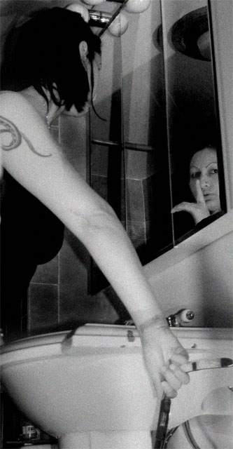
Intriguing. Its clear that we don't know everything that's going on here. In the reflection, you see her going ssshh with her left hand, but the real woman is holding something (razor?) with her left hand so it must be a different person, right? Or is something else going on here? The grain works for me, although I agree that it is a bit too smooth.
I like the shot, but there are three things that kinda bug me. First, like bvy, I don't have any clue what she's holding. Second, the label/barcode thing in the lower left sticks out to me. I'm not sure it's supposed to. Finally, the noise/grain is a great addition, but it's too uniform, IMO, too "digital". That may just be a matter of personal preferance though. I love how you pulled off the trippy reflection.
indeed, quite intersting shot, as far as I can see it's a razor she's holding, leaves much room for interpretation. i find the aspect ratio a bit skinny, but that's probably due to hiding the second person (reflected). I like the grainy look as well as the tones. This image needs a bold white border if you ask me.
Well I like it. At first glance, it's kind of disorienting, and I think viewers will be split as to whether that's a distraction or an attraction. For instance, I can't quite tell what she's holding. Also, is that her reflection? It's more intriguing if it isn't (and most intriguing if it's no one's!).
The noise, whether you added it or not, works nicely as does the black and white. I think retricting your tone pallette to the mids and lows, was also a good choice. Too much contrast, and it would have lost its subtlety. Really, really nice.