| Author | Thread |
|
|
11/29/2008 10:07:35 PM · #1 |
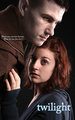
Has anyone else done this yet? hehe
Message edited by author 2008-11-30 20:49:51. |
|
|
|
11/29/2008 10:25:57 PM · #2 |
| That's pretty cool!! I'd say if you want it to look more like the poster you should make it darker around the edges more, and touch up the faces to make it look more illustrative. |
|
|
|
11/29/2008 10:27:26 PM · #3 |
|
|
|
11/29/2008 11:04:13 PM · #4 |
Nice effort! I like the lighting and editing is pretty good. However, if I am to compare this to Joey's poster the main difference is the feelings expressed.
In Joey's photo the guy comes across as a protector and the girl feels safe where as in your photo the guy feels like he is invaded her space and she looks scared or at the very least timid. It's all about the positioning. In Joey's photo the guy's position is arched as if he is pulling away ever so slightly. He also wraps around the top frame which makes him look as if he is protecting her from the outside world. In your photo the guy is much more straight and is leaning forward so it gives the impression that he is invading her space rather than protecting it. Couple that with her expression being a little wide eyed and it makes it look as if she's in danger. The very subtle differences changes the shot completely.
Anyway, just an observation. I hope you don't mind! :)
Message edited by author 2008-11-29 23:06:12. |
|
|
|
11/30/2008 03:37:06 AM · #5 |
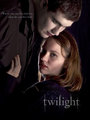
Looks pretty good! The lighting and whatnot looks pretty close to the poster, my only nitpick would be that it needs to be edited more.
Hope you don't mind (and if you do mind let me know, and I'll take it down) but I decided to have a go at editing it myself...

Message edited by author 2008-11-30 03:37:28. |
|
|
|
11/30/2008 10:22:26 AM · #6 |
Originally posted by mobster:
Looks pretty good! The lighting and whatnot looks pretty close to the poster, my only nitpick would be that it needs to be edited more.
Hope you don't mind (and if you do mind let me know, and I'll take it down) but I decided to have a go at editing it myself...
|
Hey, I don't mind one bit. I love to see other peoples interpretations and visions. I like what you did, except her eyes, she is human and those look as if she has changed/crossed over. I am a sucker for overdone eyes, so these do appeal to me, just not the mood i was trying to convey with this particular photo. Thanks for your time and effort! |
|
|
|
11/30/2008 02:34:01 PM · #7 |
I did the same thing with my attempt at editing except i desaturated the eyes of the girl and i don't know how to make the guys face so smooth. Love to know your editing steps.
Also Kelly i would love to know how you lit this :) it's exactly the same as the poster or almost.
Message edited by author 2008-11-30 14:36:11. |
|
|
|
11/30/2008 04:46:38 PM · #8 |
| cujee. Lighting was my sons doing. silver umbrella front right, softbox rear left, with external flash aimed at a white ceiling. You would have to experiment with intensity. |
|
|
|
11/30/2008 04:48:10 PM · #9 |
Hey Kelly - was just thinking about you and wondering where you'd been - even did a check of your profile and saw you'd been MIA a little - GRIN!
Glad to see you around! |
|
|
|
11/30/2008 06:05:40 PM · #10 |
DITTO! good to see you taking pics & posting :)
Originally posted by iamwoman:
Hey Kelly - was just thinking about you and wondering where you'd been - even did a check of your profile and saw you'd been MIA a little - GRIN!
Glad to see you around! |
|
|
|
|
11/30/2008 11:23:25 PM · #11 |
The editing was pretty straight forward... most of it was done with the Dodge and Burn tools. The face was softened with two layers, one set to normal at about 50% and one set to Soft Light at about 70%, both blurred with the Surface Blur tool.
Heres a GIF of the editing steps.

You were right about the eye... so I fixed it.

Message edited by author 2008-11-30 23:23:43. |
|
|
|
12/01/2008 09:59:01 AM · #12 |
|
|
|
12/01/2008 05:54:04 PM · #13 |
Kelly inspired me to try my own knockoff. It was so hard to get the lighting even close to the poster.
Just as I was getting closer, my models decided they were sick of it :-(
So here is my attempt, complete with jpg artifacts, that the bigger version doesn't have.
I realize it is far from perfect, but I'm glad that I eventually got at least as close as I did.
|
|
|
|
12/01/2008 08:55:12 PM · #14 |
| I think you did great!! Atleast your Edward is in a better position than mine. You used burgandy lipstick on the guy, thats smart. OH, you got the twilight font too. What fun. |
|
|
|
12/01/2008 09:14:23 PM · #15 |
Just in case folks don't know this: a DPC Alum by the name of  Joey Lawrence shot the original poster. Joey Lawrence shot the original poster.
|
|
|
|
12/01/2008 09:48:50 PM · #16 |
|
Home -
Challenges -
Community -
League -
Photos -
Cameras -
Lenses -
Learn -
Prints! -
Help -
Terms of Use -
Privacy -
Top ^
DPChallenge, and website content and design, Copyright © 2001-2024 Challenging Technologies, LLC.
All digital photo copyrights belong to the photographers and may not be used without permission.
Current Server Time: 04/24/2024 02:38:54 AM EDT.


