| Author | Thread |
|
|
04/27/2007 10:48:05 PM · #1 |
Like it says, I will offer my humble opinions on your digital art, which includes photo-manipulations.
I want see see your most creative images, images where others think they are 'over edited' and such.
All I ask in return are two things, If you do you not care for this style of imagery please post in a different thread saying as such if you feel the need to voice your distaste.
Second, Please don't bombard the image with requests or requests of images that are not digital art. If, I feel your image does not hold the digital art feel, I will politely let you know and if I have time may offer a critique.
Thanx, I hope to see some fantastically creative images. (-;
|
|
|
|
04/28/2007 12:10:03 AM · #2 |

Feeling lonely? LOL!!!! I'll get you started.
I'm curious if you even think this is digital art or not.
|
|
|
|
04/28/2007 12:24:37 AM · #3 |
I think this is my best editing job, done many years ago, recomposing a scan of a B&W print:
 into this into this  |
|
|
|
04/28/2007 12:26:43 AM · #4 |
here's a couple for you. I did a whole series of these a while back.
I'm looking forward to your comments.


The fullsize image looks a lot better
Message edited by author 2007-04-28 00:29:26. |
|
|
|
04/28/2007 12:44:28 AM · #5 |
Originally posted by stdavidson:
Feeling lonely? LOL!!!! I'll get you started.
I'm curious if you even think this is digital art or not. |
This image really borders I think on digital art. Even though to me, the image minus the sky does give a nice artistic feel for me, the sky itself totally throws me off and for me looks extremely out of place. The shadows are very pronounced and the placement of the lightning leads me to think the shadows would be a bit different especially on the tops of the plateaus. I like the lighting, and I like the plateaus and ground. I just personally don't care for them together.
|
|
|
|
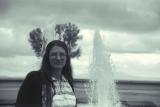
04/28/2007 12:48:52 AM · #6 |
Originally posted by GeneralE:
I think this is my best editing job, done many years ago, recomposing a scan of a B&W print:
into this |
This image for some reason makes me think of Andy Warhol. I think because of the smoothness of the colours on top of the black and white, this gives an interesting feel. I do notice you flipped her around and moved her closer to the fountain. The smooth lines around her make this feel like two different images. Although, there is just something intriguing about it. It drawls me a bit and makes me wonder. I think the moving of the eyes really creates a little extra something for the image. Nice job. its fun.
|
|
|
|
04/28/2007 12:52:03 AM · #7 |
Originally posted by m2iw:
here's a couple for you. I did a whole series of these a while back.
I'm looking forward to your comments.
|
I really like this style, the 'comic' style some people have called it when I use it. I have used it mostly on people though. I think you did a fantastic job here. The reflection in the side door, almost looks like a photographic reflection still. Not sure what to make of that, but I think overall this image is great fun.
|
|
|
|
04/28/2007 12:54:35 AM · #8 |
Originally posted by m2iw:
here's a couple for you. I did a whole series of these a while back.
I'm looking forward to your comments.
The fullsize image looks a lot better |
Like I said for the other image, I really like this style. However, I must say, the freeze-frame of this car leaves me lacking a bit. I love the dramatic motion blur of the stands the colours and lighting are fantastic. But, to see the car apparently sitting still, just throws me a touch. I think even if just a slight motion blur on only the trunk would add a much more dramatic feel. Otherwise I think its a fantastic image.
|
|
|
|
04/28/2007 12:59:47 AM · #9 |
|
|
|
04/28/2007 01:40:07 AM · #10 |
Originally posted by Ristyz:
 |
This is a very interesting image, it pushes me out and pulls me in at the same time. Meaning, there is a distractive element within the details of the horse that makes me want to look away, but as I do, the shadows and lines of the trees pull me right back into the horse. A moonlight image, both smooth and sharp at the same time. Very interesting image. It makes me wonder what if this looked more 'painted'? It may add even another element. Very nice image.
|
|
|
|
04/28/2007 08:56:22 AM · #11 |
|
|
|
04/28/2007 10:07:15 AM · #12 |
|
|
|
04/28/2007 10:09:20 AM · #13 |
I would love for you to critique my graphics.
Please check out a few to look over here
You should be ashamed is my favorite piece of work. I made the brushes used in the piece and wrote the poem. My first and last poem LOL
Thank you ! |
|
|
|
04/28/2007 10:35:53 AM · #14 |
Originally posted by Bosborne:
 |
Nice idea, great colours.. BUT...
It would of been far better if you could of made the rings spreading out from the bird, so the water leooks more natural. There is no rhyme nor reason for the rings just to be in the middle of the water.. otherwsie its a good effort. Just remember not to use special effects filters just for the sake of using them, remember a lot of the time "less is more". |
|
|
|
04/28/2007 10:37:02 AM · #15 |
Originally posted by Shiiizzzam:
I would love for you to critique my graphics.
Please check out a few to look over here
You should be ashamed is my favorite piece of work. I made the brushes used in the piece and wrote the poem. My first and last poem LOL
Thank you ! |
Post some of them on this site/ forum and I will be happy to comment on a few of them. |
|
|
|
04/28/2007 10:44:42 AM · #16 |
Originally posted by Shiiizzzam:
You should be ashamed is my favorite piece of work. I made the brushes used in the piece and wrote the poem. |
Hm.. forgive me if I'm wrong, but isn't the actual photograph included in that picture one of Sally Mann's photos? |
|
|
|
04/28/2007 12:18:33 PM · #17 |
|
|
|
04/28/2007 12:31:07 PM · #18 |

Here is one I made a couple weeks ago using liquefy and mirror. |
|
|
|
04/28/2007 12:57:53 PM · #19 |
Here are 2 i did a while back that obviously look like manipulations :P
 
|
|
|
|
04/28/2007 02:01:02 PM · #20 |
Originally posted by soup:
 |
This is a really fantastic image. I looked at it earlier this morning, and don't know if it was the wrong light hitting my screen, or what but, there was something I didn't care for. I came back now to take another look and it looks great. I wouldn't go as far as calling this digital art, more of just a composite. I think there is something about the base of the tree that can be a touch sharper in my opinion. That mist over it, kinda throws me a bit. But it is a very nice image. colours, sky, water all nicely balanced.
|
|
|
|
04/28/2007 02:05:40 PM · #21 |
Originally posted by Bosborne:
|
What I really enjoy with this image is the reflection and the smoothness of the colour transitions in the water. The bird itself, I think it is a bit too gritty. Along the gritty lines I think the noise was added? to the top of the image, what I think you should have done is only add it to the bird, and maybe created the same smoothness of the water in the leaves behind the bird.
Personally I think the best fix would be to smooth out the leaves behind the bird to match the smoothness of the water. As well as add a small surface blur to the bird to give it a more painted feel and remove the sharp gritty texture to it.
The composition is very nice.
|
|
|
|
04/28/2007 02:09:40 PM · #22 |
Originally posted by littlegett:
Originally posted by GeneralE:
I think this is my best editing job, done many years ago, recomposing a scan of a B&W print:
into this |
This image for some reason makes me think of Andy Warhol. I think because of the smoothness of the colours on top of the black and white, this gives an interesting feel. I do notice you flipped her around and moved her closer to the fountain. The smooth lines around her make this feel like two different images. Although, there is just something intriguing about it. It drawls me a bit and makes me wonder. I think the moving of the eyes really creates a little extra something for the image. Nice job. its fun. |
If this is not a great "stuff growing out of someone's head" rescue ... I don't know what the HELL is!
OMG OMG OMG ... I just read it all and see that this was a B&W original? ... That is just insanely good IMO! I hope you got LOTS of money for that work. If not, though, you can be assured, at least, that your work with it has astounded at least ONE man!
Message edited by author 2007-04-28 14:12:47.
|
|
|
|
04/28/2007 02:10:17 PM · #23 |
Originally posted by zeuszen:
 |
Very interesting concept here. I know a touch about the bound feet thing, but not a lot. Without the title first thought in my mind was someone behind a bathroom stall. Here I would hope to see the 'bound feet' a touch better, maybe even showing the bindings a bit. What if one of the feet had part of the binding laying out? I think that would have made for a more dramatic feel. The screen is very surreal and graphical, it is as if the more I look at it the more it becomes pronounced. I really enjoy the textures and find it very pleasurable to look at. I think the feet are the major distraction, which is ironic because it is the title of the image.
|
|
|
|
04/28/2007 02:17:10 PM · #24 |
Originally posted by ssodell:
Here is one I made a couple weeks ago using liquefy and mirror. |
Very conceptual image, I think  Art Roflmao would enjoy this much. When I look at this image, It seems more like a photograph, taken with a mirror distortion. It is very interesting to look at and takes me inside to look at all the details. However the flatness of the chest is really distracting for me. It appears almost out of place for the image. Just the chest colour throws me. Art Roflmao would enjoy this much. When I look at this image, It seems more like a photograph, taken with a mirror distortion. It is very interesting to look at and takes me inside to look at all the details. However the flatness of the chest is really distracting for me. It appears almost out of place for the image. Just the chest colour throws me.
Also, even though I like a bit more symmetry I think this image is really heightened by being not symmetrical. The effect is really so funhouseish and moody. Very nice piece I think. Just wish for the chest to be a little more befitting.
|
|
|
|
04/28/2007 02:21:47 PM · #25 |
Originally posted by elsapo:
Here are 2 i did a while back that obviously look like manipulations :P
|
I look at this and find a beautiful image, However, I also see an obviously manipulated image. What I think breaks the fantasy feel for this image, is the smoothness of the water over the rocks. If, there was a more illustrative feel to the rapids, I think this picture would be award winning. I really enjoy the colours of the trees, the fairy and orbs are nice. But, for me the water takes me away from the imaginary.
|
|
Home -
Challenges -
Community -
League -
Photos -
Cameras -
Lenses -
Learn -
Prints! -
Help -
Terms of Use -
Privacy -
Top ^
DPChallenge, and website content and design, Copyright © 2001-2024 Challenging Technologies, LLC.
All digital photo copyrights belong to the photographers and may not be used without permission.
Current Server Time: 04/25/2024 12:53:58 AM EDT.


