| Author | Thread |
|
|
01/26/2022 12:00:19 AM · #1 |
| Post your outtakes from the Furniture III (ARCHIVAL) challenge here. |
|
|
|
01/26/2022 04:11:01 PM · #2 |
This was my entry (thank you for the ribbon and nice comments!)
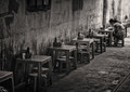
But I was torn between that and the original color version that I thought was interesting in its own right.

Those brightly-colored little plastic tables and matching "baby" chairs in Vietnamese street cafes and diners were one of the most peculiar things I encountered in Vietnam. It turns out that the story behind them is quite interesting |
|
|
|
01/26/2022 11:16:59 PM · #3 |
Interesting story. China has similar plastic setups but not necessarily that small.
As for the picture, I can see why it was had to make the choice. I like the color version but the ladies flowered shirt spoils a bit the feeling. That part looks better in B&W. I was one of your 9s. Funny enough my entry is also taken in Vietnam! |
|
|
|
01/27/2022 10:32:57 AM · #4 |
| In the color version, in my opinion, the eye travels back and forth along the colorful line of tables, chairs and patron, rather to the neglect of the context that is fundamental. The black and white version is more of a piece, giving due regard to the wonderful tones, textures and lines. The line of tables, etc., complements the context with a strong, interesting symmetry and more modest focus. The eye happily ranges throughout. |
|
|
|
01/27/2022 02:31:30 PM · #5 |
Originally posted by streetpigeon:
In the color version, in my opinion, the eye travels back and forth along the colorful line of tables, chairs and patron, rather to the neglect of the context that is fundamental. The black and white version is more of a piece, giving due regard to the wonderful tones, textures and lines. The line of tables, etc., complements the context with a strong, interesting symmetry and more modest focus. The eye happily ranges throughout. |
you nailed it Rich. In the color version, there is much more focus on the tables, that's why I thought it could be perhaps more appropriate for the "Furniture" challenge. The topic notwithstanding, I also prefer the BW version since the line of tables is just a leading line to the "true" subject of the photo, and the emphasis is on the human, not on plastic :). |
|
|
|
01/27/2022 05:08:25 PM · #6 |
| There is always a bit more drama in the B&W because we are forced to look in the way the photographer intended. I really like them both. |
|
|
|
01/27/2022 05:13:01 PM · #7 |
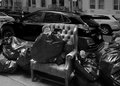
There is a long life story between my entry and the outtake.
 |
|
|
|
01/27/2022 06:52:32 PM · #8 |
| I much prefer your outtake, Mariuca. It is such a poignant commentary on the transience of material being |
|
Home -
Challenges -
Community -
League -
Photos -
Cameras -
Lenses -
Learn -
Prints! -
Help -
Terms of Use -
Privacy -
Top ^
DPChallenge, and website content and design, Copyright © 2001-2024 Challenging Technologies, LLC.
All digital photo copyrights belong to the photographers and may not be used without permission.
Current Server Time: 04/19/2024 11:53:51 PM EDT.


