| Author | Thread |
|
|
02/25/2013 11:25:41 PM · #1 |
Years and years ago DPC members helped me design a logo for a non-profit I helped found working with asthmatics. I was amazed at the quick responses and wonderful creativity. Well, I'm back at it again. This time I am starting a community garden called "Grace Community Garden". Our goal is to grow organic produce which will be used to help feed the homeless and poor of Lane County. I wondered if anybody was willing to help brainstorm ideas or provide some mockups for a simple logo. I've already been thinking and like the idea of using the initials GCG as well as some silhouettes of veggies in reds or greens or oranges or whatever. But that was only one idea and I lack the graphic design ability to bring it to any quality fruition.
Is anybody willing to devote a tiny bit of time to help me out? |
|
|
|
02/26/2013 12:04:13 AM · #2 |
| I'm happy to be in the loop. Perhaps the GCG could be spelled out in running tendrils of a bean plant or some such? |
|
|
|
02/26/2013 07:33:48 AM · #3 |
| i'm not very good at creating vector art, but the first idea that comes to mind would be a small sprout growing out the dirt. |
|
|
|
02/26/2013 07:53:00 AM · #4 |
Those letter are potentially dangerous in the wrong hands! Here's an example of some similar letters causing a major problem for the Office of Government Commerce....
Original: 
can also be seen as: 
Take care! |
|
|
|
02/26/2013 08:07:41 AM · #5 |
awesome i've never seen a snowman doing that before.
Message edited by author 2013-02-26 08:08:10. |
|
|
|
02/26/2013 08:52:51 AM · #6 |
| that's a good one for the 'intentional letters' challenge |
|
|
|
02/26/2013 09:07:19 AM · #7 |
link
Message edited by author 2013-02-26 09:08:24. |
|
|
|
02/26/2013 10:13:09 AM · #8 |
Originally posted by mike_311:
awesome i've never seen a snowman doing that before. |
lol, dirty, dirty snowman! |
|
|
|
02/26/2013 12:42:32 PM · #9 |
| That looks cool Eli. I didn't know you can just browse and buy logos. Part of me wants to look, but then part of me doesn't because what hope would I have to create my own without at least subconsciously borrowing from what you saw and liked? |
|
|
|
02/26/2013 01:09:04 PM · #10 |
There's a reason I use a camera and computer instead of a pencil ... how about something along this line (but well-drawn) ...
 |
|
|
|
02/26/2013 01:28:09 PM · #11 |
Originally posted by GeneralE:
There's a reason I use a camera and computer instead of a pencil ... how about something along this line (but well-drawn) ...
|
Ha! I love it! |
|
|
|
02/26/2013 02:01:42 PM · #12 |
:-)
Feel free to make/have made a more artistic interpretation, or PM me with an email address if you want the hi-res version to use or adapt. |
|
|
|
02/26/2013 02:34:10 PM · #13 |
| I'm going to goof around with the idea. I'll show you what I come up with. |
|
|
|
02/26/2013 03:20:08 PM · #14 |
|
|
|
02/26/2013 04:01:18 PM · #15 |
What do you think Paul? I cobbled together some free brushes and fonts.
 |
|
|
|
02/26/2013 04:03:58 PM · #16 |
| you need some mulch in that garden ;-) |
|
|
|
02/26/2013 04:49:48 PM · #17 |
|
|
|
02/26/2013 05:13:54 PM · #18 |
Originally posted by skewsme:
you need some mulch in that garden ;-) |
The bottom reminds my of that windblown grass at the beach, but I think the fruiting plants look pretty good. I say make the lower stuff more broadleaf (think collards or mustard greens), and maybe some carrot or radish tops. Consider taking some photos at the farmer's market and doing some nifty image manipulation (e.g. "Find Edges" filter) if you don't want to try drawing them freehand, or find some actual clip art.
Mine was made with fonts too -- cheap clip art if you know how to manipulate it!
ETA: I'd like to see you composite that "beach scene" with a nice Pacific sunset ... ;-)
Message edited by author 2013-02-26 17:15:13. |
|
|
|
02/26/2013 06:55:50 PM · #19 |
OK, new version. I'm the worst when it comes to picking a font though...
I did keep the grass. I just like the look, although I agree it probably doesn't really belong in a garden.
 |
|
|
|
02/26/2013 07:25:58 PM · #20 |
Just a quick attempt....

Message edited by author 2013-02-26 19:26:17.
|
|
|
|
02/26/2013 07:43:17 PM · #21 |
a little redesign

|
|
|
|
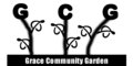
02/26/2013 08:00:54 PM · #22 |
Originally posted by KingPinVic:
a little redesign
|
Whoa. Did you do that yourself? :) That's some sweet action, although I might make the color of the C much closer to the rest. |
|
|
|
02/26/2013 10:21:13 PM · #23 |
Originally posted by DrAchoo:
OK, new version. I'm the worst when it comes to picking a font though... |
I've always heard it's important to make sure a logo will reproduce well in B&W or/and grayscale. Try converting to bitmap mode using diffusion dither and see what you get ...
The veggies look good. :-) |
|
|
|
02/27/2013 04:13:40 AM · #24 |
How about this one?

Obviously nothing more than a change on the C from  KingPinVic's logo KingPinVic's logo
Message edited by author 2013-02-27 04:13:51. |
|
|
|
02/27/2013 09:29:52 AM · #25 |
| how about a moody -stripped down, black and white Weston style pepper with GCG incorporated into it? |
|
Home -
Challenges -
Community -
League -
Photos -
Cameras -
Lenses -
Learn -
Prints! -
Help -
Terms of Use -
Privacy -
Top ^
DPChallenge, and website content and design, Copyright © 2001-2024 Challenging Technologies, LLC.
All digital photo copyrights belong to the photographers and may not be used without permission.
Current Server Time: 04/19/2024 12:19:11 PM EDT.


