| Author | Thread |
|
|
08/13/2012 02:31:26 AM · #1 |
just wanted to no why my shot did poorly, and well you might not think it did, but to me anything under 5.70, I might as well just forget about. I really liked my shot, and thought it might even garner me a new PB, but I was obv wrong.
Was it the PP, the subject, the smooth clouds, (ok must stop using denoise too much), or the blue tones, please help me, b/c I feel demoralized.......lol

I mainly want to hear from those who gave me 4's yes 13 of them bit harsh I feel !!! Oh yeah and the ones twos and threes, while you're at it~
Actually I even thought it was better than this shot of mine which recvd 6.71 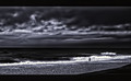 so why did that do well and not the beach shot, haa I'm baffled!! so why did that do well and not the beach shot, haa I'm baffled!!
Message edited by author 2012-08-13 03:11:25. |
|
|
|
08/13/2012 02:45:43 AM · #2 |
:/
Message edited by author 2012-08-13 06:33:36. |
|
|
|
08/13/2012 02:47:40 AM · #3 |
I gave it a three.
It was the post processing that really bothered me. I didn't like the monochrome treatment to the photo along with what looks like to be either over sharpening or ramping the definition up to max. I prefer subtle edits and once it reaches this level, any image will be hard pressed to elicit anything higher than a four out of me. |
|
|
|
08/13/2012 02:57:10 AM · #4 |
Originally posted by Venser:
I gave it a three.
It was the post processing that really bothered me. I didn't like the monochrome treatment to the photo along with what looks like to be either over sharpening or ramping the definition up to max. I prefer subtle edits and once it reaches this level, any image will be hard pressed to elicit anything higher than a four out of me. |
ok yes I probably did over sharpen it a slight, but a 3, I see over sharpened images on DP all the time win ribbons, still thanks anyway! |
|
|
|
08/13/2012 03:13:20 AM · #5 |
Too dark, halo around the building (large halo, high radius), harsh look, oversharp look on the building, clouds are crazy obliterated, subject is at best ok, color isn't great...
Here, this would be my best shot at it using your edited version, clearly I'd try not to push this as hard, and to get some more dynamic range out of the building/sky/ocean... I added in a touch of noise on the sky to make it "feel" more natural, and knocked that color of yours down to a reasonable level.. Brightness, contrast, sharpness (did a librodo then backed it off, and a selective smart sharpen on the guy/water area)
 vs vs
Overall, this just feels better to me, and although I didn't vote, I would definitely give this edit a 2 point boost, with some better editing on the original, it would probably have been 3 points... So yeah, this could have been a 6 or 7 for me. But then again, it could only have ever been a 6 or a 7, the action is too far away, the story too indistinct. My guess is that this was some place that you have personal adoration for which colors your opinion of the image... Don't worry, it happens to all of us. ;)
Message edited by author 2012-08-13 03:25:44. |
|
|
|
08/13/2012 03:15:04 AM · #6 |
Originally posted by Neat:
Actually I even thought it was better than this shot of mine which recvd 6.71 so why did that do well and not the beach shot, haa I'm baffled!! |
I haven't the foggiest... This one has really bad jpg artifacts... Probably just that it really fit the challenge well, had the right mood, and most voters don't know what a jpg artifact is... :) Plus it didn't have that awful blue/indigo/violet color. ;) |
|
|
|
08/13/2012 03:17:45 AM · #7 |
Originally posted by Cory:
Originally posted by Neat:
Actually I even thought it was better than this shot of mine which recvd 6.71 so why did that do well and not the beach shot, haa I'm baffled!! |
I haven't the foggiest... This one has really bad jpg artifacts... Probably just that it really fit the challenge well, had the right mood, and most voters don't know what a jpg artifact is... :) Plus it didn't have that awful blue/indigo/violet color. ;) |
i know about the artifacts, hoping no one would notice...lol and no one seemed to, well no comments about it! |
|
|
|
08/13/2012 03:22:05 AM · #8 |
Looking through your portfolio, it seems that either you like rather dark images, or your monitor may be adjusted to just a bit on the bright side... Mostly I just lose details in the shadows that should be there.
Might adjust your monitor to being just a bit darker and lower contrast, since I see most of your images as dark and low contrast, and this monitor is quite good with dynamic range and contrast. |
|
|
|
08/13/2012 03:22:35 AM · #9 |
| I gave this shot a 5 Anita which is probably one of the lowest scores I've given you. I really looked at this shot for some time as the composition and the lone person appealled to me. However, the processing was a bit strong for me for this type of shot for me to score it higher. I gave your other shot a 7 but would have been higher if the sky wasn't so unnatural (it is a great shot overall). You do have a great eye but I'm not sure I connect with your current processing style. Maybe I just need to evolve to appreciate it more. After all, it wasn't that long ago that I didn't fully appreciate the more artistic images and preferred the technically correct shots only. |
|
|
|
08/13/2012 03:24:33 AM · #10 |
Funny enough, I gave your other photo a three also.
At least I'm consistent. |
|
|
|
08/13/2012 03:31:28 AM · #11 |
I agree with what the others have said Anita. I didn't vote but if I had it would have been a five, it just comes across as being too over processed, as if it was shot out of focus and forced back in, the halo is also very distracting. I did like the composition and the subject being small doesn't bother me, in fact I think it adds to the scale of things.
|
|
|
|
08/13/2012 04:00:23 AM · #12 |
Originally posted by Venser:
Funny enough, I gave your other photo a three also.
At least I'm consistent. |
Anita, don't take this too hard... His favorite number is three. ;)
Venser:
Avg Vote Cast: 3.8867
And just for the record, I fully support his voting style/method/etc, I am not criticizing him in any way, just pointing out that a 3 from him really isn't that bad. :) |
|
|
|
08/13/2012 04:03:05 AM · #13 |
| I gave it a 5, mainly because it is overprocessed. IMO, stop using denoise (or at least use it for the right purpose ^_^). The composition was really good and the subject, as Jagar said, completes the scene. I didn't like the purple tone, but I wouldn't penalize an image because of that :) |
|
|
|
08/13/2012 04:24:45 AM · #14 |
[quote=Alexkc] I gave it a 5, mainly because it is overprocessed. IMO, stop using denoise ...well I only have it on trial now for 30 days, might give it the flick, I used it on my FS as well and that went down bad as well haha, must be a sign.
Message edited by author 2012-08-13 04:25:26. |
|
|
|
08/13/2012 04:49:22 AM · #15 |
Originally posted by Neat:
well I only have it on trial now for 30 days, might give it the flick, I used it on my FS as well and that went down bad as well haha, must be a sign. |
LOL :)
No, it can be very useful, but I rarely see it as an 'artstic tool'. |
|
|
|
08/13/2012 06:24:53 AM · #16 |
| personally not a fan of the blue treatment but more importantly to me (and it seems only to me) is the composition - i'd've liked to have seen the bottom 10-15% cropped out... i think that would have increased the flow of the shore and the beach and let more the imagination work instead of seeing the stone wall in the foreground. plus it would've put the dude in the corner which i think would have increased the emotive aspect of the image. |
|
|
|
08/13/2012 07:01:08 AM · #17 |
Originally posted by mrchhas:
personally not a fan of the blue treatment but more importantly to me (and it seems only to me) is the composition - i'd've liked to have seen the bottom 10-15% cropped out... i think that would have increased the flow of the shore and the beach and let more the imagination work instead of seeing the stone wall in the foreground. plus it would've put the dude in the corner which i think would have increased the emotive aspect of the image. |
but then it would of looked just like this ~ |
|
|
|
08/13/2012 07:07:34 AM · #18 |
Originally posted by Neat:
i know about the artifacts, hoping no one would notice...lol and no one seemed to, well no comments about it! |
I noticed that is why you only got a 9 from me :) The Proverb entry to me had more emotion, energy and scale which is why I loved it. The Beach entry seemed to miss on most of that and left me with thinking it was an ok shot but lacking in key areas and only gave it a 6. Not under a 5 but still 3 full points lower then your other shot. |
|
|
|
08/13/2012 08:25:45 AM · #19 |
Originally posted by mrchhas:
personally not a fan of the blue treatment but more importantly to me (and it seems only to me) is the composition - i'd've liked to have seen the bottom 10-15% cropped out... i think that would have increased the flow of the shore and the beach and let more the imagination work instead of seeing the stone wall in the foreground. plus it would've put the dude in the corner which i think would have increased the emotive aspect of the image. |
I have to agree. The lower section of the wall should be cropped. Leave in the building. At least, my 'window cropping' seems to show it works better. |
|
|
|
08/13/2012 08:31:40 AM · #20 |
ok thanks all, I've learnt my lesson~
I will try to never ever over sharpen an image again~
Message edited by author 2012-08-15 22:18:21. |
|
|
|
08/13/2012 08:50:40 AM · #21 |
| Anita, if you're still reading this thread, I would like to know what you see in this image, why you liked it well enuf to enter it, if you can describe it in words. |
|
|
|
08/13/2012 09:29:50 AM · #22 |
you have to decide what type of end result you're looking for when you enter a challenge.
are you trying to compete? all you have to do is look at the challenge archives to see what the voters are looking for. if that's the type of stuff you want to shoot and are able to shoot, then you can be competitive.
are you trying to score? you have to get real about what the score means. anything above a 5.5 means you got more 6s than 5s or less, which is not bad. anything above a 6 means you got mainly 6s, but more 7s than 5s, and that is very good. being this good takes some work, as well as some understanding of what the dpc voters are looking for (see above).
are you trying to get comments? what type of comments? if you are trying to compete or score (see above), you'll typically get nothing but "wow" and "nice" comments. if you are trying to get helpful comments, don't expect to get them in a challenge. maybe, rarely, but not often. you're better off participating in side-challenges or simply posting and asking.
are you doing it for fun? then what does it matter what score you get or how you place?
the bottom line is that only a handful of people here have ever moved dpc to adopting their work as a gold standard. if you want to enter images that you like, but have expectations of them scoring well without following the dpc formula, you are bound for frustration. so there you have it: follow the leaders, follow your heart but give up on scoring, or quit. |
|
|
|
08/13/2012 09:55:37 AM · #23 |
Originally posted by Neat:
ok yes I probably did over sharpen it a slight, but a 3, I see over sharpened images on DP all the time win ribbons, still thanks anyway! |
This is why I don't like giving you comments - you say "try me" but then you seem to get depressed and hurt.
I didn't care for this photo - and I normally love your work. I love the non-blue version, and I agree that the lower wall should have been cropped out - which would have focused my attention more on the actual beach, with the lovely building as a nice frame. Would have been a big bump on both counts.
Stick with your work, Anita - you do amazing things. Not all of them are ribbon worthy, and that's hardly a criticism! It's what makes you an artist - and an admired photographer.
Just my humble thoughts. |
|
|
|
08/13/2012 10:24:13 AM · #24 |
6 from me. You're using a pallette that people don't associate with the beach. DPC voters do not like to have their assumptions questioned. It's also dark. DPC voters don't like the dark. Your composition is complex. DPC voters do not like complexity.
I hope you finally get it now, and all the rest of your photos win ribbons. ;) |
|
|
|
08/13/2012 10:25:50 AM · #25 |
Originally posted by Cory:
Originally posted by Venser:
Funny enough, I gave your other photo a three also.
At least I'm consistent. |
Anita, don't take this too hard... His favorite number is three. ;) |
I wasn't trying to be demoralizing, but was simply pointing out that type of processing will probably elicit the exact same score in most challenges. There would really need to be something special in terms of composition or uniqueness to jump past this barrier. |
|


