| Author | Thread |
|
|
04/17/2012 08:58:18 AM · #1 |
Going into this challenge, I thought for sure that this image would be a 6+, especially for a 'minimal' challenge.
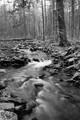
I personally find it to be my best entry yet, and it kills me that it's technically my #2 score, and not a 6.
I really enjoyed shooting this scene and would like to do it some more of this type of shot, but for me spotting potential improvements has proved to be difficult. And with only one comment (a positive one), I'm having trouble critiquing it myself.
So, any input is really appreciated! I know it's got a fairly respectable score, but I want to improve beyond my current limits.
Message edited by author 2012-04-17 08:59:29. |
|
|
|
04/17/2012 09:02:31 AM · #2 |
| I find the black and white conversion seems not very "punchy" like it needs more contrast maybe. I think also the area surrounding the water is just not very intersting. Might have score a little higher in color. To be honest I am a little surprised it score a 5.9. |
|
|
|
04/17/2012 09:05:19 AM · #3 |
I think the shot's great. IMHO you could improve it by getting a bit closer to the ground to really get a good perspective on the stream, also because the forest without leaves is super busy and takes away from the beautiful and simple stream itself. That would also let you have the apex of the stream in the upper third quandrant. As for why it didn't get a six I would bet it's because you used desat as the theme and it's a bit too easy/boring - even though your explanation makes sense and I like it.
That's my 2 cents.
Chris |
|
|
|
04/17/2012 09:10:51 AM · #4 |
Originally posted by smardaz:
I find the black and white conversion seems not very "punchy" like it needs more contrast maybe. I think also the area surrounding the water is just not very intersting. Might have score a little higher in color. To be honest I am a little surprised it score a 5.9. |
+1
There are too similar elements for a B/W in the image and there's too much brightness in the sky. I know it's hard with minimal editing. In any case I had another B/W landscape in that challenge and scored 5.99. Perhaps landscapes in B/W didn't work this time :D |
|
|
|
04/17/2012 10:24:01 AM · #5 |
For me it doesn't work in B/W.
Its a fair shot and I gave it 6.
Which is ok as that is around where it ended .
Don,t think thats anything to be downhearted about. |
|
|
|
04/17/2012 10:26:34 AM · #6 |
I didn't cast a vote on that image. I think the average score you rec'd is generous.
The leading line of the stream leads the viewer into the forest clutter.... not a good thing to happen to the viewer. I think the image needs an additional element of interest. I don't doubt your exif data, but this doesn't have as much silk water effect as I'd expect with a 2 second exposure. An f/22 aperture is a tiny pinhole...so tiny, in fact, that light waves can be diffracted as they pass through the opening to the sensor. Stopping down all the way is rational, but ill-advised. You did achieve a deep DOF, but at the expense of some image clarity and richness. The auto-sharpening brought back sharpness, but it's of a lesser quality. I think there are some details lost in the brightest highlights and the blackest shadows. There is some minor, reflective glare coming off the wet rocks. It might have been effective to use a polarizing filter in this situation. You would have been about 1.5 stops slower in shutter speed, but then, you wouldn't have had to stop down so tiny. I've found the best silk water effect to come from shutter speeds between 0.5s to 1.5s.
That said, not too bad an effort in minimal editing. Effective B&W conversions of scenes like this usually need additional moderate to sophisticated editing steps. And, those weren't available to you in the ruleset. |
|
|
|
04/17/2012 10:32:11 AM · #7 |
The shot is ok, I like the monochrome look, some nice textures. The broken tree, branches hanging down and the log across the back make it a bit busy and lack focus.
Plus, if you do a gimmicky type shot, on this site,like float water or water drops, or even liquids in glass making a checkerboard reflection, you have to do it really well to get a high score .
Personally I like some of your other shots better, the bus shot, for instance, is really good. |
|
|
|
04/17/2012 12:00:33 PM · #8 |
Originally posted by hahn23:
I didn't cast a vote on that image. I think the average score you rec'd is generous.
The leading line of the stream leads the viewer into the forest clutter.... not a good thing to happen to the viewer. I think the image needs an additional element of interest. I don't doubt your exif data, but this doesn't have as much silk water effect as I'd expect with a 2 second exposure. An f/22 aperture is a tiny pinhole...so tiny, in fact, that light waves can be diffracted as they pass through the opening to the sensor. Stopping down all the way is rational, but ill-advised. You did achieve a deep DOF, but at the expense of some image clarity and richness. The auto-sharpening brought back sharpness, but it's of a lesser quality. I think there are some details lost in the brightest highlights and the blackest shadows. There is some minor, reflective glare coming off the wet rocks. It might have been effective to use a polarizing filter in this situation. You would have been about 1.5 stops slower in shutter speed, but then, you wouldn't have had to stop down so tiny. I've found the best silk water effect to come from shutter speeds between 0.5s to 1.5s.
That said, not too bad an effort in minimal editing. Effective B&W conversions of scenes like this usually need additional moderate to sophisticated editing steps. And, those weren't available to you in the ruleset. |
So what is a good aperture for water shots Hahn? |
|
|
|
04/17/2012 12:29:16 PM · #9 |
I think this image suffers from the lack-of-context syndrome. This is when the photographer is privy to more information than exists in the image (including sensory and emotional information), and mistakenly believes the image conveys that information.
This is a decent image, but not a particularly excellent one, for me. It is oversharpened in many places, and the largest, most prominent portion is blurry water. The lighting overall is flat, with everything lit in the same, even light.
That being said, minimal editing is brutal. |
|
|
|
04/17/2012 12:38:38 PM · #10 |
Originally posted by chazoe:
So what is a good aperture for water shots Hahn? |
I think he means in general rather that just for water shots. Diffraction can start after f/16 or so which will degrade the image. I think he's saying if you can use a polarizer to keep the same shutter speed but open the aperture two stops (instead of using f/22) the image may be overall of better quality. It's not, however, going to take a shot from ok to awesome. |
|
|
|
04/17/2012 12:41:06 PM · #11 |
I think you answered your own question in your description of the photo:
"Maybe a bit of a shoehorn, oh well. Figured I'd play on the fact that a stream is literally saturated with water."
It is a good image, but as a shoehorn (and many of the voters probably felt this way) do you feel it deserved a six (as far as the challenge itself goes)?
Now on the merits of photo itself.
It is a good scene. I think cropping the bottom might have helped a bit.
While I tend to like darker/flat photos myself, I don't think this is the consensus of the voters. Brighten it up if you want a higher score.
And lastly, it is the type of image that is easily overlooked in quick voting. This type of image takes a moment to take in, which is not something for the audience here.
Cheers.
Jayson |
|
|
|
04/17/2012 12:44:30 PM · #12 |
Originally posted by DrAchoo:
Originally posted by chazoe:
So what is a good aperture for water shots Hahn? |
I think he means in general rather that just for water shots. Diffraction can start after f/16 or so which will degrade the image. I think he's saying if you can use a polarizer to keep the same shutter speed but open the aperture two stops (instead of using f/22) the image may be overall of better quality. It's not, however, going to take a shot from ok to awesome. |
Thanks. |
|
|
|
04/17/2012 12:51:40 PM · #13 |
Thanks for all the input guys. Keep it coming if you've got any opinions.
The first shot was straight from the camera in B&W. I figured it best to do that in camera since I couldn't mess with color levels in post. I was focused on a quote I had seen from Ansel Adams which goes something like ~"the key to a good B&W is getting the full range of textures and shades of grey in the photo in even quantities"... Maybe I got a bit too much midtones, and not enough black and white, which made it feel a bit flat to some users. If I recall, I did have the contrast setting turned up pretty high in camera.
Chris,
I kind of understand what you mean about "a forest without leaves", but I actually liked the detail that was brought out... showing how deep the forest goes with the wall of trees.
Hahn,
If I recall, I used a one stop ND filter also. I'll have to play with using the polarizer next time. I didn't consider it because I wasn't dealing with much sky nor direct reflections, but I'll keep it in mind next time.
Interesting that you say stopping down to f/22 can work against sharpness. This is something I was not aware of, but you mean to say that the diffraction can cause some amount of blurriness in the highlights?
Blindjustice,
I see what you mean. Originally I really liked the broken tree across the bg because it seemed to be a leading line that brought your eye back into the image after tracing the stream.
Tanguera,
The lack of context seems to be the theme. I think especially with a challenge where you must title the image to convey the relevance to the challenge, it makes it difficult to pass on some of the emotion that comes in the image. Titles seem to be a very important part of the voting process, more than I care to admit probably.
Now, from the same outing, I had the below color shot too - I didn't spend much time on post editing it, but I was pretty happy here too. But I thought trying to call it "saturated" wasn't going to be clear enough for the voters. It's a bit different because the sun popped over the ridge, it's a different section of stream, and it's quite saturated with color.
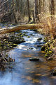
While I like the color shot, it doesn't do as well in B&W because there seem to be some blown out areas. But as a color shot, I think the blues, greens, and yellows accurately portray what I was seeing. I think I made a good call going with the B&W, but I'm curious to other people's opinions. |
|
|
|
04/17/2012 12:54:24 PM · #14 |
| As far as I know, all scores are comparative to the other entries and their scores. At least that's how I score. All scoring does is order the entries from best to worst or worst to best. If a 6 is the lowest score than that picture is at the bottom of the pile and if a 6 is the best then it's at the top. |
|
|
|
04/17/2012 01:03:55 PM · #15 |
| You described the shot as a bit of a shoehorn. I would agree. That may have hurt the score a bit. 5.9 is a good score. I enjoy several 5.9s that are framed and are hanging on my wall. |
|
|
|
04/17/2012 01:44:44 PM · #16 |
Originally posted by JamesDowning:
Interesting that (Hahn says) stopping down to f/22 can work against sharpness. This is something I was not aware of, but you mean to say that the diffraction can cause some amount of blurriness in the highlights? |
Not just the highlights, everywhere there's detail it is compromised by too small an aperture. Very small apertures cause considerable diffraction of the light as it squeezes through. And it's not a matter of f/stop as much as it is the physical size of the aperture.
F/stop = focal length divided by size of aperture. So a 2.5mm aperture on a 25mm lens would be f/10. But f/10 on a 100mm lens would be a 10mm aperture. Moral of the story; the wider-angle the lens, the more limited is your usable f/stop range if you want critical sharpness.
But since DOF is also a function of the physical size of the aperture, NOT the focal length of the lens, there's not much trade-off. F/8 on a 25mm lens gives you the same DOF, roughly, as f/16 on a 50`mm lens or f/32 on a 100mm lens, and they all have similar diffraction profiles as well, since in each case the physical size of the aperture would be the same.
In wide-angle landscapes, with proper focusing techniques, it's rarely necessary to get smaller than f/8 and virtually never past f/11...
R.
|
|
|
|
04/17/2012 03:10:53 PM · #17 |
I'm glad you asked the question. I learned a lot and learn a bunch through these forums.
One more thing I noticed about the shot is, to gave maximum impact, compositionally, you want.to have the lightest and darkest area of the shot meet together in the golden mean. I know its tough to do in minimal or basic. Check where yours is in this shot, near dead center, stealing the gaze away from foreground watery goodness. |
|
|
|
04/17/2012 03:11:38 PM · #18 |
Many of the points of my reaction have been touched on (slight shoehorn, not a perfect B&W conversion) but one thing that bothered me that hasn't been mentioned is the framing. The upper 1/3 of the image is pretty dull. That milky white sky creeping around the foliage of the trees demands attention and then adds nothing to the image. If I block out the top and start the frame where it is all trunks and no sky, then the interest is all the stream and the trees become unobtrusive background with lots of textural interest, but no demand for attention.
Had you framed down a bit, it would have gone up a point for me, and put it in the score you wanted. |
|
|
|
04/17/2012 03:44:42 PM · #19 |
Originally posted by blindjustice:
One more thing I noticed about the shot is, to gave maximum impact, compositionally, you want.to have the lightest and darkest area of the shot meet together in the golden mean. I know its tough to do in minimal or basic. Check where yours is in this shot, near dead center, stealing the gaze away from foreground watery goodness. |
Which area are you talking about, the bright white area of the stream?
Originally posted by MemberBrennanOB:
Many of the points of my reaction have been touched on (slight shoehorn, not a perfect B&W conversion) but one thing that bothered me that hasn't been mentioned is the framing. The upper 1/3 of the image is pretty dull. That milky white sky creeping around the foliage of the trees demands attention and then adds nothing to the image. If I block out the top and start the frame where it is all trunks and no sky, then the interest is all the stream and the trees become unobtrusive background with lots of textural interest, but no demand for attention. |
Interesting observation. I was concentrating on putting the horizon/horizontal tree line at 1/3, as I felt it was a natural delineation point. If I were to crop, I might take off 50 pixels or so, and it does balance it a bit more. But I don't think I'd want to get rid of the sky entirely, as I think it does balance things a bit.
Keep em coming if you have em. Trying to soak it all up. |
|
|
|
04/17/2012 03:47:55 PM · #20 |
Originally posted by BrennanOB:
Many of the points of my reaction have been touched on (slight shoehorn, not a perfect B&W conversion) but one thing that bothered me that hasn't been mentioned is the framing. The upper 1/3 of the image is pretty dull. That milky white sky creeping around the foliage of the trees demands attention and then adds nothing to the image. If I block out the top and start the frame where it is all trunks and no sky, then the interest is all the stream and the trees become unobtrusive background with lots of textural interest, but no demand for attention.
Had you framed down a bit, it would have gone up a point for me, and put it in the score you wanted. |
+1 |
|
|
|
04/17/2012 03:56:24 PM · #21 |
Originally posted by tanguera:
I think this image suffers from the lack-of-context syndrome.
That being said, minimal editing is brutal. |
Apparently the voters don't care about context, given that this didn't even get a five while the challenge winner is (IMO) a strong DNMC candidate ... |
|
|
|
04/17/2012 04:13:23 PM · #22 |
Originally posted by JamesDowning:
If I were to crop, I might take off 50 pixels or so, and it does balance it a bit more. But I don't think I'd want to get rid of the sky entirely, as I think it does balance things a bit. |
What are you balancing? The image is balanced as presented. Balanced between an awful sky, the sort we all dread with blowouts and a luminosity that overpowers everything it touches, and a fairly pretty, but subtle stream. What is the balance point between a scream and a whisper? With the sky and the creek, the eye balances between the two, and ends up looking in the trunks as the balance point, but those tones are pretty flat and nothing too interesting is going on there. IMHO the balance should be down between the rocks and the water, it seems a lot more interesting to me. |
|
|
|
04/17/2012 04:46:52 PM · #23 |
Originally posted by GeneralE:
Originally posted by tanguera:
I think this image suffers from the lack-of-context syndrome.
That being said, minimal editing is brutal. |
Apparently the voters don't care about context, given that this didn't even get a five while the challenge winner is (IMO) a strong DNMC candidate ... |
I don't think the winner was DNMC, but I do like "Unsharp Mask" |
|
|
|
04/17/2012 05:14:13 PM · #24 |
James,
While I didn't vote in this competition, I don't think I would give this image over a 6 because there isn't anything unusually good about it. It's a decent shot of a small creek, captured with a long exposure and then converted to black and white. It doesn't say anything particularly meaningful, nor does it have any special beauty to it. It's not bad. It's not really special either, in my opinion. I hope that doesn't bother you too much.
|
|
|
|
04/17/2012 05:26:04 PM · #25 |
| I usually take note of what my eyes do when I first look at a picture - they were flitting around, there was nothing to fix on, it didn't engage me. That doesn't make it a bad picture, just didn't work for me :) |
|


