| Author | Thread |
|
|
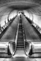
01/15/2009 10:24:14 PM · #76 |
I have 29 accepted photos. 15 color, 14 black and white or toned images. I don't think you need dark and moody monotone to make it.
I have 13 rejections
Here are the ones I have on DPC.
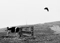    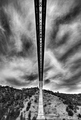
[thumb]674088[/thumb]   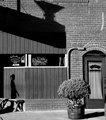 
My percentage was in the high 80's for awhile but I would get bored and just throw something at it and see if it stuck. I find it amusing my highest rated DPC photo was one of my fastest rejections. :P
|
|
|
|
01/15/2009 10:25:54 PM · #77 |
| hey i know this is a stupid question, but how does one get their photos rejected? |
|
|
|
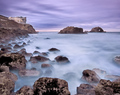
01/15/2009 10:28:21 PM · #78 |
These are two of my rejects. The b&w was rejected out of hand, but they took awhile longer with the colored shot. I submitted several others, none of which were accepted. I honestly can't remember which ones they were.
I do remember that I had a horrible time uploading pictures -- the file names had to be just so or they wouldn't load.
Now that I see what good company I'm in, maybe I'll try again. Once a week.... |
|
|
|
01/15/2009 11:17:45 PM · #79 |
| I have more than plenty of rejections over there too. I bet I have you all beat with my number. I will start uploading some....might get a bit overwhelming though. LOL |
|
|
|
01/15/2009 11:40:33 PM · #80 |
Originally posted by njsabs2323:
I have more than plenty of rejections over there too. I bet I have you all beat with my number. I will start uploading some....might get a bit overwhelming though. LOL |
Nope, there's no foolin' us Jennifer. We know you are in league with the devil... |
|
|
|
01/15/2009 11:43:32 PM · #81 |
LOL - I signed up a long time ago but didn't get involved with the site.
They rejected me at login this time. Even when I reset my password, and all that.
I feel - sob - so rejected.
:-((
|
|
|
|
01/15/2009 11:57:27 PM · #82 |
My opinion, based in part on monitoring numbers for b/w vs. numbers for colour images uploaded to 1X: 1X gets about the same number of B&Ws vs. colour images.
What you guys are missing is that the background of 1X is black, images are displayed on a black background, and the inline is very, very subtle, hardly noticeable. Any image, or any group of images, displayed on black is going to look much darker overall than the same image or group of images displayed on white, or a light colour like the grey with black inline here at DPC. Also, thumbnails are displayed closer together at 1X than here at DPC, which again increases the feeling of dark. The number of images coming in to 1X in B&W vs. in colour is very similar, as is, over time, the number of published images in B&W vs. in colour.
As for images being dark, I haven't monitored that aspect, and I think there is some truth to that impression, but the bias isn't nearly as strong as it is being said here. More than anything else, it is again a result of the dark background. Look, frequently images are adjusted to take the background or the mat on which they will be displayed into account, both for online display and for printed display. Darker backgrounds tend to call for darker images, whereas lighter images work better on lighter backgrounds.
But overall, to say that there is a very heavy bias towards B&W or dark images at 1X would be similar to saying that there's a very heavy bias towards simple and medium light images at DPC, because of the size allowances and the grey background at DPC. There is some truth in that, but it isn't nearly as heavy as it is being presented in this thread.
Try it. Take some of your own images, both colour and B&W, and put them on a white background, a grey background, and a black background. The images are going to look different on the different backgrounds. Imagine how you would adjust the image so that it would work well with the background of choice. See what you come up with.
Last, B&W as a medium has been used for a longer time than colour. In art photography, B&W has dominated historically, or at least had a much stronger role than colour. One other area where B&W has been and still is strong is portraiture, but B&W is less prevalent in other kinds of photography (stock, travel, everyday memories). Also, DPC is purely digital (digital = much more colour work), whereas 1X includes traditional darkroom work (where a lot of it was in B&W, in part because of the market that the photographers were working in, and because most were using their own developing/printing, and B&W simply was/is a lot more common than colour for self labs). Because of the kind of site that 1X is, you will get a larger proportion of B&W vs. colour than you will get at DPC, or at Flickr, or at BetterPhoto, or other places. But, to say that you should turn any image into B&W to "have it published" at 1X is just so much bologna. Pictures don't work that way. Photographers certainly shouldn't work that way. Most images that are made with colour in mind and then turned into B&Ws tend to not look very good in B&W, they look instead like poor conversions, like colour images presented out of their medium.
Just my many opinions :)
|
|
|
|
01/16/2009 12:16:01 AM · #83 |
I have never seen the "Latest Additions" window on the front page contain more color pictures than B&W and monotone. Currently there are 8 B&W, 1 Selective Desat, and 1 color shot which is mainly muted blues. I'm not sure I've even seen it at a 50/50 split. Screener's Choice is usually even more tilted. Currently there are 3 B&W, 1 selective desat (muted) and 1 muted color.
I think you should watch a bit closer. Your own portfolio probably represents 50% of the color on the site. ;) |
|
|
|
01/16/2009 12:33:01 AM · #84 |
Originally posted by ursula:
My opinion, based in part on monitoring numbers for b/w vs. numbers for colour images uploaded to 1X: 1X gets about the same number of B&Ws vs. colour images.
What you guys are missing is that the background of 1X is black, images are displayed on a black background, and the inline is very, very subtle, hardly noticeable. Any image, or any group of images, displayed on black is going to look much darker overall than the same image or group of images displayed on white, or a light colour like the grey with black inline here at DPC. Also, thumbnails are displayed closer together at 1X than here at DPC, which again increases the feeling of dark. The number of images coming in to 1X in B&W vs. in colour is very similar, as is, over time, the number of published images in B&W vs. in colour.
As for images being dark, I haven't monitored that aspect, and I think there is some truth to that impression, but the bias isn't nearly as strong as it is being said here. More than anything else, it is again a result of the dark background. Look, frequently images are adjusted to take the background or the mat on which they will be displayed into account, both for online display and for printed display. Darker backgrounds tend to call for darker images, whereas lighter images work better on lighter backgrounds.
But overall, to say that there is a very heavy bias towards B&W or dark images at 1X would be similar to saying that there's a very heavy bias towards simple and medium light images at DPC, because of the size allowances and the grey background at DPC. There is some truth in that, but it isn't nearly as heavy as it is being presented in this thread.
Try it. Take some of your own images, both colour and B&W, and put them on a white background, a grey background, and a black background. The images are going to look different on the different backgrounds. Imagine how you would adjust the image so that it would work well with the background of choice. See what you come up with.
Last, B&W as a medium has been used for a longer time than colour. In art photography, B&W has dominated historically, or at least had a much stronger role than colour. One other area where B&W has been and still is strong is portraiture, but B&W is less prevalent in other kinds of photography (stock, travel, everyday memories). Also, DPC is purely digital (digital = much more colour work), whereas 1X includes traditional darkroom work (where a lot of it was in B&W, in part because of the market that the photographers were working in, and because most were using their own developing/printing, and B&W simply was/is a lot more common than colour for self labs). Because of the kind of site that 1X is, you will get a larger proportion of B&W vs. colour than you will get at DPC, or at Flickr, or at BetterPhoto, or other places. But, to say that you should turn any image into B&W to "have it published" at 1X is just so much bologna. Pictures don't work that way. Photographers certainly shouldn't work that way. Most images that are made with colour in mind and then turned into B&Ws tend to not look very good in B&W, they look instead like poor conversions, like colour images presented out of their medium.
Just my many opinions :) |
I think a lot of the talk about dark pertains to the mood of the pictures, not the visual tone. Dark in the sense of foreboding, dreary, or somewhat depressing. The background color has little to do with that.
The quality of the published images shows an incredible amount of talent is drawn to 1x. I think the emotional tone of the images published is more a reflection of the screeners than the photographers. Not saying it's a bad thing, just an impression that shared by more than a few that have been to the site. You can't chalk it all up to sour grapes or frustration over getting rejected.
Of the 20 images on the main page at 11:25 PM CST, I would say only one conveys a positive emotion, and that one could go either way.
Now I like dark and moody as much as the next guy, but geez, there is a lot of it at 1x.
I do like the site a lot and plan to submit some more images.
|
|
|
|
01/16/2009 12:42:25 AM · #85 |
For those that are new to the site, be aware that having more accepted than rejected (Joe, Claire, Ursula, etc) is rare. The vast majority have way more rejects than accepts. Also be aware that the number of attempts per week you're allowed is based on your acceptance rate. There's also the option to pay to play, meaning you can get more upload slots per week if you buy a membership.
Posting a rejected shot for critique can be very useful, though as someone else pointed out you may get conflicting input/advice. That's not a bad thing - just means your photograph affects different people differently, which I consider a good thing. It's a different kind of learning experience. |
|
|
|
01/16/2009 12:47:25 AM · #86 |
My one and only submission was rejected for being too "ordinary", IIRC. They are not horse people, this was not an ordinary shot in my world. It did keep me from submitting any more, at least for a while until I can understand their biases better. Same thing happened when I started here though.
 |
|
|
|
01/16/2009 12:51:54 AM · #87 |
Originally posted by ursula:
Originally posted by Melethia:
Ursula is gonna kill me. :-) |
Nah, Deb, I love you, and I'm just going to reject all your pictures, to make you real happy :)
|
Heh! Thanks, but I don't think I need the help. :-)
What I could use help on, though, is getting the marvelous, almost metallic tones that some of the street shooters get there. And I suspect they do a lot of "cleaning" in their street scenes sometimes - trash, street signs, clutter - they all seem to shoot in such pristine locations.... |
|
|
|
01/16/2009 01:10:20 AM · #88 |
Originally posted by Melethia:
Originally posted by ursula:
Originally posted by Melethia:
Ursula is gonna kill me. :-) |
Nah, Deb, I love you, and I'm just going to reject all your pictures, to make you real happy :)
|
Heh! Thanks, but I don't think I need the help. :-)
What I could use help on, though, is getting the marvelous, almost metallic tones that some of the street shooters get there. And I suspect they do a lot of "cleaning" in their street scenes sometimes - trash, street signs, clutter - they all seem to shoot in such pristine locations.... |
Oh, yeah, like Rui? I've also wondered how he gets those. I've never asked. He might help you if you write to him.
|
|
|
|
01/16/2009 01:11:58 AM · #89 |
Originally posted by DrAchoo:
I have never seen the "Latest Additions" window on the front page contain more color pictures than B&W and monotone. Currently there are 8 B&W, 1 Selective Desat, and 1 color shot which is mainly muted blues. I'm not sure I've even seen it at a 50/50 split. Screener's Choice is usually even more tilted. Currently there are 3 B&W, 1 selective desat (muted) and 1 muted color.
I think you should watch a bit closer. Your own portfolio probably represents 50% of the color on the site. ;) |
Obviously you haven't been monitoring it much :) |
|
|
|
01/16/2009 01:15:43 AM · #90 |
Originally posted by ursula:
Oh, yeah, like Rui? I've also wondered how he gets those. I've never asked. He might help you if you write to him. |
Yeah, Rui's one of the guys I watch there. Marvelous eye, that one. |
|
|
|
01/16/2009 01:20:13 AM · #91 |
Originally posted by ursula:
Originally posted by DrAchoo:
I have never seen the "Latest Additions" window on the front page contain more color pictures than B&W and monotone. Currently there are 8 B&W, 1 Selective Desat, and 1 color shot which is mainly muted blues. I'm not sure I've even seen it at a 50/50 split. Screener's Choice is usually even more tilted. Currently there are 3 B&W, 1 selective desat (muted) and 1 muted color.
I think you should watch a bit closer. Your own portfolio probably represents 50% of the color on the site. ;) |
Obviously you haven't been monitoring it much :) |
Could be... ;) I'll tell you what. The moment you have 5 pictures on "Latest additions" that obviously contain a majority of different colors you come running here and prove me wrong. The clock is starting....NOW! |
|
|
|
01/16/2009 01:31:53 AM · #92 |
Ok...I got my last 2 rejections:

Reasons:
Your picture is edited too extensively or looks too unnatural. Editing must always reinforce the message of the photo and have a purpose. If the viewer only thinks about the editing instead of enjoying the motif, the photo is over-edited. If you edit your picture extensively, you must state what kind of editing you have performed. Documentary photos should be unedited.
The picture has a weak message and therefore seems a bit pointless or it's confusing and therefore hard to understand what it means. What do you want to say with the photo?
It's a good photo, but it doesn't stand out that much. A photo might be technically perfect, but it also has to affect the viewer.
...the thing is...this was not edited that much...Just a simple B&W conversion. It was taken in the late evening...? I'm at a loss. And apparently car images don't go over well there hence this comment...The picture has a weak message and therefore seems a bit pointless...oi...and ugh...then some more oi on top of that. I know a lot of people hate car shots...but...? I also didn't know what category to put this in so it ended up in Documentary...bad idea.

Reasons:
The composition in your picture is unbalanced which might be related to a bad crop or something is cut off. It could also mean that the composition is too cluttered, in which case you should try to isolate some objets, or that the photo is not leveled correctly.
It is not a bad photo, but it's not a material for Onexposure. Take a careful look at the accepted photos to see what kind of photos are expected. Some examples of motifs rarely published are sunsets, flowers, seagulls, sculptures, pets, smiling kids, zoo-pictures, wedding photos, product shots and overly commercial motifs. Photos with text added in post-processing are rarely accepted. Improper, offensive and repulsive photos also fall into this category.
It's a good photo, but it doesn't stand out that much. A photo might be technically perfect, but it also has to affect the viewer.
That's enough for me...so I canceled my account. I have quickly learned it isn't a place for me. I can only handle so much rejection you know, and honestly, "seems a bit pointless" peeved me a bit. I know it's a canned response, I think, but I just don't care for anyone saying and image is pointless. |
|
|
|
01/16/2009 01:35:26 AM · #93 |
Originally posted by DrAchoo:
Originally posted by ursula:
Originally posted by DrAchoo:
I have never seen the "Latest Additions" window on the front page contain more color pictures than B&W and monotone. Currently there are 8 B&W, 1 Selective Desat, and 1 color shot which is mainly muted blues. I'm not sure I've even seen it at a 50/50 split. Screener's Choice is usually even more tilted. Currently there are 3 B&W, 1 selective desat (muted) and 1 muted color.
I think you should watch a bit closer. Your own portfolio probably represents 50% of the color on the site. ;) |
Obviously you haven't been monitoring it much :) |
Could be... ;) I'll tell you what. The moment you have 5 pictures on "Latest additions" that obviously contain a majority of different colors you come running here and prove me wrong. The clock is starting....NOW! |
You know, I've never heard of moderators/head screeners/owners/admins/etc/whatever defend a site they're a part of before! UNPOSSIBLE! (that's my new favorite unword). (that's my second favorite unword.) |
|
|
|
01/16/2009 03:47:55 AM · #94 |
#2
 |
|
|
|
01/16/2009 04:12:39 AM · #95 |
Originally posted by scarbrd:
I think a lot of the talk about dark pertains to the mood of the pictures, not the visual tone. Dark in the sense of foreboding, dreary, or somewhat depressing. The background color has little to do with that. |
Oh I disagree. The way that site is designed has a lot to do with attracting the content you describe. Take away all of the photos and you'd still be left with a dark and moody web site. Hell, even the choice of fonts, which are very thin, suggests a vulnerability. I almost expect them to shiver from the cold breeze that blows through the site.
Message edited by author 2009-01-16 04:13:22. |
|
|
|
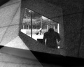
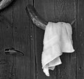
01/16/2009 07:06:14 AM · #96 |
Reject #1:
 |
|
|
|
01/16/2009 07:10:42 AM · #97 |
Originally posted by JDubsgirl:
hey i know this is a stupid question, but how does one get their photos rejected? |
Sounds like merely submitting them does the trick. |
|
|
|
01/16/2009 07:36:36 AM · #98 |
| I was going to submit one for rejection but I'm having a hard time with understanding the sizing and I can't find the answers on the site. |
|
|
|
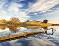
01/16/2009 07:48:19 AM · #99 |
 AND my only DPC ribbon AND my only DPC ribbon 
both rejected!
Suprisingly this  made it past the 1st screening phase. I don't know how many phases there are?? made it past the 1st screening phase. I don't know how many phases there are??
I do have to say the quality of the images are very high.
I was like a kid in a candy store when i saw all the amazing thumbs!
The downside, you need an even thicker skin than for this site!!
|
|
|
|
01/16/2009 07:56:54 AM · #100 |
Rejection #3
I will give it another try in a week. |
|


