| Author | Thread |
|
|
12/14/2008 03:55:33 PM · #76 |
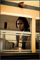
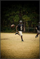
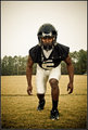
Thanks everyone for liking my picture.
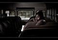
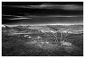
Here are some outtakes from that same photoshoot.
|
|
|
|
12/14/2008 03:58:16 PM · #77 |
Originally posted by Dirt_Diver:
Thanks everyone for liking my picture... |
IMO, you had the right one in the challenge :) |
|
|
|
12/14/2008 04:01:27 PM · #78 |
Originally posted by FocusPoint:
Originally posted by Dirt_Diver:
Thanks everyone for liking my picture... |
IMO, you had the right one in the challenge :) |
Thanks because I was really torn between the one I entered and this one,
|
|
|
|
12/14/2008 04:02:56 PM · #79 |
The average of subjective scores is NOT objective.
The worth of a picture depends on its artistry. Artistry is the relationship of form to content. It includes skill and inspiration. It allows for hard work and accidents.
Technicals, beauty and concept are just three arbitrarily chosen tools that an artist may or may not use. They should not form the basis of a score. |
|
|
|
12/14/2008 04:17:53 PM · #80 |
Originally posted by posthumous:
The average of subjective scores is NOT objective.
The worth of a picture depends on its artistry. Artistry is the relationship of form to content. It includes skill and inspiration. It allows for hard work and accidents.
Technicals, beauty and concept are just three arbitrarily chosen tools that an artist may or may not use. They should not form the basis of a score. |
Amen.
|
|
|
|
12/14/2008 05:32:20 PM · #81 |
Originally posted by posthumous:
The average of subjective scores is NOT objective.
The worth of a picture depends on its artistry. Artistry is the relationship of form to content. It includes skill and inspiration. It allows for hard work and accidents.
Technicals, beauty and concept are just three arbitrarily chosen tools that an artist may or may not use. They should not form the basis of a score. |
This is interesting!
I think Shannon meant that to score well on DPC, the T/B/C formula seems to work. I believe that you also are quite correct that "artistry....allows for accidents" but largely because it makes me feel better about my own shots. :)
In all seriousness, was there a shot in the Master's Free Study that would pictorially depict artistry as a relationship of form to content that we haven't already discussed? I *think* I know what you mean (Zigomar's shot using skill and inspiration on-the-spot?) but I'd like to explore your point of view a little more. |
|
|
|
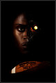
12/14/2008 05:42:06 PM · #82 |
Originally posted by Dirt_Diver:
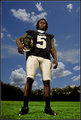
Thanks everyone for liking my picture.
|
Wow- he was quite some model! Was he a paid model or was this a senior photoshoot (or something similar) ?
Message edited by author 2008-12-14 17:42:42.
|
|
|
|
12/14/2008 05:46:21 PM · #83 |
Originally posted by Lonni:
Originally posted by Dirt_Diver:
Thanks everyone for liking my picture.
|
Wow- he was quite some model! Was he a paid model or was this a senior photoshoot (or something similar) ? |
It was a photoshoot for a magazine. No one was paid however I do get a full page ad in the mag  , some online exposure, A press pass to get into games free High school and college and some other minor things. He is going to be on the cover along with a complete story inside. , some online exposure, A press pass to get into games free High school and college and some other minor things. He is going to be on the cover along with a complete story inside.
|
|
|
|
12/14/2008 05:51:46 PM · #84 |
|
|
|
12/14/2008 05:54:59 PM · #85 |
Originally posted by Ecce Signum:
Role on 2009, my 'artistic' entries and the demise of my current average lol. |
I hear ya. Look for the Music of Lensbaby from me in 2009... Average be damned...
R.
Message edited by author 2008-12-15 05:15:57.
|
|
|
|
12/14/2008 06:28:40 PM · #86 |
Originally posted by Artifacts:
Originally posted by Bear_Music:
Originally posted by Artifacts:
Btw, Jason, in my personal opinion your image captures the look and feel of this Ansel Adams photograph:
Moonrise, Hernandez, New Mexico, 1941
However, Bear_Music is far more qualified to comment on that than I. |
I already did, actually, in the comments section, with a thumb of the Adams "moonrise" as well:
Originally posted by comments:
Wonderful piece of work. For those who aren't aware of it, Doc is paying homage to one of Ansel Adams's most famous images, "Moonrise, Hernandez, New Mexico".
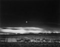
Ain't that remarkable? Check out the SKY. A better reproduction of the Adams would more closely resemble Doc's tones. |
|
|
This is the first time I saw the Ansel painting. And there's no doubt Jason that you did an excellent job in your homage!
I instantly thought of a picture I took 4 years ago that happened to have the moon in the same area as in your and Anse1s image. It was color though and I attempted b/w conversion just now tonight but not very good at it so also the reason I'm interested in the tutorial! :)
Here's mine after conversion:
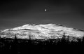 And the original: And the original: 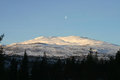
The light clouds in the b/w image were also in the original but showed up first when I brought up the contrast. |
|
|
|
12/14/2008 06:35:21 PM · #87 |
This one provides a strange feeling of distorted reality by a mixture of light, color cast and tilt effect. The man with a serious face while wearing this funny hat provides a further feeling of absurdity within a strange foreign world. It reminds me of movies directed by Caro and Jeunet, or by Terry Gilliam.

To me, this one is THE masterpiece of this challenge. It is raw, disturbing, and hard to look at. It is a striking immediate travel back to reality, especially when presented along with many eye-appealing pictures in this challenge. I really made me uneasy, and I think that causing such a strong reaction to the viewer is an achievement. It is a reality we all know about, but a reality which we usually prefer to not think about or remember.
It might be soon or only in a few years, but we all know what will be the final point of this story. Jean-Jacques also knows it, but still had the guts to shot this. It was probably hard for him because of the strong connection between the subject and him, but it likely that this is also this connection which allowed him to convey such a powerfull impact within this picture.
We don't know his mother, but many of us will now remember her. Because of this, I think that this is a nice present he gave her through this photography, even if she probably doesn't know about it. |
|
|
|
12/14/2008 07:03:41 PM · #88 |
I'd like to compliment everyone for providing one of the more interesting and "useful" discussions of photography I've seen here in a while. I think that one of the inhibitions to our having more of these discussions is the tension introduced by the term "underrated" which connotes that the voters were somehow "wrong" in their evaluation, and immediately leads to attitudes of attack and defense rather than contemplative analysis.
Since the stimulus for these threads seems to be a photo which someone finds especially interesting but was not highly-ranked, I suggest these threads be titled something more like the boring but neutrally-descriptive "Some Interesting Photos from the ___ Challenge." |
|
|
|
12/14/2008 07:10:37 PM · #89 |
Originally posted by L2:
In all seriousness, was there a shot in the Master's Free Study that would pictorially depict artistry as a relationship of form to content that we haven't already discussed? I *think* I know what you mean (Zigomar's shot using skill and inspiration on-the-spot?) but I'd like to explore your point of view a little more. |
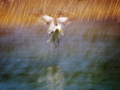 by by  rinac rinac
Content: a bird in flight. Form: intense motion blur.
The connection is clear, I hope. As a critic, I can go deeper into this connection. I can talk about how certain things are miraculously not blurred and what effect that creates in the viewer. I believe that often in great works of art, form and content actually blur together (so to speak).
 by by  Skip Skip
Content: shuttleboard as a metaphor for DPChallenge, i.e. pictures getting shuttled into categories and scores. Form: silhouetting, motion blur and noise
The picture is a tribute to those who go beyond fixed ideas, those who go out of the box. The silhouetting, noise and blur obliterate all detail from the scene. The person is unrecognizable, has no face/facade. The suggestion here is that it is possible to go beyond a superficial, pretty facade. In this case, the "focus" (there is none) is on the process. Motion blur makes that clear. We don't know what score she will get. We don't know who she is. The artist in this case is not the egotist, but the devotee who eclipses herself (silhouette) in the light of her art. Skip is trying to capture the glimmering egoless act of creation. Content and form both contribute to this goal.
|
|
|
|
12/14/2008 07:21:30 PM · #90 |
Originally posted by GeneralE:
I suggest these threads be titled something more like the boring but neutrally-descriptive "Some Interesting Photos from the ___ Challenge." |
Naaah.... more like
"Lost talents of ____ challenge" would be better. |
|
|
|
12/14/2008 07:53:27 PM · #91 |
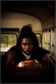
Originally posted by joynim:
I really liked this one
|
Originally posted by Zigomar:
Well, thanks for the kind words, but although I also really like this photo [;-)] I don't find it underrated, actually I was surprised that it did so well on DPC cause, you see, it's partially blurry :-) |
Funny thing that......two years ago I would have been a victim of the typical facile eye candy, don't get me wrong, I still like crisp, pretty shots, but IMNSHO all the things that make this wrong as a DPC knockout help me to focus on the face......that really speaks to me, almost like he's there paying attention to me.
I love the subtle humor in the title, and the theoretical technical issues are what make this a really cool image.
Nicely done!
|
|
|
|
12/14/2008 07:59:59 PM · #92 |
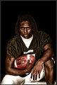
Originally posted by xakpeet:
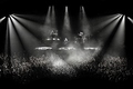
through my eyes this was a bit under rated... beyond the usual oohs and ahhs this one has a sense of feeling for me. It oozes energy. maybe one needs be a fan of the slightly more ruckus music to relate?
ETA: my vote was a 10... top 3 imo. |
Best concert shot I've seen in years.
|
|
|
|
12/14/2008 08:56:38 PM · #93 |
Originally posted by posthumous:
Originally posted by L2:
In all seriousness, was there a shot in the Master's Free Study that would pictorially depict artistry as a relationship of form to content that we haven't already discussed? I *think* I know what you mean (Zigomar's shot using skill and inspiration on-the-spot?) but I'd like to explore your point of view a little more. |
by rinac
Content: a bird in flight. Form: intense motion blur.
The connection is clear, I hope. As a critic, I can go deeper into this connection. I can talk about how certain things are miraculously not blurred and what effect that creates in the viewer. I believe that often in great works of art, form and content actually blur together (so to speak).
.... |
I wish you would go a bit deeper into the connection, I'm interested.
Rinac says in her photog notes on it: "...The idea being to photographically capture the essence of your subject(s), rather than all of the fine details. Investigating the nuances of light, colour and movement by slowing. things. down." How does what she says in her notes relate to what you are saying about form and content blurring together?
The two shots you first mentioned (Skip's shuffleboarder) both used motion blur. Gordon's shot seemed to take a different direction with blur:

Going with your Content/Form paradigm, how would the use of blur in Gordon's shot fit in?
|
|
|
|
12/14/2008 10:34:01 PM · #94 |
Originally posted by L2:
I wish you would go a bit deeper into the connection, I'm interested.
Rinac says in her photog notes on it: "...The idea being to photographically capture the essence of your subject(s), rather than all of the fine details. Investigating the nuances of light, colour and movement by slowing. things. down." How does what she says in her notes relate to what you are saying about form and content blurring together? |
How do you capture the "essence" of a subject? Not by simply pointing a camera at it. You do it with "technicals." In this case she panned the bird at a slow shutter speed.
I would say the "subject" here is not the bird but the action itself. She captured the essence of a moment, not a bird. What pushed it even further into ribbon territory was the composition, her decisions not to crop too close to the bird and to leave the bird centered, creating a beautiful sense of harmony to what was actually a rather chaotic scene. She extended the photographer's task of freezing time and made it one of ordering chaos.
Originally posted by L2:
The two shots you first mentioned (Skip's shuffleboarder) both used motion blur. Gordon's shot seemed to take a different direction with blur:
Going with your Content/Form paradigm, how would the use of blur in Gordon's shot fit in? |
You got me. I just think it's pretty.
Maybe this is why I score landscapes so low: I can't make it fit my form-content paradigm.
|
|
|
|
12/15/2008 12:02:25 AM · #95 |
Originally posted by posthumous:
by Skip
Content: shuttleboard as a metaphor for DPChallenge, i.e. pictures getting shuttled into categories and scores. Form: silhouetting, motion blur and noise
The picture is a tribute to those who go beyond fixed ideas, those who go out of the box. The silhouetting, noise and blur obliterate all detail from the scene. The person is unrecognizable, has no face/facade. The suggestion here is that it is possible to go beyond a superficial, pretty facade. In this case, the "focus" (there is none) is on the process. Motion blur makes that clear. We don't know what score she will get. We don't know who she is. The artist in this case is not the egotist, but the devotee who eclipses herself (silhouette) in the light of her art. Skip is trying to capture the glimmering egoless act of creation. Content and form both contribute to this goal. |
this analysis pretty much sums it up. when i was contemplating an entry for this challenge (my first in over a year), it was going to be a matter of picking something i had shot as opposed to shooting something specifically for the challenge. i did have some eye-candy shots that would have decidedly scored higher, and i also had some candids that would have scored higher. however, anything other than this entry would have been simply playing it safe--and, for me, that would have been a slap at those that i learned the most from in terms of making art with a camera.
personally, i believe in the pursuit of the imperfect image that is captured when the photographer has control over nothing more than the camera. according to ashton k and his ilk, nearly anyone can produce technically perfect images. well, where's the soul in that? give me the grain, give me the blur, take me into the moment. let me experience what was before you and your camera. tell me a story. share your art. don't just show me what your camera can do in auto mode. i don't care how you came about your image or how you processed it, as long as the end result feels real, like there was a living artist capturing an moment the way they wanted to see it expressed.
it really was a fun challenge, and i really appreciate all the comments my image got, especially from those who got it. after looking through the latest dq threads and the subsequent art-rule discussion, i'm not quite sure as what to expect in the future (though i imagine the images will even be moreso of the in-the-box-play-it-safe-eye-candy variety...sigh).
one other subtle note: it almost looks like the she's about to commit a foot-fault, stepping over the line...another dpc parallel that fits the image ;-) |
|
|
|
12/15/2008 02:33:24 AM · #96 |
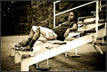
Ah, yes; indeed, I remember this photograph taken during a Bear_Music "skiff" pit stop in Seaside between Cannon Beach and Astoria.
This is one of the few remaining pieces of photographic evidence proving I exist and it reveals one of many secret government survival strategies taught to highly trained undercover agents. As such, the NSA and other government intelligence services require it be destroyed immediately as a direct matter of national security and world stability.
I could tell you why but then I'd have to kill you.
Originally posted by Bear_Music:
I been wondering where the heck you were! How ya doing, friend? Remember this?

\:-) R. |
|
|
|
|
12/15/2008 01:50:57 PM · #97 |
What irony! Focus Point asked for a discussion about images and getting into the problems of conflict (which partially led to this thread)and here I am completely in disagreement with his underated choices but here's the kicker...I'm scared of getting in a tussle with him OR risk insulting the photographers in question. LOL.
Focus-Point-I'll PM you when I gather my thoughts. I'll play it safe...ok?
Robert Franks "The Americans" is going on tour (a must see for me) and as I was reading about it I came across an awesome quote by Elliott Erwitt...
"Quality doesn't mean deep blacks and whatever tonal range. That's not quality, that's a kind of quality. The pictures of Robert Frank might strike someone as being sloppy - the tone range isn't right and things like that - but they're far superior to the pictures of Ansel Adams with regard to quality, because the quality of Ansel Adams, if I may say so, is essentially the quality of a postcard. But the quality of Robert Frank is a quality that has something to do with what he's doing, what his mind is. It's not balancing out the sky to the sand and so forth. It's got to do with intention." (Elliott Erwitt)
Regarding this thread and how people judge images I found it spot on, pertinent to the topic.
What qualities are we looking for? I suppose it's obvious but it really struck me how disparate or incongruent the qualtiies we all judge on, have become. This seems to be the crux of the conflict.
eta: I thought Gordons image was more of a thumb in the eye, to the voters or the standards that have been set. Not sure if we're supposed to like or if it was a simple statement??? Since it doesn't resemble much or any of his recent/past work, I'm going with my gut reaction...but only he knows...
Message edited by author 2008-12-15 13:57:00. |
|
|
|
12/15/2008 01:56:57 PM · #98 |
 pawdrix, waiting for you PM... pawdrix, waiting for you PM... |
|
|
|
12/15/2008 02:24:07 PM · #99 |
Originally posted by pawdrix:
eta: I thought Gordons image was more of a thumb in the eye, to the voters or the standards that have been set. |
yeah, that's why I gave it an 8. :)
Message edited by author 2008-12-15 14:24:20. |
|
|
|
12/15/2008 02:40:21 PM · #100 |
Originally posted by posthumous:
Originally posted by pawdrix:
eta: I thought Gordons image was more of a thumb in the eye, to the voters or the standards that have been set. |
yeah, that's why I gave it an 8. :) |
Isn't it a good example of impressionism and the art of "getting to the essence of the subject" when you can have a photo with what might ordinarily be considered severe exposure and focus issues, and yet the scene is instantly recognizable, and you can easily place yourself in the photographer's place and have a good idea of what it looked and felt like? |
|