| Author | Thread |
|
|
09/03/2008 08:20:30 PM · #1 |
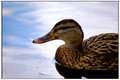
Hello all.
I took this photo today and spent a little while in photoshop processing it. I would really appreciate it if you could leave some criticisms, areas to improve, what works, what dosn't ect.
Harry
Message edited by author 2008-09-03 20:36:44. |
|
|
|
09/03/2008 09:19:44 PM · #2 |
|
|
|
09/03/2008 09:22:44 PM · #3 |
|
|
|
09/03/2008 09:25:36 PM · #4 |
|
|
|
09/03/2008 09:39:02 PM · #5 |
My take on it. |
|
|
|
09/03/2008 09:39:33 PM · #6 |
|
|
|
09/03/2008 09:41:18 PM · #7 |
I like this picture. It follows many of the rules of photography, but has a hard time standing out in this particular crowd as above average. The problem areas (as I see them) are not necessarily within your control before the PP stage with this shot, however. They are lighting, distractions, and human nature.
First is the darkness around the eyes of the subject. (In this case it happens to be a duck, but the eyes are critical in any shot of a live specimen.)
Next, would be the distracting elements around the subject. (Yep, subject is still a duck!) Specifically, the stuff floating in the water in front of him. This could be removed in post, but not (I fear) if you want to follow the challenge rules. (As an aside, I have found that trying to get a shot within the rules of this site has made me a better photographer. It has meant that I have to get things right in camera, not rely on post processing!)
More importantly is the relative brightness of the water around him. (Yes, it's an assumption that it's actually a 'him', but what do I know about ducks?) Point is, the eye is naturally drawn to the brightest areas in an image first. Once they've been found, your main subject has to be interesting enough to draw the eye away (if you have chosen to break this rule. . . and in this case, I think you have. Did I mention that the subject is a duck? Not interesting enough in my opinion to draw the eye back.)
Ok, now the good stuff! First, it's a duck and I think ducks are cool. :)
Next, the focus is dead on, and the level of detail is great.
Then, we'll talk about the color. Both on the duck itself (himself?) and in the water. It looks like you have amped them up in post processing, but that you have avoided the mistake (which I still make!) of going too far. The overall feeling is a soothing, calming one. |
|
|
|
09/03/2008 09:49:36 PM · #8 |
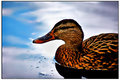
Originally posted by Patsfan:
My take on it. |
Hmm I like the way it looks sharper but the saturation and contrast is maybe too much. I was going for a smoother feel. |
|
|
|
09/03/2008 09:59:59 PM · #9 |
Hopefully you don't mind:
A quick edit by me for you.
[thumb]717983[/thumb]
I dodged the eye a bit to brighten, sharpen, then played with the saturation a little and switched the border
|
|
|
|
09/03/2008 10:10:22 PM · #10 |
Thats great! I dont mind at all, especially when its in the name of progress.
I was actually in the middle of trying a few things and got somthing similar!
|
|
|
|
09/03/2008 10:24:37 PM · #11 |
Do you want me to edit the pic under Basic editing or Advanced editing?
|
|
|
|
09/03/2008 10:25:48 PM · #12 |
Here's what I did with it in Paintshop Pro
[thumb]717987[/thumb]
-Adjust curves, here's the curve I applied to lighten the duck and bring down the water:
[thumb]717988[/thumb]
-Selected background only and adjusted saturation, slight blur, cleaned up water in foreground with blemish fixer
-inverted selection
-Increased saturation on duck
-selected only beak
-increased saturation of beak
-selected eye and pulled up curves to create a highlight in the eye
-undo all selections
-applied clarify w/ value of 2
-unsharp mask
Message edited by author 2008-09-03 22:31:02. |
|
|
|
09/03/2008 10:40:07 PM · #13 |
Originally posted by Shutter-For-Hire:
Do you want me to edit the pic under Basic editing or Advanced editing? |
I don't mind, someone said the limitation of basic can be intersting to work with but its up to you =]
|
|
|
|
09/03/2008 10:56:44 PM · #14 |
ok... here's my go at it...
[thumb]718034[/thumb] |
|
|
|
09/04/2008 06:08:05 AM · #15 |
Re-do |
|
|
|
09/07/2008 04:17:21 PM · #16 |
Originally posted by yospiff:
Here's what I did with it in Paintshop Pro
[thumb]717987[/thumb]
-Adjust curves, here's the curve I applied to lighten the duck and bring down the water:
[thumb]717988[/thumb]
-Selected background only and adjusted saturation, slight blur, cleaned up water in foreground with blemish fixer
-inverted selection
-Increased saturation on duck
-selected only beak
-increased saturation of beak
-selected eye and pulled up curves to create a highlight in the eye
-undo all selections
-applied clarify w/ value of 2
-unsharp mask |
I personally like this edit the best of the ones shown. It addresses a lot of problem areas (i.e. bright background, dark eye) without going too crazy and still legal under advanced. The steps are also relatively easy for anyone and they would transfer to PS as well.
|
|
|
|
09/07/2008 04:55:54 PM · #17 |
|
Home -
Challenges -
Community -
League -
Photos -
Cameras -
Lenses -
Learn -
Prints! -
Help -
Terms of Use -
Privacy -
Top ^
DPChallenge, and website content and design, Copyright © 2001-2024 Challenging Technologies, LLC.
All digital photo copyrights belong to the photographers and may not be used without permission.
Current Server Time: 04/19/2024 07:11:38 PM EDT.


