| Author | Thread |
|
|
06/01/2008 10:43:08 AM · #1 |
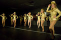
Question of White Balance (unfortunately, I shot a gray card, but then in the rush between shows we changed the lighting completely)
Can anyone tell me which looks to have the best white balance here? Or if not, what's wrong with WB in all of them (i.e., what color cast)?
Thanks!
These are just proof conversions from lightroom...


If you need a different shot/example, let me know...I have lots of different ones :)
Message edited by author 2008-06-01 10:44:13. |
|
|
|
06/01/2008 10:58:01 AM · #2 |
Auto WB is probably the most accurate of them, the most neutral. 3354 is the most pleasing to my eye. I will look at it in CS3 and see if I have any suggestions.
R.
|
|
|
|
06/01/2008 11:04:47 AM · #3 |
| 3354 is also my favorite of the three presented. |
|
|
|
06/01/2008 11:05:00 AM · #4 |
| Like Robert, I think Auto WB has pretty much "compensated out" the warm lighting and yielded a more neutral image, but at the expense of the ambiance of the warmer lighting. I too think the 3354 is best. If I were editing it, I think I'd go somewhere between the 3354 and auto, just a bit cooler than 3354, but not nearly as cool as auto. |
|
|
|
06/01/2008 11:05:03 AM · #5 |
Thanks Robt. My eye agrees completely! Here's another, closer example of 3354, -3

eta: more responses came in while writing this. Thanks Fritz and Susan!
Message edited by author 2008-06-01 11:06:02. |
|
|
|
06/01/2008 11:05:53 AM · #6 |
I took "as shot" and opened in CS3. Duped the base layer and used "match color", set to neutralize, with luminance at 176 and intensity at 138. Then I faded the overlayer to 50%. Would help if I knew what color the costumes actually are...
R.
ETA: 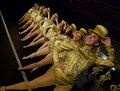
Both these can be tweaked with hue/sat. Once you have one nailed, leave it up and use match color with that one as a source image and all the others can be matched to it.
Message edited by author 2008-06-01 11:10:02.
|
|
|
|
06/01/2008 11:08:13 AM · #7 |
3354 is also my favorite of the three presented.
my post..... frostypaws is messing with my computer. but yes Susan also agrees.
Message edited by author 2008-06-01 11:10:27. |
|
|
|
06/01/2008 12:15:07 PM · #8 |
This is pretty similar to Bear's, but a different approach. From the Adobe Photoshop CS3 Book:
1) Duplicate Layer, change mode to difference. Fill with 50% gray.
2) Create threshold layer. Move slider all the way to the left to make the photo totally white
3) Bring the slider back to the right until a small area becomes black.
4) Press shift and the mouse button over that spot. This will save the point.
5) Delete the threshold and exclusion layers.
6) Perform the curves adjustment. Select the grey pointer checkbox, then click over the point tracked in step 4.
You have your grey point.
[thumb]684464[/thumb]
I would do more adjustments, but as Robert said, it would be helpful to know the colors.
|
|
|
|
06/01/2008 12:55:58 PM · #9 |
Thanks everyone.
The costumes are gold.
I am however, somewhat limited to doing these in Lightroom, rather than PS. They are RAW and I only have CS not CS3 which won't read my Nikon D80 files. I could, I guess, convert them all to DNG, but LR can balance them, I just need to decide what the right balance is. And timewise, I'm trying to just use LR sice I have a lot of shots to process.
Thanks again!
|
|
|
|
06/01/2008 02:17:40 PM · #10 |
It's great you asked us, but are those that are giving an opinion using a calibrated monitor? If not, their thoughts are about useless.
Of the three posed originally the middle looks the best (not sure where folks are getting the number from...)
Nobody - your image is too red/purple.
|
|
|
|
06/01/2008 02:34:51 PM · #11 |
I guess it depends on the monitor, but I think the third of three looks the best to me on this monitor - the first is a bit too yellow and the second a bit too blue for me.
JMO. |
|
|
|
06/01/2008 04:04:21 PM · #12 |
Originally posted by Prof_Fate:
It's great you asked us, but are those that are giving an opinion using a calibrated monitor? If not, their thoughts are about useless.
Of the three posed originally the middle looks the best (not sure where folks are getting the number from...)
Nobody - your image is too red/purple. |
I was just sharing a trick on finding the grey point. I didn't claim the photo was fully adjusted. Sorry to have offended you. |
|
|
|
06/01/2008 04:21:19 PM · #13 |

Nothing fancy here- a default Levels adjustment did most of the heavy lifting. I lightened the midtones a little and shifted the yellow hues slightly to the warm side (like -1), then sharpened. |
|
Home -
Challenges -
Community -
League -
Photos -
Cameras -
Lenses -
Learn -
Prints! -
Help -
Terms of Use -
Privacy -
Top ^
DPChallenge, and website content and design, Copyright © 2001-2024 Challenging Technologies, LLC.
All digital photo copyrights belong to the photographers and may not be used without permission.
Current Server Time: 04/19/2024 12:57:17 AM EDT.


