| Author | Thread |
|
|
02/19/2008 10:39:41 PM · #1 |
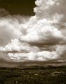
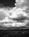
Do you prefer this image with the tone or without the tone? I guess I should mention that the end result of this image is an 11x14 print.
Or would you prefer a different tone?
As aways, general comments on the photo are very welcome!
toned.
not so toned.
Thanks!
Aaron |
|
|
|
02/19/2008 10:52:20 PM · #2 |
Definitely without... lovely shot...
N
|
|
|
|
02/19/2008 10:54:32 PM · #3 |
Im always partial to the warm brown tone so I vote the first one. Can't go wrong with either imo though.
Message edited by author 2008-02-19 22:54:54. |
|
|
|
02/20/2008 09:57:53 AM · #4 |
| Bump for the morning crowd. |
|
|
|
02/20/2008 09:59:59 AM · #5 |
| I'm torn between the two but I think I like the tones slightly better |
|
|
|
02/20/2008 10:06:43 AM · #6 |
|
|
|
02/20/2008 10:08:31 AM · #7 |
| Fantastic clouds! Image looks great both ways, but I prefer the B&W version :-) |
|
|
|
02/20/2008 10:19:13 AM · #8 |
|
|
|
02/20/2008 10:21:31 AM · #9 |
| toned, but less saturated |
|
|
|
02/20/2008 10:21:53 AM · #10 |
| I prefer the toned one. Always partial to warmer tones. There seems to be more contrast in that one as well. |
|
|
|
02/20/2008 11:28:57 AM · #11 |
I'd tone it, but not that heavily... maybe use an adjustment layer on the color blending mode? Just a thought... maybe push the blacks too in selective color.
total cost $0.02. |
|
|
|
02/20/2008 11:57:27 AM · #12 |
Originally posted by Tez:
I'd tone it, but not that heavily... maybe use an adjustment layer on the color blending mode? Just a thought... maybe push the blacks too in selective color.
total cost $0.02. |
I think I am leaning towards the toned image, but agree with you and others that having it be a little more subtle might be better.
What did you mean by push the blacks too in selective color?
Thanks,
Aaron |
|
|
|
02/20/2008 04:33:26 PM · #13 |
sorry, it's my own vernacular.
There's a thing called 'selective color' that opens up a little submenu of the main color groups, as well as whites, neutrals or blacks. I find that selecting neutrals and maybe adding 3-5% in the blacks helps give some depth and shape to objects where you want to emphasise the roundness.
|
|
|
|
02/20/2008 06:38:53 PM · #14 |
Originally posted by Tez:
sorry, it's my own vernacular.
There's a thing called 'selective color' that opens up a little submenu of the main color groups, as well as whites, neutrals or blacks. I find that selecting neutrals and maybe adding 3-5% in the blacks helps give some depth and shape to objects where you want to emphasise the roundness. |
Thank you. I like that technique. I had not used the selective color all that much. |
|
|
|
02/20/2008 07:52:32 PM · #15 |
|
|
|
02/20/2008 10:16:43 PM · #16 |
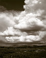
I have finalized on a print. There is slightly more contrast in the clouds and the tone is more subtle than the original that I posted. Thanks for all of your input.
 |
|
Home -
Challenges -
Community -
League -
Photos -
Cameras -
Lenses -
Learn -
Prints! -
Help -
Terms of Use -
Privacy -
Top ^
DPChallenge, and website content and design, Copyright © 2001-2024 Challenging Technologies, LLC.
All digital photo copyrights belong to the photographers and may not be used without permission.
Current Server Time: 04/23/2024 02:52:51 PM EDT.


