| Author | Thread |
|
|
01/12/2008 11:45:50 PM · #1 |
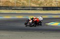
How would you crop this photo ? I'm going to use this as an example in a tutorial and would appreciate your comment.
Thanks
|
|
|
|
01/12/2008 11:53:24 PM · #2 |
| I would crop off at the bottom (where the uninteresting bitumen is) and crop off at the right. |
|
|
|
01/13/2008 12:28:20 AM · #3 |
Originally posted by Monique64:
I would crop off at the bottom (where the uninteresting bitumen is) and crop off at the right. |
I agree.
|
|
|
|
01/13/2008 12:45:42 AM · #4 |
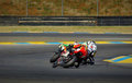
I would crop to the comply with the ROT compositional rule.
In addition, it's usually a good idea with motion-type of shots to allow room for the subject(s) to "move into". With my version (shown below), the subjects are moved up to the upper left quadrant, giving the sensation of driving into the open area in front of them.

. . (click to enlarge)
Message edited by author 2008-01-13 00:47:20.
|
|
|
|
01/13/2008 12:55:27 AM · #5 |
|
|
|
01/13/2008 01:28:19 AM · #6 |
Originally posted by AperturePriority:
I would crop to the comply with the ROT compositional rule.
In addition, it's usually a good idea with motion-type of shots to allow room for the subject(s) to "move into". With my version (shown below), the subjects are moved up to the upper left quadrant, giving the sensation of driving into the open area in front of them.
. . (click to enlarge) |
I second this. |
|
|
|
01/13/2008 01:45:05 AM · #7 |
Thank you for your reply. I'm trying to balance some of the elements in the photo that provide information when more than a casual look at the picture occurs. One of those 'items' are the "uninteresting bitumen" as it is 'no mans land' and if you get into that area it becomes real interesting just before you crash. I appreciate your comment and perspective!
Originally posted by Monique64:
I would crop off at the bottom (where the uninteresting bitumen is) and crop off at the right. |
|
|
|
|
01/13/2008 01:46:52 AM · #8 |
Originally posted by AperturePriority:
I would crop to the comply with the ROT compositional rule.
In addition, it's usually a good idea with motion-type of shots to allow room for the subject(s) to "move into". With my version (shown below), the subjects are moved up to the upper left quadrant, giving the sensation of driving into the open area in front of them.
. . (click to enlarge) |
Having seen this crop I really like it, even the uninteresting bitumen. |
|
|
|
01/13/2008 01:59:31 AM · #9 |
Originally posted by fotomann_forever:
[thumb]632180[/thumb] |
I wanted to eliminate the fence and the all or part of the grass in the upper side of the photo as I think it distracts and adds little to the subject matter (4 motorcycles very tightly bunched up dancing very fast around a very tight corner) Thank You for your reply. |
|
|
|
01/13/2008 02:29:48 AM · #10 |
|
|
|
01/13/2008 02:38:35 AM · #11 |
... and I would submit for consideration that you could substitute 'racing motorcycles' as a very close second in that 'danger and play'...
Originally posted by fotomann_forever:
I agree. |
�The true man wants two things: danger and play. For that reason he wants woman, as the most dangerous plaything.�
|
|
|
|
01/13/2008 10:12:14 AM · #12 |
My question, not having to do with crop, is why you were shooting at f/13 and ISO 640? Neither one of those are good for your image. Anything from about f/11 and beyond will make your image become fuzzy due to diffraction. And you were probably forced to up the ISO to 640 due to the small aperture. My recommendation would be to drop both of them down and you'll get a better quality image. Also, a longer lens and/or getting closer to the action would have helped a lot. (rent a lens if you need to, there may be a local shop near you, or there are several companies on the internet that rent lenses)
Just some examples from my one and only time ever shooting motorcycles at the speedway. None of these are cropped or edited, only reduced in size for posting on the internet.
|
|
|
|
01/13/2008 10:39:53 AM · #13 |
Originally posted by dwterry:
My question, not having to do with crop, is why you were shooting at f/13 and ISO 640? Neither one of those are good for your image. Anything from about f/11 and beyond will make your image become fuzzy due to diffraction. And you were probably forced to up the ISO to 640 due to the small aperture. My recommendation would be to drop both of them down and you'll get a better quality image. Also, a longer lens and/or getting closer to the action would have helped a lot. (rent a lens if you need to, there may be a local shop near you, or there are several companies on the internet that rent lenses)
Just some examples from my one and only time ever shooting motorcycles at the speedway. None of these are cropped or edited, only reduced in size for posting on the internet. |
I agree with dwterry. The composition is good but the overall image quality is low due to what looks like over sharpening and saturation. I'm guilty myself of sometimes forgetting the technical aspects of what makes a great photograph. I've never been a fan of a higher ISO than required. 640 is pushing a little too much for a daylight shot IMO. |
|
|
|
01/13/2008 12:46:25 PM · #14 |
I don't mind the fence at all. It gives context to the scene. Here's my take on it:
Used shadow/highlight, then added an empty "multiply" layer filled with white and ran black-to-transparent gradients top and bottom, then faded to suit. Finally, added a corner vignette. And oh yeah, used skew tool to lift upper right corner and level the fence.
R.
Message edited by author 2008-01-13 12:47:13.
|
|
|
|
01/13/2008 12:58:50 PM · #15 |
Originally posted by Rasai:
... and I would submit for consideration that you could substitute 'racing motorcycles' as a very close second in that 'danger and play'...
Originally posted by fotomann_forever:
I agree. |
�The true man wants two things: danger and play. For that reason he wants woman, as the most dangerous plaything.� |
:-D Quite true! Hey, if you mess up, both will leave you with a sore bum.
|
|
|
|
01/13/2008 06:06:41 PM · #16 |
|
|
|
01/14/2008 07:07:22 AM · #17 |
David, In a word ~ IGNORANCE! Thank you for sharing with me the best information I have gleaned from the DPC site since I joined in 2003! I enjoyed looking at the Motorcycle Racing Pictures at Utah's Fabulous new racetrack facility, I cant wait to get a chance to race there! I noticed that some of your shots are a bit on the blurry side and that is a problem I've been trying to mitigate for years. I shoot a lot of Motorsports photography as its my favorite subject, with the information you have shared with me I expect to raise the bar! My comment regarding the 'blurry shots' is based on what the magazines & program providers want ... that is to see as deep a depth of field as possible on the rider and motorcycle and showing as many as possible (read ALL) of the sponsors logos/names in a sharp focus. I typically tried to use the higher f-stops (11+) whenever possible and at times had to increase the ISO up to do it. I'm also struggling with the new regulations forbidding the use of tripods by the media photographers, as it has been demonstrated that it is a safety hazard. The use of monopods is allowed and condoned. At this point in time I'm using a trusty old (14 years) 300mm Nikkor lens, which has unfortunately bounced down the road with me a few times during unplanned - non-vertical motorcycle excursions! The lens isn't as sharp as it once was needless to say even though it has been tuned and adjusted by Nikon.
Thanks again for the information. I'll practice it and hope to put it to good use.
I was the only one I know of at the right place, at the right time, to get a series of photographs on the second to last lap for the Completion of the AMA Championship Winning Pass. Ben used a back marker as a 'pick' to get by Matt riding on 'NO MANS LAND' ~ the new alligator curbing' on the exit of the Corkscrew at Laguna Seca:The completion of the Championship Winning Pass... of note I was handholding the camera in a portrait mode and panning this standing on my tip toes and all things considered I was very pleased with the photos. You can see how Ben slides of the curbing at the apex of the turn and keeps it pinned!... and on to the Win! The 8 photos were captured in 1.58 seconds!
Originally posted by dwterry:
My question, not having to do with crop, is why you were shooting at f/13 and ISO 640? Neither one of those are good for your image. Anything from about f/11 and beyond will make your image become fuzzy due to
Just some examples from my one and only time ever shooting motorcycles at the speedway. None of these are cropped or edited, only reduced in size for posting on the internet. |
Message edited by author 2008-01-14 09:23:22. |
|
|
|
01/14/2008 09:53:44 AM · #18 |
Robert, I like the cropping example you've created. You've done well by it and most importantly got the 'horizon' correct by using the fence posts. This location is the highest point on the track and as I mentioned I considered skewing it to look like they were at the top of a hill starting down hill and including the fence would have blown the photos credibility. I'm going to work with a few of these and will post what I end up with. Thanks again for taking the time to help me with this!
Originally posted by Bear_Music:
I don't mind the fence at all. It gives context to the scene. Here's my take on it:
Used shadow/highlight, then added an empty "multiply" layer filled with white and ran black-to-transparent gradients top and bottom, then faded to suit. Finally, added a corner vignette. And oh yeah, used skew tool to lift upper right corner and level the fence.
R. |
|
|
|
|
01/14/2008 10:26:01 AM · #19 |
Hello Michelle
Thank you for your version of the photo. I like it, as you have been able to accomplish something I hadn't yet, by leveling the picture correctly and including the fence to give the correction impression that the 4 riders were about to start back downhill... I think I'll work with this version too.
I believe that the horizon issue some people had with your shot of the Ocean was incorrect. It looked to me like it started out level and the fog and clouds obscured the true horizon!
I also liked the photo of your Lilly. If you get a chance please take a look at the picture of the Lilly I submitted and comment:
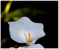
I like the colors but was unable to get rid of a distracting element in the photo and may have been better off by doing something similar to yours.
Originally posted by aliqui:
 |
Message edited by author 2008-01-14 10:34:58. |
|
|
|
01/14/2008 03:28:00 PM · #20 |
Originally posted by Rasai:
Hello Michelle
Thank you for your version of the photo. I like it, as you have been able to accomplish something I hadn't yet, by leveling the picture correctly and including the fence to give the correction impression that the 4 riders were about to start back downhill... I think I'll work with this version too.
I believe that the horizon issue some people had with your shot of the Ocean was incorrect. It looked to me like it started out level and the fog and clouds obscured the true horizon!
I also liked the photo of your Lilly. If you get a chance please take a look at the picture of the Lilly I submitted and comment:
|
I left a comment on your Calla Lily photo. As for my ocean shot, a lot of people have commented on the bent horizon, but I'm still not bothered by it in the slightest. When I've gone to the beach there's always been a bend in the horizon. While this scene probably didn't naturally have that bend before my lens got a hold of it, it still adds that perception I always see when at the coast when looking out into the vastness. I should probably add a comment to the photo explaining the vision, but neh, heh.
Thanks for taking a look around my profile. |
|
Home -
Challenges -
Community -
League -
Photos -
Cameras -
Lenses -
Learn -
Prints! -
Help -
Terms of Use -
Privacy -
Top ^
DPChallenge, and website content and design, Copyright © 2001-2024 Challenging Technologies, LLC.
All digital photo copyrights belong to the photographers and may not be used without permission.
Current Server Time: 04/18/2024 09:56:58 PM EDT.


