| Author | Thread |
|
|
09/26/2007 01:16:49 AM · #1 |
We said in the scores thread we'd do an "after challenge" discussion for those of us who had rather lackluster scores. I think it's a good chance to learn from our "mistakes" - learn what we did right with respect to DPC scoring, and what we need to work on in the future.
I'll start:

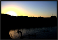
In retrospect, it's rather dull. It's also subjectless and doesn't have particularly good balance for a landscape. I do think it's in silhouette, but without a truly well-defined subject, I don't think it sufficiently meets the challenge.
Just for fun, here's a different edit - a bit less depth, but more silhouette-ish? I also posted a couple in the outtakes thread that probably would have scored better.
[thumb]588481[/thumb]
Message edited by author 2007-09-26 01:17:37. |
|
|
|
09/26/2007 02:04:03 AM · #2 |
fwiw... i think i prefer your the 2nd one to your challenge entry. For me the sun in combination with the reflection of the sun off the water was very bright and distracting to me.
The main subject that i interpreted being silhouetted were the two small trees but they are almost washed out by the brightness of the sun and you loose the detail.
|
|
|
|
09/26/2007 04:43:22 AM · #3 |
Well I am very dissapointed with my result - 239 out of 273...?!?!?
This is interesting.
Avg (all users): 4.6265
Avg (commenters): 7.3333
Avg (camera): 4.6211
Avg (no camera): 4.8000
The commenters obvioulsy liked it a great deal more than the non-commenters!
Is it really that bad?
I have done a re-edit which would not comply with the basic ruleset which is MUCH better, showing more detial in the foreground and greater saturation in the water reflecting the sky.
Here is the edit...

Would like to hear your thoughs...
AL.
Message edited by author 2007-09-26 12:32:58. |
|
|
|
09/26/2007 05:58:23 AM · #4 |
| Al - I was one of your 7s. Unfortunately, I don't think many saw the figures in the water, which to me are a nice quiet surprise in this. Shots like this are also very dependent on viewers' monitors - in some instances, this may simply have been too dark. I suspect the advanced edit may have corrected that a bit. In short, this doesn't have the "snap" appeal that DPC votes high for, but it is a shot that I very much like. |
|
|
|
09/26/2007 06:10:11 AM · #5 |
Thanks  Melethia, Melethia,
I hadn't thought about users displays and the possibility of them not seeing the silhouetted figures... Makes sense.
Thanks... |
|
|
|
09/26/2007 06:13:40 AM · #6 |
left a commentOriginally posted by pix-al:
Thanks Melethia,
I hadn't thought about users displays and the possibility of them not seeing the silhouetted figures... Makes sense.
Thanks... |
|
|
|
|
09/26/2007 07:04:07 AM · #7 |
Originally posted by pix-al:
Well I am very dissapointed with my result - 239 out of 273...?!?!?
This is interesting.
Avg (all users): 4.6265
Avg (commenters): 7.3333
Avg (camera): 4.6211
Avg (no camera): 4.8000
The commenters obvioulsy liked it a great deal more than the non-commenters!
Is it really that bad?
I have done a re-edit which would not comply with the basic ruleset which is MUCH better, showing more detial in the foreground and greater saturation in the water reflecting the sky.
Would like to hear your thoughs...
AL. |
I really like your entry!!! I knew it wouldn't do too well tho =( I thought there were loads to look at =) but that'sh how it goes eh... |
|
|
|
09/26/2007 07:06:25 AM · #8 |
Originally posted by Melethia:
We said in the scores thread we'd do an "after challenge" discussion for those of us who had rather lackluster scores. I think it's a good chance to learn from our "mistakes" - learn what we did right with respect to DPC scoring, and what we need to work on in the future.
I'll start:
In retrospect, it's rather dull. It's also subjectless and doesn't have particularly good balance for a landscape. I do think it's in silhouette, but without a truly well-defined subject, I don't think it sufficiently meets the challenge.
Just for fun, here's a different edit - a bit less depth, but more silhouette-ish? I also posted a couple in the outtakes thread that probably would have scored better.
[thumb]588481[/thumb] |
I gave you a 6 because to me it did meet the challenge...but I wasn't too interested in the subject itself ...
Message edited by author 2007-09-26 07:09:07. |
|
|
|
09/26/2007 07:13:41 AM · #9 |
I would like to bring up a great injustice to this pic!!!!!!!!!!!!!!!!!

No way it deserved what it got!!!!!!!!!!!! |
|
|
|
09/26/2007 07:17:42 AM · #10 |
I loved this shot as well, very abstract, I think it's stunning and YES i gave it a 10!!! Anyone else who actually agrees with me?

Message edited by author 2007-09-26 07:28:01. |
|
|
|
09/26/2007 07:34:45 AM · #11 |
Finally here's my entry!!

I'm not too happy with the 23 4S?!!!!TWENTY THREE?!!!!!!! I would like to know why... as usual the non commenters NEVER tells you why... grrrrrr
The only 2 reasons people gave me for not liking were, added too much contrast and that the light attracted much. Yes light did attract some detail but that was the point it was still silhouetted at the end of the day! hahahahah
And here is the outtake would've been better?
Message edited by author 2007-09-26 07:43:03. |
|
|
|
09/26/2007 07:38:27 AM · #12 |
Place: 173 out of 273
Avg (all users): 5.1867
Avg (commenters): 6.0000
Avg (camera): 5.1975
Avg (no camera): 4.7500
Views since voting: 2
Views during voting: 223
Votes: 166
Comments: 5
Favorites: 0
Here's mine any comments would help. Thank you
MAX! |
|
|
|
09/26/2007 07:43:59 AM · #13 |
I got a 5.4, do you guys think that is a fair? I thought it would take at least 6.0. What do you think?

Message edited by author 2007-09-26 07:44:51. |
|
|
|
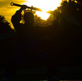
09/26/2007 07:45:30 AM · #14 |
Originally posted by Quigley:
Place: 173 out of 273
Avg (all users): 5.1867
Avg (commenters): 6.0000
Avg (camera): 5.1975
Avg (no camera): 4.7500
Views since voting: 2
Views during voting: 223
Votes: 166
Comments: 5
Favorites: 0
Here's mine any comments would help. Thank you
MAX! |
I left you a comment!! I did like your subject was ery interesting, the highlight of his face brings him forward fromthe background...altho from the wait below it doesn't so kinda blends in with the background... =) |
|
|
|
09/26/2007 07:53:41 AM · #15 |
Originally posted by McFrikki:
I got a 5.4, do you guys think that is a fair? I thought it would take at least 6.0. What do you think?
|
I gave u an 8, didn't leave a comment, its a nice solid silhouette and the sky looks amazing, personally I like simplicity too. That's why I gave you that score... It's a very nice shot, but its not absolutly WOW maybe your choice of subject was a bit too simple for others? |
|
|
|
09/26/2007 08:12:05 AM · #16 |
I was hoping to do better with this, but I really can't complain with a 5.5112, especially after seeing how some of you got slammed.

Message edited by author 2007-09-26 08:13:04.
|
|
|
|
09/26/2007 08:24:27 AM · #17 |
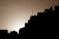
This is the one I entered which did much better than the one I entered in Silhouettes III challenge in 2006.

I took this one after the challenge started. Which is a bummer because I would have entered it because it looks more interesting.
[thumb]590416[/thumb]
Message edited by author 2007-09-26 08:24:54. |
|
|
|
09/26/2007 08:24:39 AM · #18 |
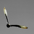 Why isn't this a silhouette? I just left some colors in the feathers. It appears by the 1s, 2s, & 3s that it DNMC to some folks. Why isn't this a silhouette? I just left some colors in the feathers. It appears by the 1s, 2s, & 3s that it DNMC to some folks. |
|
|
|
09/26/2007 08:44:34 AM · #19 |

My score is not hard to figure out. There is a little bit of color and detail left on the flower, which DPCers (erroneously) believe is not "allowed" for a silhouette. Also, it's hard to recognize the subject. It's largely abstract.
It's nice when I know why my score is low, then I can just relax and hope someone comes along who likes it. I got a last-minute positive comment from  vtruan that I appreciated a great deal. vtruan that I appreciated a great deal. |
|
|
|
09/26/2007 08:49:53 AM · #20 |
Proof positive that only stock photos do well here. It's amazing some of the comments I get here versus other sites where the images are judged by professionals. No sour grapes though. I enter what I like and I get a few wonderful comments along the way.
Thanks everyone. ;~D |
|
|
|
09/26/2007 09:23:45 AM · #21 |
This was my entry.

I'm fairly pleased with how well I did, about in the middle of the pack at #141. I think the overhead beam detracts from the subject a little, but I can't take it out for basic editing. I did get one cryptic comment though, that I am not sure if it is a compliment or criticism:
Originally posted by Man:
"hard still soft" |
Message edited by author 2007-09-26 09:27:41. |
|
|
|
09/26/2007 09:26:48 AM · #22 |
Originally posted by Jutilda:
Proof positive that only stock photos do well here. |
I've read this opinion here a couple of times. Could someone define for me what is generally considered "stock". My assumption is it implies unoriginal work of a type that has been done before. |
|
|
|
09/26/2007 09:43:02 AM · #23 |
Originally posted by yospiff:
Originally posted by Jutilda:
Proof positive that only stock photos do well here. |
I've read this opinion here a couple of times. Could someone define for me what is generally considered "stock". My assumption is it implies unoriginal work of a type that has been done before. |
Stock Photography II
Images geared toward use by advertising agencies for various usage: magazines, billboards, web ad's, etc...
Usually clean (clear subject, not cluttered) and tell a story in a simple manner. |
|
|
|
09/26/2007 09:50:30 AM · #24 |
Originally posted by booboo_goon:
I really like your entry!!! I knew it wouldn't do too well tho =( I thought there were loads to look at =) but that'sh how it goes eh... |
Thanks for all of the comments gained after the "Post Mortem" thread.
I will post my re-edit tonight when I go home in about 3 to 4 hours time...
I think monitor calibration may be to blame here as there are actually 5 figures in the water, not 2 as  yospiff commented on seeing! yospiff commented on seeing!
The sun was meant to be the main focus of the image, the figures in the water are an added intrest in the composition as I see it. I didn't shoot it for the challenge, I was on holiday and wanted a sunset shot, this just managed to fit the "Silhouette" well with a bit of contrast/Brightness adjustment! |
|
|
|
09/26/2007 10:07:21 AM · #25 |
Originally posted by pix-al:
I think monitor calibration may be to blame here as there are actually 5 figures in the water, not 2 as yospiff commented on seeing! |
I can only see two figures as well. |
|
Home -
Challenges -
Community -
League -
Photos -
Cameras -
Lenses -
Learn -
Prints! -
Help -
Terms of Use -
Privacy -
Top ^
DPChallenge, and website content and design, Copyright © 2001-2024 Challenging Technologies, LLC.
All digital photo copyrights belong to the photographers and may not be used without permission.
Current Server Time: 04/19/2024 11:48:57 PM EDT.


