| Author | Thread |
|
|
04/16/2012 08:50:59 AM · #1 |
This image did very poorly in the Yellow Still Life challenge, and I would like some ideas as to why. 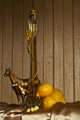
IMHO (after all I am a CC member), technically it's fine - everything is in focus, the lighting is fine, the comp isn't the most exciting, but it works. It's a still life. And in the artistic sense, every item is a shade of yellow though only a couple are actually the bright shiny yellow that most voters seem to have been expecting.
Thoughts? Opinions?
|
|
|
|
04/16/2012 09:04:01 AM · #2 |
Personally... I think the background is fighting for attention with the subjects.
The horses and carafe are rather dark, and seem to take a back seat to the brightly lit and reflective back drop.
I see you used f/8, maybe f/5 could have produced a less focused background, and as a result brought more focus to the objects on the table? Maybe try angling the door so that the reflection from your light source isn't back at the camera, so it could possibly produce a darker back drop.
Also, not sure about the eggs. They kinda feel like a last minute addition. K.I.S.S.! :)
Message edited by author 2012-04-16 09:54:49. |
|
|
|
04/16/2012 09:24:51 AM · #3 |
| Ok - so I was behind on comments for this one. I gave it a 5 mostly because it felt more gold than yellow. Since the largest object that got my attention was not yellow and only some stuff at the bottom "yellow still life" didn't quite click. I agree with the previous comment on the focus also. my scoring method is 5 = average, I reserve 9s and 10s for top notch so most get between 3 and 7. |
|
|
|
04/16/2012 09:27:46 AM · #4 |
I agree with pretty much everything JamesDowning mentioned. I'd like to emphasize his comment on the eggs....it seemed to me like you gathered up a bunch of stuff you had lying around that was yellow and threw them together....if it's been done in a clever way, the idea is too genius for me to grasp ;)
|
|
|
|
04/16/2012 10:09:48 AM · #5 |
Well good to see that there is a general consensus on the eggs, which were indeed a last-minute addition. I did try using f.5 but then lost focus on the horses, which are the items most to the rear of the shot. If the space had been a bit bigger I could have set the still life setup a few more feet away from the bg. And the lines on the door aren't quite straight, so had I angled it I felt people would be whining about tilted horizons etc.
Ah well, live and learn...thanks all for your input. |
|
|
|
04/16/2012 12:51:54 PM · #6 |
In my opinion the background is very poor and the actual subjects and lighting are boring.
As you say technically it's all good and I scored you 5,which I still think is fair.
Certainly not one of your finest.
Message edited by author 2012-04-16 12:52:21. |
|
|
|
04/16/2012 12:55:39 PM · #7 |
| Your backdrop is a scratched-up dirty-looking wall, with thick paint hiding the wood. Simple as that. |
|
|
|
04/16/2012 01:06:31 PM · #8 |
Originally posted by posthumous:
Your backdrop is a scratched-up dirty-looking wall, with thick paint hiding the wood. Simple as that. |
Actually it's the shed door itself, but no matter. So I guess this means I don't get a posty? Now I'm really depressed :-( |
|
|
|
04/16/2012 01:11:54 PM · #9 |
Originally posted by snaffles:
Originally posted by posthumous:
Your backdrop is a scratched-up dirty-looking wall, with thick paint hiding the wood. Simple as that. |
Actually it's the shed door itself, but no matter. So I guess this means I don't get a posty? Now I'm really depressed :-( |
I saw a couple of shots that I really liked, but no posties in this challenge. You would have had a better chance with me if you made it black and white.
and dark.
and blurry. you should have focused on the ugly wall instead of the yellow stuff. give ritzmeister some competition for the brown!
Or just close your eyes and take 100 pictures!!! lololol |
|
|
|
04/16/2012 01:22:50 PM · #10 |
Originally posted by posthumous:
Originally posted by snaffles:
Originally posted by posthumous:
Your backdrop is a scratched-up dirty-looking wall, with thick paint hiding the wood. Simple as that. |
Actually it's the shed door itself, but no matter. So I guess this means I don't get a posty? Now I'm really depressed :-( |
I saw a couple of shots that I really liked, but no posties in this challenge. You would have had a better chance with me if you made it black and white.
and dark.
and blurry. you should have focused on the ugly wall instead of the yellow stuff. give ritzmeister some competition for the brown!
Or just close your eyes and take 100 pictures!!! lololol |
Yeah, probably would have done a lot better that way!!! :-) Also just looked at the histogram - don't think I've seen such a skinny histo on any of my entries, ever. |
|
|
|
04/16/2012 01:31:40 PM · #11 |
I agree about the backdrop. A couple of other things that don't seem quite right are the eggs, and the strong orange cast in the lemons. The wine bottle, being so tall, stretched the composition, making it necessary to use a lot of the "not so pretty" background.
For many users, portrait crop makes it necessary to scroll down, and that's not good for voting.
|
|
|
|
04/17/2012 08:40:18 AM · #12 |
| I'm glad melon mentioned the tall wine bottle thing. You have to back out so much to get all of it in, that the lemons, which really should draw the eye the most, get shoved uncommfortably low in the picture, and throw the composition off. Other than that, lots of other great advice already given by others, so no need to keep beating that drum. However, just because it was the biggest thing I noticed right away, I will also mention that the specks of dirt in the background (which needed to be more blurred and darker) kept drawing my eye away from the subject. |
|
|
|
04/17/2012 09:07:08 AM · #13 |
Without having read the above replies, so please excuse if I duplicate what others have said:
1- The background takes up too much of the photo
2- The background is neither sharp nor sufficiently blurry.
3- The items in the still life don't really have any rhyme or reason. Horses, lemons, candy, a vase (or bottle) & forsythia. Without your explanation, they make no sense.
4- More gold than yellow
5- The angle just doesn't seem right. It's almost as if you are shooting up at it.
Message edited by author 2012-04-17 11:30:53. |
|
|
|
04/17/2012 10:40:39 AM · #14 |
| I can only add one thing to the previous very good observations. The position of the still life in the frame feels uncomfortable to me. I would like to see more room in front of the horses (breathing room on the left) and a tighter crop on the right, by the lemons. Perhaps crop a bit off the very bright area at the bottom, which pulls the eye away from the subject. |
|
|
|
04/17/2012 04:07:19 PM · #15 |
Originally posted by snaffles:
This image did very poorly in the Yellow Still Life challenge, and I would like some ideas as to why.
IMHO (after all I am a CC member), technically it's fine - everything is in focus, the lighting is fine, the comp isn't the most exciting, but it works. It's a still life. And in the artistic sense, every item is a shade of yellow though only a couple are actually the bright shiny yellow that most voters seem to have been expecting.
Thoughts? Opinions? |
Everyone looks at the parts -isolated aspects of an aesthetic that doesn’t relate to or evoke any real feeling but a hall-mark sentiment, technical effects that seek and find neither unity, nor anything else that could be construed to serve a unifying whole or purpose worth an attention or interest beyond
all that glitters here.
What is a photograph, if it does not tell a story we have not heard before or one we know all too well that does not show us something new. What moves us to look, if not to see?
And even with effort and all the good will in the world, I see
a pear, perhaps, two
lemons
and a handful of eggs, I wish
were of pheasant or quail
rather than made
in a factory,
but even these
are pulled down,
are made cheap
by the chintz,
by the attempt
to sell a display.
Message edited by author 2012-04-17 16:08:05. |
|
|
|
04/17/2012 04:27:49 PM · #16 |
I agree with everything stated thus far, but for me it's mostly about the composition, which is quite awkward to my eyes. Even still lives have to tell a story, and I can't begin to imaging what that would be here. Horses and eggs...? And wine and lemons... Things that make liquids...?
All joking aside, you have far better tidbits in your port. |
|
|
|
04/17/2012 04:56:16 PM · #17 |
Originally posted by tanguera:
Even still lives have to tell a story, and I can't begin to imaging what that would be here. Horses and eggs...? And wine and lemons... Things that make liquids...?. |
Telling a story in a still life has it's limits. I thought my yellow entry was just so clever. I wanted dutch master type lighting with everything yellow. In gathering yellow books to stage some lemons upon I noticed a story in the book bindings, learning Spanish, Conrad's Secret Agent, Best American Essays......Oh I'll add a yellow pepper to be the secret agent trying to blend in with the lemons, but bring up the saturation to make the yellow green lemons stand out from the yellow orange of the pepper. It seemed so clever to me. It came out exactly as I wanted. The resulting reaction was between "yawn" and "eww".
"by the way, you know, when you're telling these little stories? Here's a good idea - have a POINT. It makes it SO much more interesting for the listener! "
Looking at the ribbon winners, it seems next time, keep the subject very simple and keep the light very soft.
Message edited by author 2012-04-17 17:07:33. |
|
|
|
04/17/2012 05:04:28 PM · #18 |
Originally posted by BrennanOB:
Originally posted by tanguera:
Even still lives have to tell a story, and I can't begin to imaging what that would be here. Horses and eggs...? And wine and lemons... Things that make liquids...?. |
Telling a story in a still life has it's limits. I thought my yellow entry was just so clever. I wanted dutch master type lighting with everything yellow. In gathering yellow books to stage some lemons upon I noticed a story in the book bindings, learning Spanish, Conrad's Secret Agent, Best American Essays......Oh I'll add a yellow pepper to be the secret agent trying to blend in with the lemons, but bring up the saturation to make the yellow green lemons stand out from the yellow orange of the pepper. It seemed so clever to me. It came out exactly as I wanted. It just didn't seem clear to anyone else.
"by the way, you know, when you're telling these little stories? Here's a good idea - have a POINT. It makes it SO much more interesting for the listener! "
Looking at the ribbon winners, it seems next time, keep the subject very simple and keep the light very soft. |
Well I like the photo a lot- the lighting's spot on. And +10 for the excellent movie reference! |
|
|
|
04/17/2012 05:08:42 PM · #19 |
Best thing to do is to look at some good still lifes. These are two of my favorite still lifes -- done by  ajhopp ajhopp
Now compare these to what's been shown here. The shadows are deeper, but warm and not muddy. It's all about the lighting and the composition.
Message edited by author 2012-04-17 17:09:45. |
|
|
|
04/17/2012 05:13:57 PM · #20 |
Originally posted by zeuszen:
Originally posted by snaffles:
This image did very poorly in the Yellow Still Life challenge, and I would like some ideas as to why.
IMHO (after all I am a CC member), technically it's fine - everything is in focus, the lighting is fine, the comp isn't the most exciting, but it works. It's a still life. And in the artistic sense, every item is a shade of yellow though only a couple are actually the bright shiny yellow that most voters seem to have been expecting.
Thoughts? Opinions? |
Everyone looks at the parts -isolated aspects of an aesthetic that doesn’t relate to or evoke any real feeling but a hall-mark sentiment, technical effects that seek and find neither unity, nor anything else that could be construed to serve a unifying whole or purpose worth an attention or interest beyond
all that glitters here.
What is a photograph, if it does not tell a story we have not heard before or one we know all too well that does not show us something new. What moves us to look, if not to see?
And even with effort and all the good will in the world, I see
a pear, perhaps, two
lemons
and a handful of eggs, I wish
were of pheasant or quail
rather than made
in a factory,
but even these
are pulled down,
are made cheap
by the chintz,
by the attempt
to sell a display. |
What he said. |
|
Home -
Challenges -
Community -
League -
Photos -
Cameras -
Lenses -
Learn -
Prints! -
Help -
Terms of Use -
Privacy -
Top ^
DPChallenge, and website content and design, Copyright © 2001-2024 Challenging Technologies, LLC.
All digital photo copyrights belong to the photographers and may not be used without permission.
Current Server Time: 04/19/2024 04:19:49 PM EDT.


