| Author | Thread |
|
|
02/09/2011 12:29:03 PM · #1 |
History � Average score and position placement
Introduction:
Have you ever wondered what score is needed to to finish in the top five? The following data from 2002 through 2010 looks at what it takes:
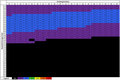
Top 5 positions, low, average and high scores:

This chart shows the low, average and high scores that have placed in the top five positions of challenges. There's no surprise that there is a lot of overlap of the ranges; blue ribbons have been won with scores as low as 6.3972 and a score of 7.7687 has finished as low as 5th place.
Predicting your final position:
Wouldn't be interesting if you could predict what the final position of your image would be at submission? The algorithms that would be needed for this are way above my head. With the amount of subjectivity involved I can't even image it would be possible. However, if your image has been in voting for a while, say maybe on hundred votes :-), and you want to estimate where your image might place, the DPC history may help you.
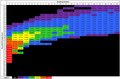
I created the tables below from the historical data comparing rounded average scores to finishing positions, yes I know I need to get a life. They can't predict the future per se, but they can tell you how similar images have placed in the past. For example let's take a stable 6.5 score; by looking at the intersection of Finishing Position 1 and Rounded Average Score 6.5, it shows that images with that score have finished in first place only 0.25% of the time. They have finished in second place 0.76% and third place 1.47%. Adding all three values together shows that 6.5 scores have ribboned a little less than 2.5% of the time. Further calculations show that the percentages for hitting the top 10 and top 20 are quite good though.
For a score of 6.5:
Top 3, 2.5%
Top 10, 30.5%
Top 20, 67.1%
Top 40, 89.6%
Calculating the same for a score of 7.0:
Top 3, 44.0%
Top 10, 93.1%
Top 20, 99.4%
Top 27, 100.0%

If you want to see the data from the tables above follow this link and look for the attachment at the bottom of the page:
Link to Voting Stats site
|
|
|
|
02/09/2011 12:34:10 PM · #2 |
Sooooooo, the average score required to get into the ribbons (ie. yellow) is 6.9139 (with the range being 6.0913-7.8734).
My goodness, that depresses me......I have a long, long way to go before I get close to that!! |
|
|
|
02/13/2011 07:57:37 AM · #3 |
Interesting. I was thinking about this recently myself, actually. I think there has to be a relationship to the number of participants in challenges too. Not necessarily the case, of course, but I'd say if you had 6.5 with 10 participants you'd be more likely to be in the top 10 than had there been 150 participants (sorry to use such a silly example... actually I'm not :P).
Would it be possible to modify that plot for challenges with >x entries.
For example, if you have 6.5 in the "What Doesn't Belong?" challenge. There are 80 entrants. Is percentage likelihood of finishing in the top 5 different to the plots you gave earlier if you considered only the history of challenges that had 80 +/- 20 (say) entrants
I don't think you can know from simply changing your grid there to consider only those categories... Maybe if you were able to go through competitions with between 60 and 100 entries and make plots like your "Top 5 positions, low, average and high scores". If there's a big difference it'd be interesting.
Would it be more intuitive to have a running sum going along the rows? Take average of 7.5. Nearly 60% chance of finishing in 1st place. I think it'd make more sense to say you then have a 85% chance of finishing in the top 2 rather than saying a 27% chance of finishing second.
Maybe not. But would you make a second plot for me anyway? :) Especially for, say, 6.5 and there being a 3% chance of being in 13th place. That means nothing. What does is that you might have a 70% chance of being at this percentile. I know the colours do this... but it's nice (I think) to not have to reference a legend.
Message edited by author 2011-02-13 08:00:44.
|
|
|
|
02/13/2011 08:12:13 PM · #4 |
There is a big correlation between the number of entrants and the score required for top 10. If there's 50 or less entries, a 6.2 will pretty much get you a top 10. If there's 100 or more, usually you need somewhere near a 6.4.
|
|
|
|
02/14/2011 06:24:02 AM · #5 |
Well, I used the grid yesterday and figured I had a 83% chance or so of getting in the top ten in the "what doesn't belong" thread... and I did :)
I also think it might be good if instead of doing the finishing position you did the percentile. That way it's all normalised and applicable for every competition.
I think this is an excellent chart indeed.
|
|
|
|
02/14/2011 07:06:44 AM · #6 |
| It is indeed an interesting grid. I wonder how that data looks for just the last 12 months? Is it wildly different? I would guess the extremes would move but the average would stay about the same? |
|
|
|
02/15/2011 03:13:50 PM · #7 |
Originally posted by NiallOTuama:
I also think it might be good if instead of doing the finishing position you did the percentile... |
I created the "percentile" table. It's nearly impossible to read in this view:

However, if you go to the following link and navigate to the bottom of the page you'll find an excel file with average scores 5.5 and greater and percentiles from 100 to 0 that you can download:
Link
If you scroll down in the file you'll also find a "cumulative" view.
|
|
|
|
02/15/2011 03:37:52 PM · #8 |
Originally posted by DJWoodward:
Originally posted by NiallOTuama:
I also think it might be good if instead of doing the finishing position you did the percentile... |
I created the "percentile" table. It's nearly impossible to read in this view:
However, if you go to the following link and navigate to the bottom of the page you'll find an excel file with average scores 5.5 and greater and percentiles from 100 to 0 that you can download:
Link
If you scroll down in the file you'll also find a "cumulative" view. |
Thanks Del :)
|
|
|
|
02/15/2011 04:06:39 PM · #9 |
Originally posted by paulbtlw:
It is indeed an interesting grid. I wonder how that data looks for just the last 12 months? Is it wildly different? I would guess the extremes would move but the average would stay about the same? |
Here's a real quick attempt at 2010 data only average vs. position:
2002-2010 Data (original table)
Score of 6.5
Top 3, 2.5%
Top 10, 30.5%
Top 20, 67.1%
Top 40, 89.6%
2010 Only Data
Score of 6.5
Top 3, 3.5%
Top 10, 42.6%
Top 20, 76.7%
Top 40, 96.9%
|
|
|
|
02/15/2011 04:34:34 PM · #10 |
Ha! And people thought it had got harder!
Is this a consequence of lower volume? |
|
Home -
Challenges -
Community -
League -
Photos -
Cameras -
Lenses -
Learn -
Prints! -
Help -
Terms of Use -
Privacy -
Top ^
DPChallenge, and website content and design, Copyright © 2001-2024 Challenging Technologies, LLC.
All digital photo copyrights belong to the photographers and may not be used without permission.
Current Server Time: 04/24/2024 04:29:58 PM EDT.


