| Author | Thread |
|
|
08/17/2010 01:52:14 AM · #1 |
Hi Friends,
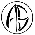
I have designed my LOGO to start with my professional venture.
I need your feedback on the same. Your suggestions will be very helpful to make it more professional.
Thanks a lot in advance.
- Ankur |
|
|
|
08/17/2010 05:01:04 AM · #2 |
Hi Ankur
Some feedback from me:
1. The logo does not indicate to me what it is that you do. I like logo's that incorporate some kind of indication as to the service that is to be provided. I.e. if it is a photographic venture, the round circle could be made to look more like a lens cap, or even include some wording?
2. The lettering could be made to stand out more. Your "S" could be mistaken for a "5" or even the letter "B"
I hope you see this feedback as constructive, and helpful.
Regards
Walter |
|
|
|
08/17/2010 07:13:57 AM · #3 |
Originally posted by walbland:
Hi Ankur
Some feedback from me:
... I like logo's that incorporate some kind of indication as to the service that is to be provided. I.e. if it is a photographic venture, the round circle could be made to look more like a lens cap... |
Or how about aperture blades? |
|
|
|
08/17/2010 07:25:36 AM · #4 |
Originally posted by walbland:
2. The lettering could be made to stand out more. Your "S" could be mistaken for a "5" or even the letter "B" |
...or a capital G, which is what I thought 'til I looked at your username.
To me, it's OK, but it's just not simple enough. It needs to be easily reproducible, and look good on both company letterhead and a coffee mug. |
|
|
|
08/17/2010 07:26:38 AM · #5 |
Thanks Walter.. I will definitly think about your suggestions.
Originally posted by walbland:
Hi Ankur
Some feedback from me:
1. The logo does not indicate to me what it is that you do. I like logo's that incorporate some kind of indication as to the service that is to be provided. I.e. if it is a photographic venture, the round circle could be made to look more like a lens cap, or even include some wording?
2. The lettering could be made to stand out more. Your "S" could be mistaken for a "5" or even the letter "B"
I hope you see this feedback as constructive, and helpful.
Regards
Walter |
|
|
|
|
08/17/2010 07:27:29 AM · #6 |
I had aperture blades in my mind... :)
Originally posted by Silent-Shooter:
Originally posted by walbland:
Hi Ankur
Some feedback from me:
... I like logo's that incorporate some kind of indication as to the service that is to be provided. I.e. if it is a photographic venture, the round circle could be made to look more like a lens cap... |
Or how about aperture blades? |
|
|
|
|
08/17/2010 07:28:40 AM · #7 |
Thanks David...
Originally posted by david_c:
Originally posted by walbland:
2. The lettering could be made to stand out more. Your "S" could be mistaken for a "5" or even the letter "B" |
...or a capital G, which is what I thought 'til I looked at your username.
To me, it's OK, but it's just not simple enough. It needs to be easily reproducible, and look good on both company letterhead and a coffee mug. |
|
|
|
|
08/17/2010 07:33:45 AM · #8 |
| logos should be simple and to the the point, like was suggested, easily reproducible, your letters are too thin and a little indistinguishable, each letter has too many breaks. You might also want to add some color, even ifs its all the same color, something other than black. |
|
Home -
Challenges -
Community -
League -
Photos -
Cameras -
Lenses -
Learn -
Prints! -
Help -
Terms of Use -
Privacy -
Top ^
DPChallenge, and website content and design, Copyright © 2001-2024 Challenging Technologies, LLC.
All digital photo copyrights belong to the photographers and may not be used without permission.
Current Server Time: 04/24/2024 11:52:35 PM EDT.


