| Author | Thread |
|
|
11/20/2009 08:32:43 PM · #1 |
Originally posted by SDW:
The main thing that sticks out to me is that your email address is upside down for that type of layout. Business cards with an area on the edge for text are usually for convince rather than style; when someone puts your card in their wallet. This allows them to see your information without taking out your card. As illustrated in the picture below.
The way you have it now, your information (email address) is upside down. I would consider flipping the information and possibly putting other contact info in that section.
 |
 SDW makes a very valid point...years ago I was told that business cards were good for one thing...tooth picks...sad...all the work you put into making a statement about yourself and they pick their teeth...(random)...lol SDW makes a very valid point...years ago I was told that business cards were good for one thing...tooth picks...sad...all the work you put into making a statement about yourself and they pick their teeth...(random)...lol
|
|
|
|
11/20/2009 08:07:31 PM · #2 |
Originally posted by Tez:
do you not have a phone number or a web address? |
Yes and no. I have a phone number, but I don't want to give it out to patients who are also clients. That could lead to trouble. I do not have a web site at this point.
Thanks TC! I like the Papyrus one. :)
Message edited by author 2009-11-20 20:07:57. |
|
|
|
11/20/2009 07:57:54 PM · #3 |
| do you not have a phone number or a web address? |
|
|
|
11/20/2009 07:53:08 PM · #4 |
Originally posted by vikas:


Since your pictures itself are so amazing, I don't see any point of trying to be creative with fonts, backgrounds, shapes (usual business card stuff). Your name and your pictures speaks well for itself, so here are some quick takes. |
Yeah, man. These are it. |
|
|
|
11/20/2009 07:49:32 PM · #5 |
Allllrighty, here are a few options. One with your favorite font and 2 with other fonts I thought you might enjoy.
I have the indd package file and if you like them, I can send it. Photo would need to be relinked to the edited one, but I figured this would work for just the showing.
This was FUN thanks for letting me play :)


 |
|
|
|
11/20/2009 07:40:50 PM · #6 |
The main thing that sticks out to me is that your email address is upside down for that type of layout. Business cards with an area on the edge for text are usually for convince rather than style; when someone puts your card in their wallet. This allows them to see your information without taking out your card. As illustrated in the picture below.
The way you have it now, your information (email address) is upside down. I would consider flipping the information and possibly putting other contact info in that section.
|
|
|
|
11/20/2009 07:31:43 PM · #7 |
Originally posted by stewzdaman:
People don't care about the pretty picture, they want your contact details. I know it sucks, but it is a fact. You have 4-6 seconds to get the message across.
Name - large bold font
phone number larger bold font
website smaller normal font
//blogof.francescomugnai.com/2009/03/38-new-business-cards-best-of-jan-feb-mar-2009/ |
In my case the patient has already been walking through my "gallery" and asked a nurse "who took those photos?" or "where can I get those photos?". At that point the only message I need to get across is my email. I am not looking to hand these out around town as much. |
|
|
|
11/20/2009 06:35:00 PM · #8 |
People don't care about the pretty picture, they want your contact details. I know it sucks, but it is a fact. You have 4-6 seconds to get the message across.
Name - large bold font
phone number larger bold font
website smaller normal font
//blogof.francescomugnai.com/2009/03/38-new-business-cards-best-of-jan-feb-mar-2009/ |
|
|
|
11/20/2009 06:20:26 PM · #9 |
Originally posted by Ja-9:
Originally posted by DrAchoo:
Thanks for the help everybody. I think it is an improvement over the original design. Eventually you just have to make a decision and I have gone with this as my final:
 |
Jason, looks much better...one last question....can you tighten up the lines between the writing? just curious |
Done. Good idea. Helps take the Jason below the waveline too. |
|
|
|
11/20/2009 06:06:14 PM · #10 |
Originally posted by DrAchoo:
Thanks for the help everybody. I think it is an improvement over the original design. Eventually you just have to make a decision and I have gone with this as my final:
|
Jason, looks much better...one last question....can you tighten up the lines between the writing? just curious |
|
|
|
11/20/2009 05:50:55 PM · #11 |
Thanks for the help everybody. I think it is an improvement over the original design. Eventually you just have to make a decision and I have gone with this as my final:
|
|
|
|
11/20/2009 04:55:35 PM · #12 |
Originally posted by DrAchoo:
Ok, the next iterations:
 
The other picture seems to be the most popular in the office as far as potential cards I've thrown around here. |
I like the font... I'm just curious why are you including the black box on the side.. It takes away from the image, IMHO.. You can always just print that information on the back of your card... Most all sites I believe that print cards allow for printing on the back too, and it wasn't that much more expensive.. Not even sure if I paid extra for that.. I used VistaPrints and my own design.. |
|
|
|
11/20/2009 04:52:25 PM · #13 |
Originally posted by DrAchoo:
Do you get sales that way? I've always wondered if anybody sold anything hung in a restaurant. |
Not an overwhelming amount but I do sell. I live in a small town that has a summer tourist trade and the establishment is a small one women show. Originally I did it as a favor when the owner /cook / friend asked me to hang some work just to help her fill her wall space when she opened. I never intended to sell but people started asking so I kind of eased into it at her urging. Now I hang work up to 24 x 36 Canvas and replace it as it sells. Recently I got a call from a lady that lives in California who had been up here at the end of the summer. She was sorry she did not buy a large canvas I had there and found out from Maryann (the restaurant owner) that it was now sold. I ended up having a 24 x 36 printed on canvas with a deep 2.5� wrap and shipped to her. She loved it! Canvas On Demand gives you a 50% discount if you print two or more so I always end up with a second print free and clear each time I sell one. Pretty cool.
So the short answer is yes.
Message edited by author 2009-11-20 17:00:32. |
|
|
|
11/20/2009 04:46:57 PM · #14 |
Originally posted by vikas:
Since your pictures itself are so amazing, I don't see any point of trying to be creative with fonts, backgrounds, shapes (usual business card stuff). Your name and your pictures speaks well for itself, so here are some quick takes. |
Both. AWESOME.
|
|
|
|
11/20/2009 04:39:53 PM · #15 |
Originally posted by jbsmithana:
edit of the edit: one of the advatages is I hang my work at a local breakfast place and it allows me to staple a bus card next to each photo that matches the photo. |
Hey, that is a great idea. Never thought of that. |
|
|
|
11/20/2009 04:37:50 PM · #16 |
Originally posted by jbsmithana:
Originally posted by DrAchoo:
Ya, those are just a bit more expensive. ;) I'm getting 1000 for $60. |
LOL! yeah, but they are classy and I don't use many.
edit: forgot to say I also received a 20% discount from a coupon I got at Photoshop World. Still expensive for bus cards.
edit of the edit: one of the advatages is I hang my work at a local breakfast place and it allows me to staple a bus card next to each photo that matches the photo. Good touch I thought. |
Do you get sales that way? I've always wondered if anybody sold anything hung in a restaurant. |
|
|
|
11/20/2009 04:29:13 PM · #17 |
Originally posted by DrAchoo:
Ya, those are just a bit more expensive. ;) I'm getting 1000 for $60. |
LOL! yeah, but they are classy and I don't use many.
edit: forgot to say I also received a 20% discount from a coupon I got at Photoshop World. Still expensive for bus cards.
edit of the edit: one of the advatages is I hang my work at a local breakfast place and it allows me to staple a bus card next to each photo that matches the photo. Good touch I thought.
Message edited by author 2009-11-20 16:32:51. |
|
|
|
11/20/2009 04:29:09 PM · #18 |
| Crikey, use Moo, every card different - it's like having a minature portfolio, no cramming the words in - you could use a different font on each one. Well, well worth the money, 1000 cards the same is not very inspirational :) |
|
|
|
11/20/2009 04:17:31 PM · #19 |
| Ya, those are just a bit more expensive. ;) I'm getting 1000 for $60. |
|
|
|
11/20/2009 04:05:49 PM · #20 |
Jason - you might want to look at Moo. They will print your business cards two sided with the text and maybe a small picture on one side and a full size picture on the back. You can use up to 50 of your favorites and they will print them in series. A little more expensive than traditional cards but you get a nice clear business card and still able to show off your work in miniature.
I just did a run and love them. |
|
|
|
11/20/2009 03:50:40 PM · #21 |
Originally posted by DrAchoo:
Ok, the next iterations:
The other picture seems to be the most popular in the office as far as potential cards I've thrown around here. |
I like both of these, but REALLY like the purple one the vikas did ... with Bear's suggestion of moving the text to the bottom and Louis' suggestion to keep the font simple ... |
|
|
|
11/20/2009 03:48:54 PM · #22 |
| These look better, Jason. I would suggest that the word "Email" is redundant -- I think anyone looking at that would understand that it's your email. Personally, I think the "Jason Friesen Photography" would look better as a single line as well. |
|
|
|
11/20/2009 03:44:10 PM · #23 |
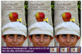
Ok, the next iterations:
The other picture seems to be the most popular in the office as far as potential cards I've thrown around here.
Message edited by author 2009-11-20 15:44:32. |
|
|
|
11/20/2009 03:27:02 PM · #24 |
Originally posted by Louis:
Originally posted by DrAchoo:
Anybody like the font I used on this entry? |
Holy seventies. ;) |
first thing I learned in owning my business..is that you have to keep it plain vanilla for fonts...alot of people can not read anything beyond PV... |
|
|
|
11/20/2009 02:37:02 PM · #25 |
Originally posted by DrAchoo:
I'm guessing there is this whole subculture of font aficionados who cringe with my simple, "ooh, that's purdy" approach. :) |
If you're interested at all in font design and its history try to catch this documentary on Helvetica.
PS: Please make the type large enough to read! I just put an email on my card instead of a phome # ... and I print them 3-up on a 4x6 print (usually at Costco) and cut them out myself, so people see them with the same paper/technology as the prints I make
Message edited by author 2009-11-20 14:42:08. |
|
Home -
Challenges -
Community -
League -
Photos -
Cameras -
Lenses -
Learn -
Prints! -
Help -
Terms of Use -
Privacy -
Top ^
DPChallenge, and website content and design, Copyright © 2001-2024 Challenging Technologies, LLC.
All digital photo copyrights belong to the photographers and may not be used without permission.
Current Server Time: 04/24/2024 02:10:30 AM EDT.


