| Author | Thread |
|
|
01/22/2009 07:29:16 AM · #1 |
Took a chance and didn't do a landscape.....oh, not so good.
Originally posted by sulamk:
Ansel Adams portfolio did not just contain landscapes , google him and see. |
|
|
|
|
01/22/2009 06:53:59 AM · #2 |
Originally posted by sulamk:
I also liked mine but it is getting slammed brown ribbon here I come, but what is worse the 2 comments are blaming something in the image on my editing in actual fact that is in the original image caused by the way I lit it! oh well It is a learning experience I guess! |
Not only is mine getting slammed 3.945
SC have now asked me to send the original for validation! which I did 18 something megs of my monthly 3G data! Wouldn't mind if it was worth it and didn't feel that it was because of my comment in the statement above.
Message edited by author 2009-01-22 06:55:09. |
|
|
|
01/21/2009 09:14:09 PM · #3 |
Originally posted by Artifacts:
[
Why Robert... you surprise me. |
I think you';re reading too much into what I said. I basically said two things:
1. I don't think the ribbon shot is lacking in its handling of the midtones; I don't see where Sidwell's is superior in that respect.
2. The ribbon winner had a stronger, more dynamic composition, and thus it was scored higher, even if we give the technical edge to the Sidwell image.
From my perspective, you're placing too much emphasis on technique here, perhaps. It's still a competition for the best image, within certain loosely-defined constraints ("in the style of AA"). The ribbon winner I posted easily falls within those stylistic constraints, even if one agrees that the Sidwell shot is "more Anselly" in its processing. And I'd argue that the Sidwell shots is a bit LESS "Anselly" in its composition, so it sort of levels out don't you think?
It's kind of a lame discussion anyway, 'cuz both shots finished very well. I just was trying to point out WHY (IMO) the Sidwell shot, for all its excellent technicals, didn't crack the top 5. For the matter of that, my OWN shot didn't crack the top 5, and I think it's a very faithful representatiuon of Zone System photography, myself.
R.
|
|
|
|
01/21/2009 09:01:54 PM · #4 |
Originally posted by Judi:
Originally posted by JulietNN:
LOL, I got your comment Bear "Note to self-Comment later"
Its that bad!!!!!!!!!!!!!!!! lolol |
Don't worry I got that same comment from Bear. I reckon I am gunna get my ass kicked!!!! |
Nah, I saw a whole bunch I want to comment on, and the only way to differentiate 'em from the others is to tag 'em with a comment or vote 'em one, which would you prefer as a placeholder? Jejeje� Now I'm working my way through 'em from front o back in the order they happen to be stacked in my pile.
With everything that's going on with me right now I may not be able to get back to all of them though before voting ends, but I'll try my best...
R.
ETA: just knocked off a few more, I've commented on 49 of the images so far, some of them at length.
Message edited by author 2009-01-21 22:07:17.
|
|
|
|
01/21/2009 08:56:02 PM · #5 |
Originally posted by Rob O:
This may have been discussed (I only scanned posts to this point in the thread), but I suspect display (monitor) quality will adversely effect voting for this challenge. ...In fact, my entry shows nice detail in the shadows and highlights which push the right side without clipping when viewed on the aforementioned 24" LCD at home, the one used for all my post processing, while the shadows are muddy and highlights a bit hot when viewed on my cheap work LCD. The the result on a crappy display is one of an image that's a bit dark overall with extreme contrast due to the highlights. And if I'd processed to look "optimal" on this crappy display, it would look completely flat on a proper monitor.
*shrug* |
Its even better when, on the same entry, one person thinks your whites aren't white enough and another thinks your whites are blown. I've given up on this issue, and merely note in my comments that, if you have a good monitor, you SHOULD be able to see all the blocks below the image on the voting screen.
Nothing you can do but hope you get close enough to the middle of the road to keep from getting 'too dark' and 'too light' comments. |
|
|
|
01/21/2009 08:31:48 PM · #6 |
Originally posted by JulietNN:
LOL, I got your comment Bear "Note to self-Comment later"
Its that bad!!!!!!!!!!!!!!!! lolol |
Don't worry I got that same comment from Bear. I reckon I am gunna get my ass kicked!!!!
|
|
|
|
01/21/2009 08:22:02 PM · #7 |
LOL, I got your comment Bear "Note to self-Comment later"
Its that bad!!!!!!!!!!!!!!!! lolol |
|
|
|
01/21/2009 03:37:16 PM · #8 |
Originally posted by Bear_Music:
 ... ...
How is that image superior to the blue ribbon winner in expressing the mid tones well?
And the ribbon-winning shot has a MUCH stronger composition going for it as well... IMO the Sidwell shot, while technically excellent, suffered from a relatively static composition. We sometimes get so hung up on Ansel's technique that we fail to recognize how extraordinary his composition often is.
R. |
Why Robert... you surprise me.
Mine, of course, is just opinion but in an Adams challenge the best rendition of the zone system in a landscape image is probably about as classic Ansel as you can get. It IS Ansel Adams.
I agree with you the blue had more interesting composition. And surely Adams can compose with the best of them but it is his masterful processing that sets him apart. He is famous more so for his attention to detail and his technical skill producing a perfect photograph than anything else. Other photographers have captured the same scenes but he is the one who brought them to everlasting life. Another hallmark of Ansel's photography was his phenomenal and unwavering patience for waiting days, weeks, months and years to be at the right place at the right time to capture the image in the right light.
Even today with all our fancy cameras and software tools we only approach the technical skill he achieved more than half a century ago with far more difficult tools to work with.
The Sidwell image reproduces Adams's technical skill better than any other. That is why it should have won. If Sidwell had post processed the ribbon winner than it would have been deserving.
The other image you showed above is another excellent, excellent example of Adams-like work and is exactly where it should be, 2nd. But it appears "muddy" by direct comparison to Sidwell's.
And speaking of composition, that 1st place cactus shot is composed nothing like most of Adams's best known saguaro images. It is as if Adams looked on the saguaro as a study in desert flora and always devoted a great deal of image real estate to the cactus itself so that the viewer could experience and learn about the saguaro's intimate detail. That other image had none of that.
It got the blue only because of the coincidental happenstance of a dramatic sky at shutter time, not because of any strong connections it has in common with Ansel Adams's work. It fit the DPC success mold.
Like I said... just my opinion. |
|
|
|
01/21/2009 02:40:50 PM · #9 |
Originally posted by sulamk:
I also liked mine but it is getting slammed brown ribbon here I come, but what is worse the 2 comments are blaming something in the image on my editing in actual fact that is in the original image caused by the way I lit it! oh well It is a learning experience I guess! |
Alright!!! Some competition for the brown ribbon... don't feel too bad as I am right at the bottom with you. I knew my shot wasn't very good, but it is what it is. Hopefully I will do better next time. |
|
|
|
01/21/2009 02:21:18 PM · #10 |
Originally posted by Artifacts:
In my opinion the image that ultimately placed 15th was by far the class of the field and closest to the classic tonal quality we all associate with Adams. It should have finished 1st. It captured mid tones exceptionally well which is a hallmark of his work and an area imitators usually fail to capture. He even gave it a white border:
|
How is that image superior to the blue ribbon winner in expressing the mid tones well?
And the ribbon-winning shot has a MUCH stronger composition going for it as well... IMO the Sidwell shot, while technically excellent, suffered from a relatively static composition. We sometimes get so hung up on Ansel's technique that we fail to recognize how extraordinary his composition often is.
R.
|
|
|
|
01/21/2009 02:04:57 PM · #11 |
Originally posted by pedrobop:
I'm not feeling very confortable to vote in this challenge because i'm not sure if i understood what is important to make a photo look like Ansel Adams work. I saw that give low votes for non-landscapes shots is wrong, but landscapes are a strong thing in A.A. work, isn`t it? So.. what should i look for, speaking about technics and other things...I saw Ansel's work in some websites, but i don't want to be unfair. |
Just vote on your own opinion, dont let the rules decide how you feel about the photos. |
|
|
|
01/21/2009 01:47:45 PM · #12 |
This may have been discussed (I only scanned posts to this point in the thread), but I suspect display (monitor) quality will adversely effect voting for this challenge. After voting last night using my calibrated 24" Dell LCD, which can discern the entire tonal spectrum from pure white to pure black, then reviewing my scores from work this morning on a middle-of-the-road 19" LCD (with analog input and integrated video card on the mobo), I was shocked how different some of the entries looked; I know I would have voted a couple lower based on what I see at work compared with how they looked from home. In fact, my entry shows nice detail in the shadows and highlights which push the right side without clipping when viewed on the aforementioned 24" LCD at home, the one used for all my post processing, while the shadows are muddy and highlights a bit hot when viewed on my cheap work LCD. The the result on a crappy display is one of an image that's a bit dark overall with extreme contrast due to the highlights. And if I'd processed to look "optimal" on this crappy display, it would look completely flat on a proper monitor.
I realize the issue of calibrated vs non-calibrated monitors, DVI vs analog input, general disparity in quality of displays/graphics cards, etc is common to all challenges. Still, it's so important when comparing an image's technical qualities to AA's work.
*shrug* |
|
|
|
01/21/2009 11:23:12 AM · #13 |
Originally posted by Bear_Music:
Originally posted by chip_k:
Last Ansel challenge someone posted a real Ansel and it originally placed 11th. .......... I think was a good example of the competition quality of DPC's shooters. ......... |
The "someone" was me, with the help of SC, and it wasn't a very good reproduction of an Ansel either. No surprise at all that it didn't make it to the ribbons, given the technical flaws of the web version, and kudos to the voters that they saw beyond the flaws to the real quality of the image itself and placed it very high in the challenge.
R. |
It is unfortunate that the digital quality of the chosen image was not particularly good, otherwise it would have placed higher than 11th.
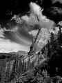
In my opinion the image that ultimately placed 15th was by far the class of the field and closest to the classic tonal quality we all associate with Adams. It should have finished 1st. It captured mid tones exceptionally well which is a hallmark of his work and an area imitators usually fail to capture. He even gave it a white border:
Willard Knob by David Sidwell |
|
|
|
01/21/2009 11:00:48 AM · #14 |
| I'm not feeling very confortable to vote in this challenge because i'm not sure if i understood what is important to make a photo look like Ansel Adams work. I saw that give low votes for non-landscapes shots is wrong, but landscapes are a strong thing in A.A. work, isn`t it? So.. what should i look for, speaking about technics and other things...I saw Ansel's work in some websites, but i don't want to be unfair. |
|
|
|
01/21/2009 08:13:51 AM · #15 |
| I also liked mine but it is getting slammed brown ribbon here I come, but what is worse the 2 comments are blaming something in the image on my editing in actual fact that is in the original image caused by the way I lit it! oh well It is a learning experience I guess! |
|
|
|
01/21/2009 07:32:03 AM · #16 |
well I am in and I am pretty shocked at my score. 5.2. i drove to a place he had shot, did all the zones, everyone I that saw the shot was WWWWWOOOOOOOOWWWWW adn for once I did actually think it was a front pager.
pffft
Shudda gone with the damn cactus shot
Message edited by author 2009-01-21 07:46:35. |
|
|
|
01/21/2009 07:28:52 AM · #17 |
I wish I'd been able to enter this one, but I shot it a few months too early.
I look forward to voting in the challenge. |
|
|
|
01/20/2009 05:22:05 PM · #18 |
I don't expect to score too highly, partly because I tend to dabble in B&W more than embrace it (plus I'm still getting to grips with the more advanced editing). Also though, I don't have access to the expansive landscapes, so I tried to mimic my estimation of his style instead. Regardless of scoring though, it was a good experience for me, as it was the first time that I'd deliberately set out to photograph for a challenge, which is probably the next stage in my development as a photographer. I'd set out with an idea in mind before and have many ideas in my head for when conditions are right, but that's not quite the same and perhaps now, I'll be better able to implement my ideas. It was also the first time that I'd deliberately set out to shoot in B&W, as opposed to thinking something would look better in B&W than colour (either at the time of shooting or after). While I would have liked the odd cloud in the sky, at least it wasn't the dull grey of the day before or even an hour earlier, I almost abandoned the idea completely, until the weather changed.
As many others have said, I'm looking forward to seeing the entries. |
|
|
|
01/20/2009 05:01:22 PM · #19 |
Originally posted by Bear_Music:
Originally posted by limerick:

Bear_Music I am curious to know what you think of this. You seem to know a lot about Ansel. |
Yeah, I actually knew Ansel, and did a little work with him. You did a good job here. He made images like this, but they aren't as well known. It has pretty much the hallmarks of a good Zone System image, especially as regards the luminosity in the middle grays. My gut feeling is it wouldn't have scored especially well because the voters will be looking for more dramatic, scenic renderings. But I could be wrong, and I hope I am :-) The voters have pleasantlyu surprised me sometimes in the past...
R. |
Yes I agree with you on the votes. I dont think Ansel did many farmscapes so I tried this one but I think the voters wont be pleased. Thank you for taking the time and the nice comment! |
|
|
|
01/20/2009 04:57:54 PM · #20 |
Originally posted by charliebaker:
Check out the newly published Natural Affinities: Georgia O'Keeffe and Ansel Adams, (New York: Little, Brown and Co., 2008). I picked it up last month. This "coffee table" art/photography book features beautiful plates of O'Keeffe's artwork and Adam's photography, often of similar subjects around New Mexico. The book also has several essays on O'Keeffe, Adams and New Mexico by Richard Woodward and Barbara Buhler Lynes. |
Beautiful book, isn't it? :-)
R.
|
|
|
|
01/20/2009 04:57:17 PM · #21 |
Originally posted by limerick:
Bear_Music I am curious to know what you think of this. You seem to know a lot about Ansel. |
Yeah, I actually knew Ansel, and did a little work with him. You did a good job here. He made images like this, but they aren't as well known. It has pretty much the hallmarks of a good Zone System image, especially as regards the luminosity in the middle grays. My gut feeling is it wouldn't have scored especially well because the voters will be looking for more dramatic, scenic renderings. But I could be wrong, and I hope I am :-) The voters have pleasantlyu surprised me sometimes in the past...
R.
|
|
|
|
01/20/2009 03:45:54 PM · #22 |
Originally posted by Bear_Music:
Originally posted by Balko:
I have ideas .... and being in New Mexico is finally a plus! Now I need the weather gods to cooperate... :) |
Ansel loved New Mexico, did a lot of work around Santa Fe and Taos. He loved photographing the Pueblo architecture, was fascinated by the adobe forms. Our "actual Ansel" entry in the first AA challenge, in fact, was one of these Adobe shots.
R. |
Check out the newly published Natural Affinities: Georgia O'Keeffe and Ansel Adams, (New York: Little, Brown and Co., 2008). I picked it up last month. This "coffee table" art/photography book features beautiful plates of O'Keeffe's artwork and Adam's photography, often of similar subjects around New Mexico. The book also has several essays on O'Keeffe, Adams and New Mexico by Richard Woodward and Barbara Buhler Lynes. |
|
|
|
01/20/2009 12:23:30 PM · #23 |
Bear_Music I am curious to know what you think of this. You seem to know a lot about Ansel. Anyone can join in to.
It was going to be my entry but I have switched to glasses after getting a good idea for that one.
Thanks from Agnes |
|
|
|
01/20/2009 11:54:46 AM · #24 |
Originally posted by Artifacts:
Ansel Adams Mountainscape
The man was a technical wizard and photographic genius of the first order of magnitude working in film, chemicals baths, enlargers and photo paper. This picture was taken from the roof of his car.
It is unimaginable what he could accomplish with today's technology and software. |
IMO that looks like a bad B&W 3D rendering out of Bryce maybe from the late 90's, or its a seriously bad scan... |
|
|
|
01/20/2009 11:32:09 AM · #25 |
Interesting to see that there are twice as many entries in this challenge opposed to glasses. Glad to see people giving it a shot. I look forward to seeing what comes out of this challenge.
|
|


