| Author | Thread |
|
|
12/23/2007 03:59:04 PM · #1 |
I liked the processed results less when I first saw the image than I did after I "studied" it for a few moments. The HDR is a bit over the top for my taste, but I can't say that I don't like it. Actually I like it quite a bit. To use an analogy: I could say that Picasso's "Guernica" is a bit over the top as his presentation stretches reality, but I certainly "like" the painting. In a similar fashion I like your over-the-top HDR. It stretches reality too. But I still appreciate it...especially the more time I take with the photo.
All of which leads me to say something else about the whole process of these challenges (and the entire DPC site, for that matter). If we click through photos fast just to vote on them, then first (fleeting) impressions will likely lead to viseral reactions and equally viseral votes (which is ok, its a matter of choice and available time). On the other hand, if voters take a few moments with a photo the entire experience is more enriching. I learn more by paying closer attention to what someone is trying to accomplish and that leads me to imitate or otherwise extend myself as a photographer (which is what is important to me). So I say, photographers "should" go over the top from time to time. That's how we hone our skills and how photography expands our collective experience.
...and with a face like yours...the possibilities are endless. (mine too, I might add).
|
|
|
|
12/23/2007 03:26:47 PM · #2 |
| Right. Had forgotten whose entry that was. (Somehow the title is greater than the book; maybe we could have a whole challenge based on it, the title). |
|
|
|
12/23/2007 02:14:34 PM · #3 |
Originally posted by Dan_Cottle:
Thank you for explaining it Bear Music.
Now don't get me wrong, you are a wonderful photographer and I really enjoy alot of your photos, and even though it does do what you wanted it too, I still don't "like" it. I am biased against HDR as a whole I supose. |
That's absolutely OK, of course; it isn't to everyone's taste.
R.
|
|
|
|
12/23/2007 02:13:55 PM · #4 |
Originally posted by tnun:
Great thread. Bear's before and after most illuminating. Vertiginous one of my favourite words, conjures the unBearable lightness of being. |
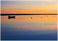
Speaking of which:
R.
|
|
|
|
12/23/2007 02:08:45 PM · #5 |
Thank you for explaining it Bear Music.
Now don't get me wrong, you are a wonderful photographer and I really enjoy alot of your photos, and even though it does do what you wanted it too, I still don't "like" it. I am biased against HDR as a whole I supose. |
|
|
|
12/23/2007 01:58:52 PM · #6 |
| Great thread. Bear's before and after most illuminating. Vertiginous one of my favourite words, conjures the unBearable lightness of being. |
|
|
|
12/23/2007 01:58:44 PM · #7 |
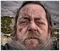
Robert, this is an awesome image, period, no qualifiers needed IMO.
|
|
|
|
12/23/2007 01:50:43 PM · #8 |
| The thing that is so great about the self potraits is how much of our personalities came through in them. I liked the ones that were a little bit different and personal, and I think this is one of those. Not everyone "gets" it, but it obviously has personal meaning to the owner of the shot and I think that's what's great about it. Not everyone got my SP either, but I think it said something personal about me and that's what I was trying to accomplish. Standard, smiley headshots are fine, but not nearly as interesting and personal. I think the tone mapping in Bear_musics shot is what took it from a regular old photo to a really personal self portrait. I think you either get it or you don't. I personally like it! |
|
|
|
12/23/2007 01:38:11 PM · #9 |
Originally posted by ClubJuggle:
I'll get back to you as soon as I finish looking up "vertiginous".
~Terry |
Ain't education wonderful? ;-)
R.
|
|
|
|
12/23/2007 11:50:27 AM · #10 |
I'll get back to you as soon as I finish looking up "vertiginous".
~Terry
|
|
|
|
12/23/2007 11:40:28 AM · #11 |
Originally posted by routerguy666:
Originally posted by Bear_Music:
2. Accentuated every single wrinkle, scar, and age mark that I wear on my face.
|
That's a mug made for high constrast b/w if I've ever seen one! |
Thanks, I think :-)
R.
|
|
|
|
12/23/2007 09:43:02 AM · #12 |
Originally posted by Bear_Music:
2. Accentuated every single wrinkle, scar, and age mark that I wear on my face.
|
That's a mug made for high constrast b/w if I've ever seen one! |
|
|
|
12/23/2007 08:08:56 AM · #13 |
| Truthfully, at first I didn�t particularly care for this type of processing, in it�s infancy it was usually overdone, making photos look cartoon like. Out of this group a few emerged that took tone mapping and mastered it. My only problem with tone mapping now, is how far short in skill ,my attempts compare to the few like Robert. |
|
|
|
12/23/2007 05:58:45 AM · #14 |
| It's so amazing to me the different tastes that people have. I really like this kind of processing and thought your SP was fantastic. It doesn't look over the top to me at all. I love doing (trying to do) casual, fun shots of people with this processing. It brings out so much character. |
|
|
|
12/23/2007 01:05:01 AM · #15 |
Your challenge entry got VERY high marks from me Robert. I really think the TM version created a wonderful character study, full of personality, wisdom, and grit.
After seeing the original (unTMed) version, I agree that it is good and has some great personal intrigues,.. but I think you definitely made the right choice. ;-)
Keep up the amazing work. You are one of the reasons I have stuck with DPC. You totally rock in my book dude! |
|
|
|
12/22/2007 10:39:46 PM · #16 |
Just found this thread. As I commented during voting, it's over the top to me, so I voted it a 5. But I would've voted the original the same, too. There's no question the editing added interest, but it wasn't a direction I found I enjoyed.
But that doesn't really matter for this thread. What I really want to say is how much I appreciate your explaining your reasoning for doing it. The teaching point is to have a reason to do things, not just randomly move sliders around. You set out with a goal and you accomplished it. You happened to also impress many more voters than those who shared my opinion. But as I often find myself commenting (and Puckzzz, this applies to your shot, too), if YOU like it, that's most important. If you also find an audience who likes it, that's even better. :)
|
|
|
|
12/13/2007 04:27:47 PM · #17 |
I just LOVE the edited version.
I don't care what people think about so called over edited shots. I did with my SP and got the score to prove it. But I still like my shot.
It´s all about what you want to say with your photo. And this one does just that! |
|
|
|
12/13/2007 04:19:17 PM · #18 |
Originally posted by littlegett:
I love this style, and I gave this image a 10 and believe it should have taken the blue. I believe what you were trying to convey came out perfectly, only being rough, most people didn't understand or care to understand it. I think its Fantastic. |
Had you left it closer to the original; I would have been closer to giving it a score more in the 4-5 range. The original isn't really anything special (I mean this in a nice way :-D). The one you've edited just draws the viewer in to take a closer look at each wrinkle, hair, scar, and or mark on your face. A very nice job, congratulations on a great finish. -BB
|
|
|
|
12/13/2007 04:04:50 PM · #19 |
FWIW, generally I find HDR/tone mapping to be overdone. It's not a tool for every image as some people seem to think. It's one tool in what should be a box full of tools.
In this case, however, I like what it does and the feeling it gives to the face, making it look as if it's seen 100 seasons working on the deck of a wooden ship. |
|
|
|
12/13/2007 02:47:35 PM · #20 |
Originally posted by trevytrev:
I thought of Ernest Hemingway's The Old Man and the Sea. |
That was my working title, actually. Then the Mishima occurred to me.
R.
|
|
|
|
12/13/2007 02:19:26 PM · #21 |
Funny thing is when this challenge was announced I thought that Bear_Music would be perfect for this type of PP. He is older so he has more lines on his face(no offense Bear) and as a great beard. I do believe that this type of PP is overused alot but I think in this case it was perfect for the portrait. Add the relation he wanted the viewer to know he had w/ the Sea and I think its great. It was one of my top picks for the challenge. I totally understand how some may not like it though and totally respect that, to each his own. Nice work Robert and everyone else as there were some great shots that didn't make the front page.
Edit: I thought of Ernest Hemingways The Old Man and the Sea.
Message edited by author 2007-12-13 14:21:57. |
|
|
|
12/13/2007 01:55:41 PM · #22 |
| I tend to distrust anything that can dominate a photo enough to be called a "style." In this case, the tonemapping matched your (original) title perfectly. It made your face part of, not the ocean, but the shore, the embattled interface between land and sea. I didn't vote because I could not find any way to vote on the picture without voting on the man, but it's easily one of the best photos in the top 10. |
|
|
|
12/13/2007 01:38:35 PM · #23 |
I love this style, and I gave this image a 10 and believe it should have taken the blue. I believe what you were trying to convey came out perfectly, only being rough, most people didn't understand or care to understand it. I think its Fantastic.
|
|
|
|
12/13/2007 01:36:26 PM · #24 |
Originally posted by karmat:
Robert does know better, and even clearly stated that he did not mind the comment -- that it was a valid opinion. There are *many* on the site who share the view, so I think Mr. Bear was simply explaining why he chose to edit in this way. |
Thanks, Karma. That's exactly why I posted. There's this whole "tone mapping: love it or hate it" thing that goes on in here, so I thought I'd explain WHY this image is tone mapped, not for any kind of personal argument's sake, but just to explain what thought process created it. I think this kind of work does have its place :-)
I completely understand why some are turned off by it.
R.
|
|
|
|
12/13/2007 12:32:28 PM · #25 |
| I think it's a lovely portrait, you have a wonderful face :) The one thing that bothers me about this technique used on people is that they end up looking grubby. I notice you mention the greyness yourself. :) |
|
Home -
Challenges -
Community -
League -
Photos -
Cameras -
Lenses -
Learn -
Prints! -
Help -
Terms of Use -
Privacy -
Top ^
DPChallenge, and website content and design, Copyright © 2001-2024 Challenging Technologies, LLC.
All digital photo copyrights belong to the photographers and may not be used without permission.
Current Server Time: 04/25/2024 09:14:13 AM EDT.


