| Author | Thread |
|
|
08/30/2019 11:49:51 AM · #1 |
The clarity of phones is amazing. I'm using my Galaxy 8+ a LOT. Look at the definition in these:
  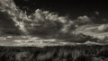
Message edited by author 2019-08-30 11:51:19. |
|
|
|
08/30/2019 11:36:24 AM · #2 |
Originally posted by Pixelstate:
I've not participated in either the forums or the challenges for some time.. I'm experimenting with an entry this week but I've no doubt that a shot taken on a 35mm f1.4 will score better than the same shot taken on an iPhone.. |

I did pretty well with an iPhone shot on a challenge that finished this week.
|
|
|
|
08/30/2019 03:43:38 AM · #3 |
Originally posted by digifotojo:
Originally posted by Pixelstate:
I've not participated in either the forums or the challenges for some time.. I'm experimenting with an entry this week but I've no doubt that a shot taken on a 35mm f1.4 will score better than the same shot taken on an iPhone.. |
I think Samsung Galaxy S9/S9+ might knock your socks off. ;-) |
The iPhone X knocks my socks off.. :)
I took a snapshot of a waiter bringing a cocktail recently - This 'in the moment' shot amazes me where Technology has reached..

Message edited by author 2019-08-30 03:47:42. |
|
|
|
08/29/2019 05:44:44 PM · #4 |
Originally posted by Pixelstate:
I've not participated in either the forums or the challenges for some time.. I'm experimenting with an entry this week but I've no doubt that a shot taken on a 35mm f1.4 will score better than the same shot taken on an iPhone.. |
I think Samsung Galaxy S9/S9+ might knock your socks off. ;-)
Message edited by author 2019-08-29 17:45:06. |
|
|
|
08/29/2019 04:32:37 PM · #5 |
Originally posted by Pixelstate:
I've not participated in either the forums or the challenges for some time.. I'm experimenting with an entry this week but I've no doubt that a shot taken on a 35mm f1.4 will score better than the same shot taken on an iPhone.. |
I think you might want to entertain some degree of doubt ... |
|
|
|
08/29/2019 03:11:59 PM · #6 |
| I've not participated in either the forums or the challenges for some time.. I'm experimenting with an entry this week but I've no doubt that a shot taken on a 35mm f1.4 will score better than the same shot taken on an iPhone.. |
|
|
|
08/29/2019 01:22:52 PM · #7 |
Originally posted by Bear_Music:
Originally posted by digifotojo:
6.0 is nothing to cry over. You might try being a little less critical of yourself, relax.. it's only a contest. |
Margaret's NOT "crying over it". She asked an honest question in a non-confrontational way. This is part of an ongoing quest by her to find out what makes the voters tick. We welcome discussions like this in the forums, actually :-) |
If you want to have a discussion about which image is stronger and why.. that makes a lot of sense. I recently started using Eric's Canon EF 100mm f/2.8 Macro lens and the difference in the detail is not only obvious, it's amazing. I'm hoping to score better with this lens. (really need to add a few more ribbons) |
|
|
|
08/29/2019 03:51:07 AM · #8 |
I didn't vote in the challenge.
It is a great image with solid composition and energy. It perhaps lacks the overall impact to flip the '6' voters' in '7' voters - Most folks skim pretty quickly through the entries and make quick judgements.
The 'flare' across the middle does not add to the image IMO and as it feels neither here or there its effect is overall detrimental. The same with the water flow it is perhaps not a long enough exposure to create the impact of 'soft' water flow contrasting with sharp rocks.
I would not give up, you have demonstrated a good eye for a scene. DPC voters are fickle and the 'best' images don't always carry away the prize.. but they do usually share a common trait of immediate impact.
|
|
|
|
08/29/2019 03:23:24 AM · #9 |
Original looked better but not much better...
And these
Originally posted by marnet:
OK, to summarize:
1. boring, déjà vu, etc :( true...
2. not quite on the challenge topic, sort of DNMC
3. technically not good - too blurry, overexposed, the plant on top left too bright, glare on the the water
4. too short exposure, more smoothing needed
5. personal likes/dislikes
Thanks! I learned something! Anita, beware! ;) |
Mine got 5.77 but I was pleasantly surprised with the score :)
 |
|
|
|
08/29/2019 01:47:35 AM · #10 |
Originally posted by Bear_Music:
Originally posted by digifotojo:
6.0 is nothing to cry over. You might try being a little less critical of yourself, relax.. it's only a contest. |
Margaret's NOT "crying over it". She asked an honest question in a non-confrontational way. This is part of an ongoing quest by her to find out what makes the voters tick. We welcome discussions like this in the forums, actually :-) |
Well said, Bear :) |
|
|
|
08/28/2019 11:35:41 PM · #11 |
Originally posted by digifotojo:
6.0 is nothing to cry over. You might try being a little less critical of yourself, relax.. it's only a contest. |
Margaret's NOT "crying over it". She asked an honest question in a non-confrontational way. This is part of an ongoing quest by her to find out what makes the voters tick. We welcome discussions like this in the forums, actually :-) |
|
|
|
08/28/2019 01:07:41 PM · #12 |
| First off the image scored a 6.0 which is not a bad score. Secondly, the challenge specified Puddles, Ponds, or Streams. Maybe you could shoehorn it into streams however, the water is running vertically throughout the image which disqualifies it as a stream in the literal sense. The waterfall by DistantColours shows the pond below but yours does not. Had you included the pond or stream with your waterfall it probably would have scored better but, again.. 6.0 is nothing to cry over. You might try being a little less critical of yourself, relax.. it's only a contest. |
|
|
|
08/28/2019 12:15:37 PM · #13 |
Originally posted by GeorgesBogaert:
I gave you a 6, but now that I see your original unedited version, I just wonder why you didn't enter that one.
No need to draw the viewer to a spot in this image, the whole scene stands on its own. |
Agreed. I much prefer the original. |
|
|
|
08/28/2019 11:52:23 AM · #14 |
I gave you a 6, but now that I see your original unedited version, I just wonder why you didn't enter that one.
No need to draw the viewer to a spot in this image, the whole scene stands on its own.
|
|
|
|
08/28/2019 10:36:30 AM · #15 |
The "original" is much stronger, Margaret. IMO anyway :-)
Message edited by author 2019-08-28 10:36:46. |
|
|
|
08/28/2019 09:59:02 AM · #16 |
Originally posted by marnet:
I just thought the image with the basic PP was boring so I tried to make it look dreamy. Very clearly it did not work. |
Nah, it looked artificial.
I would have given the original an extra point or two because the PP wasn't forced.
For myself it was the orange tinted diagonal band that was trying to simulate the sun coming down that really put me off. If you take a look where it delineates on the rocks and how it changes as you approach the right side of the image it didn't make sense (or would have been highly unlikely in a natural setting). |
|
|
|
08/28/2019 09:23:43 AM · #17 |
Since the feedback keeps on coming (thanks!) I thought I will post Before/After images - as taken with some basic PP compared with the entry:

There were no blown highlights, I just thought the image with the basic PP was boring so I tried to make it look dreamy. Very clearly it did not work. |
|
|
|
08/28/2019 08:57:24 AM · #18 |
I scored you a 6 - above my average for the challenge, but I do remember being in a bit of a quandary with it.
Pros: Met the challenge for me; I liked the composition, and the inclusion of the greens in the upper left; I felt the shutter speed was an appropriate choice - and gave the feel of a small mountain stream. A longer shutter speed to give a more silky appearance may be the fashion at the moment (and goodness, I've done it to death myself) but I like this.
Cons: Appearance of a very slight magenta caste; highlights in foreground rock seem too bright - at first I thought it was over-exposed, but I don't think the whites are blown, but I find them uncomfortable to view and draw the eye; doesn't seem as finely focussed as I would expect of a landscape photo - did you use a tripod, is your depth of field sufficient?
By way of comparison, I scored Distant Colours' waterfall a 7 and Georges' valley an 8. |
|
|
|
08/28/2019 08:40:32 AM · #19 |
I scored it a 6. I like it. To echo some others I think I would have liked it a little more with a bit longer SS. I also felt it was a tad bit over sharpened.
Message edited by author 2019-08-28 08:41:05. |
|
|
|
08/27/2019 02:49:59 PM · #20 |
Originally posted by vawendy:
Hmmm... I didn't realize that no one was giving you two a run for the money. I'm late to the game -- but perhaps I should step it up and notch. :P |
You are on Wendy! :) |
|
|
|
08/27/2019 01:05:13 PM · #21 |
Originally posted by Bear_Music:
I'll echo a couple of people: fine image, wrong challenge. "Waterfall" felt a bit like cheating, in this challenge... And technically it's not up to your usual standards, Margaret. And you STILL got a 6 and almost cracked top 10 :-) |
Listen to the Bear!! ;-) |
|
|
|
08/27/2019 12:44:54 PM · #22 |
Originally posted by marnet:
OK, to summarize:
1. boring, déjà vu, etc
2. not quite on the challenge topic, sort of DNMC
3. technically not good - too blurry, overexposed, the plant on top left too bright, glare on the the water
4. too short exposure, more smoothing needed
5. personal likes/dislikes
Thanks! I learned something! Anita, beware! ;) |
Hmmm... I didn't realize that no one was giving you two a run for the money. I'm late to the game -- but perhaps I should step it up and notch. :P |
|
|
|
08/27/2019 12:34:51 PM · #23 |
OK, to summarize:
1. boring, déjà vu, etc
2. not quite on the challenge topic, sort of DNMC
3. technically not good - too blurry, overexposed, the plant on top left too bright, glare on the the water
4. too short exposure, more smoothing needed
5. personal likes/dislikes
Thanks! I learned something! Anita, beware! ;)
Message edited by author 2019-08-27 12:35:18. |
|
|
|
08/26/2019 01:36:02 PM · #24 |
| The same thing happened in Low Key whereas some ppl didn't feel an image met the challenge. I did my research ahead of time so I know what low key entails but you can't convince some voters. |
|
|
|
08/26/2019 11:31:45 AM · #25 |
I'm glad you're getting feedback. This is the type of question we SHOULD be asking. It's not a moaning or complaining, it's simply "why didn't it work for you?"
I actually thought it fit all right. It could fit the stream option.
However...
For me it was more of a: been there, done that, got the tshirt. Things that used to score well don't do as well as they used to, simply because we've seen it soooooo many times.
I have shots that I enter that used to be 7s and barely make the 6s. It's hard to get excited about things that are just routine. I found myself scoring that challenge much lower than I usually do, because most of them were just dull. |
|
Home -
Challenges -
Community -
League -
Photos -
Cameras -
Lenses -
Learn -
Prints! -
Help -
Terms of Use -
Privacy -
Top ^
DPChallenge, and website content and design, Copyright © 2001-2024 Challenging Technologies, LLC.
All digital photo copyrights belong to the photographers and may not be used without permission.
Current Server Time: 04/24/2024 03:58:57 AM EDT.


