| Author | Thread |
|
|
12/06/2011 04:13:52 AM · #1 |
Originally posted by LydiaToo:
Just reading this...
In my (humble) opinion, either an image can stand on its own... or it can't.
I like presentation just as much as the rest of you... add a border to most of mine.
But... when it comes to voting, I vote on the image. Not the border. Not the title. Not the punctuation. Not nuthin' but the image.
Carry on...
:D |
But in ignoring the border aren't you choosing to ignore a significant percentage of the image that's being presented to you for judging? Everything inside the 1 pixel site-applied border is there to be voted on.
|
|
|
|
12/05/2011 11:51:09 PM · #2 |
Just reading this...
In my (humble) opinion, either an image can stand on its own... or it can't.
I like presentation just as much as the rest of you... add a border to most of mine.
But... when it comes to voting, I vote on the image. Not the border. Not the title. Not the punctuation. Not nuthin' but the image.
Carry on...
:D
|
|
|
|
12/05/2011 11:07:29 PM · #3 |
to me it looks far better without the crowding effect of the box. with the box it looks like we are looking down closet walls towards the subject. exact opposite of goal here of giving the room space to breathe with a long table. congrats on the pb.
Originally posted by bhuge:
I'm usually indifferent when it comes to letterbox, but I decided to try it for the first time on an entry. It ended up being a personal best, but this makes me wonder if it would have scored higher without the letterbox.
I had to crop they way I did to keep a few arms and legs of playing kids out of the picture. But without the letterbox it just looked too small.
So what do you think, would this have done better without the letterbox? Or does it add to the image in this case?
  |
|
|
|
|
12/05/2011 11:03:13 PM · #4 |
matter of taste I guess, but it look quite awkward to me.
Originally posted by SEG:
Originally posted by oldbimmercoupe:
Im curious if ANYONE in DPC has their art, on their walls, in their home, WITH "letterbox" or other gimmick border matting. just curious. |
I do. This image
I have it with a thick black border and a thin white line on top and bottom. It is in a black frame with black matte and I like the way it looks with the white cut edges of the matte and then the 2 extra white lines running horizontal. It's next to my widescreen TV that's hanging on the wall and I think it compliments it nicely.
*****Edit to add proof.

I know many may not like it and this is just a quick snap that I just took of it so you can't see how the TV and the picture on the other side looks together but it's there on my wall and I've sold a few matted prints of this image. I no longer sell it with "letterbox" but that's for selfish reason's. LOL
Let the flaming begin |
|
|
|
|
12/05/2011 10:32:53 PM · #5 |
I'm usually indifferent when it comes to letterbox, but I decided to try it for the first time on an entry. It ended up being a personal best, but this makes me wonder if it would have scored higher without the letterbox.
I had to crop they way I did to keep a few arms and legs of playing kids out of the picture. But without the letterbox it just looked too small.
So what do you think, would this have done better without the letterbox? Or does it add to the image in this case?
|
|
|
|
12/05/2011 07:55:47 PM · #6 |
Originally posted by Bear_Music:
Really high aspect ratio images just don't have the screen real estate to compete. I'm with the camp that syas we should have a total-dimension (height+width=x) rather than a single maximum dimension. Then the high-aspect ratio images could be wider, and thus bigger, and we'd see less letterboxing.
R. |
I see your point, Robert, however to give skinny images the same screen real estate, one should limit the product of width and height, not the sum. So the area of the image is constrained, not the perimeter (it would be fun to see someone submitting a 10x64000 image :)). |
|
|
|
12/05/2011 07:24:54 PM · #7 |
Originally posted by oldbimmercoupe:
exactly. it not only doesnt add, it SUBTRACTS. gimick. worse, it is a coverup to divert the eye from the image itself. ever see wall hanging art with crap like that? ever spend the bucks to mat a print like that? no. this is amateur stuff. perhaps its time to bail on the 50% black background here at DPC.
Originally posted by DomD:
I don't see what it adds. |
|
If I had a gorgeous panorama type cropped photo, I wouldn't display it on my wall 6" wide and 2" tall. It would be more like 42" inches wide, and the panoramic type crop wouldn't look silly, it would look spectacular!
When I have to display it about 6" wide on a computer, the letterbox border helps give it breathing space and makes it look more reasonable.
So I agree with oldbummercoupe! Why display it differently on a screen than on a wall??
Until we all have monitors that are 42" wide to handle how we would hang our artwork, let's just skip it all!
Also, since we display our photos on line with a whole bunch of messy windows, menus, icons, etc,. all around them, we should make sure that we're writing these messy things all over our walls, as well! We want to make sure how we display online matches what we do in real life, after all...
|
|
|
|
12/05/2011 03:57:46 PM · #8 |
Originally posted by oldbimmercoupe:
exactly. it not only doesnt add, it SUBTRACTS. gimick. worse, it is a coverup to divert the eye from the image itself. ever see wall hanging art with crap like that? ever spend the bucks to mat a print like that? no. this is amateur stuff. perhaps its time to bail on the 50% black background here at DPC.
Originally posted by DomD:
I don't see what it adds. |
|
...and this isn't a gimmick type presentation?
One of your recent entries --> 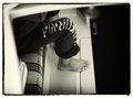
I'd counter nearly every point you make in the your quote with this photo illustration ("coverup...ever see wall hanging art...ever spend the bucks to mat...amateur stuff..."). |
|
|
|
12/05/2011 02:32:23 PM · #9 |
Originally posted by oldbimmercoupe:
exactly. it not only doesnt add, it SUBTRACTS. gimick. worse, it is a coverup to divert the eye from the image itself. ever see wall hanging art with crap like that? ever spend the bucks to mat a print like that? no. this is amateur stuff. perhaps its time to bail on the 50% black background here at DPC. |
Matting functions on prints pretty much as borders (letterbox-style or otherwise) do on digital images. A border, like a mat, gives breathing room to the image, separating it from the surrounding space. It may be true that at worst the border/mat "is a cover-up to divert the eye from the image itself," but at best or even usually it focuses attention on the image. |
|
|
|
12/05/2011 11:12:04 AM · #10 |
exactly. it not only doesnt add, it SUBTRACTS. gimick. worse, it is a coverup to divert the eye from the image itself. ever see wall hanging art with crap like that? ever spend the bucks to mat a print like that? no. this is amateur stuff. perhaps its time to bail on the 50% black background here at DPC.
Originally posted by DomD:
I don't see what it adds. |
|
|
|
|
09/12/2011 04:53:19 AM · #11 |
Originally posted by Magnum_za:
... Would be nice to have a "View on Black" option here. |
Or something like this website Outdoorphoto.co.za in South Africa where if you move the mouse over the picture the background goes almost completely black
(Picture in link chosen to show the difference it has to the eye between a bright background and dark background) |
|
|
|
09/12/2011 04:18:44 AM · #12 |
| I see the borders adding to an image's overall enjoyment here. Pictures (Paintings) have been framed for centuries. Sometimes with multiple frames. Not all my pictures at home are on a canvas with no visible outer frame. The frame is also chosen to complement the other decor in the home, notwithstanding the wall colour it is hanging on. Due the limitations of the 800px by 800px you are occasionally forced to add a frame to give some form of balance to "thin" in height image, as mentioned Pano's etc. The bland blue/grey of DPC doesn't help either. Would be nice to have a "View on Black" option here. |
|
|
|
09/05/2011 10:02:11 AM · #13 |
Originally posted by Cyberlandz:
More new entries with border just showed in cityscape top ten. I think those comments on borders and the points they deduct are losing impact now. |
Interesting...maybe borders don't matter at all. I didn't vote in either of the 'Scapes' challenges that just finished so I'm seeing the front page entries for the first time this morning. I just took a peek at the ones with letterbox borders and you're right, no comments on them at all - even for the 1st place 'Cityscape' where the image bled into the bottom letterbox border. |
|
|
|
09/05/2011 12:56:31 AM · #14 |
| More new entries with border just showed in cityscape top ten. I think those comments on borders and the points they deduct are losing impact now. |
|
|
|
09/01/2011 11:12:02 PM · #15 |
Originally posted by glad2badad:
Well, in the FWIW column, I will still add a letterbox once in awhile just because I like the way it looks. So there! :-P |
That kind of radical thinking isn't going to get you anywhere around here! :) |
|
|
|
09/01/2011 10:28:38 PM · #16 |
Originally posted by Bear_Music:
I'm with the camp that says we should have a total-dimension (height+width=x) rather than a single maximum dimension. Then the high-aspect ratio images could be wider, and thus bigger, and we'd see less letterboxing.
R. |
+1 |
|
|
|
09/01/2011 10:19:20 PM · #17 |
Originally posted by NikonJeb:
Originally posted by Bear_Music:
There are good arguments to be made for limiting the vertical dimension of challenge entries to 800 pixels (view without scrolling on common screen formats) but no good argument, IMO, for limiting horizontal dimensions. If the height is less than 800 pixels, permit horizontal expansion to a total perimeter measurement of 1600 pixels or less. |
I'd argue that these so-called "common screen formats" are no longer common. Go to any electronics site and just try and find a monitor that's *not* widescreen.... |
Yes, that was my point: everyone these days can see WIDE. It's a little less common to be able to see more than 850 pixels vertically. I can see restricting vertical dimensions, but not so much horizontal.
R. |
|
|
|
09/01/2011 10:16:03 PM · #18 |
| Well, in the FWIW column, I will still add a letterbox once in awhile just because I like the way it looks. So there! :-P |
|
|
|
09/01/2011 09:45:44 PM · #19 |
Originally posted by Bear_Music:
There are good arguments to be made for limiting the vertical dimension of challenge entries to 800 pixels (view without scrolling on common screen formats) but no good argument, IMO, for limiting horizontal dimensions. If the height is less than 800 pixels, permit horizontal expansion to a total perimeter measurement of 1600 pixels or less. |
I'd argue that these so-called "common screen formats" are no longer common. Go to any electronics site and just try and find a monitor that's *not* widescreen....
I've not entered good images that I have simply because sizing them down to 800 pixels wide eliminates the impact of the image.
That said.....I don't think that I'd enter one with a letterbox format to try to carry that impact....8~)
Message edited by author 2011-09-01 21:48:35.
|
|
|
|
09/01/2011 06:16:07 PM · #20 |
Originally posted by glad2badad:
Originally posted by Qiki:
Originally posted by Bear_Music:
[
How many times have you seen a strongly horizontal image, a skinny image, ribbon WITHOUT letterboxing? WITH letterboxing? I haven't done a study, but I can't offhand think of an example of the former, but several of the latter come to mind. Those really high aspect ratio images are at an extreme disadvantage in voting, and letterboxing helps to give them weight and presence on the page.
Someone else commented, earlier, that you NEVER see letterboxing of art hung on the wall, as if that proves something, and it doesn't: we do letterboxing for web presentation of challenge entries specifically to try to overcome this shape bias that's present in the voting. Really high aspect ratio images just don't have the screen real estate to compete. I'm with the camp that syas we should have a total-dimension (height+width=x) rather than a single maximum dimension. Then the high-aspect ratio images could be wider, and thus bigger, and we'd see less letterboxing.
R. |
You took the words right out of my mouth Robert. I don't often use these borders, but did so on one of my current entries simply because it looked 'silly' when resized to 800 pixels on the long side, because it was left at less than 500 pixels on the short side. The image just didn't have any 'presence' like this. Surely the time has come to limit total image dimension size, rather than just limiting the size of one side? |
How would that help? The aspect ratio of the image would still be the same and would just change proportionately (long and skinny looking).
I agree with Robert that often a letterbox helps "balance" a widescreen type photo (my wording may be different - apologies to Robert if it changes your context). |
No, you got it right.
As far as the bolded part above goes, the real problem we have (in DPC) isn't just the aspect ratio, it's also the lack of image area. There just aren't enough pixels in an 800x400 (or whatever) image to render effectively. 1100x500, on the other hand, packs a lot more punch, and it's the same total image dimension as 800x800, which of course is legal right now.
There are good arguments to be made for limiting the vertical dimension of challenge entries to 800 pixels (view without scrolling on common screen formats) but no good argument, IMO, for limiting horizontal dimensions. If the height is less than 800 pixels, permit horizontal expansion to a total perimeter measurement of 1600 pixels or less.
To those who'd argue that this is "unfair" to vertical images, I'd counter that "wide screen" formats are very common (it's a natural for landscapes and panoramas) but "tall screen" images are extremely uncommon.
In the meanwhile, you CAN make the argument, convincingly, that our size restrictions are forcing people into displaying square, or squarish, images solely so they can display complex detail, and there's no reason to force the horizontal shooters, at least, into that mold. Not as long as our computer screens stay nice and wide :-)
R. |
|
|
|
09/01/2011 07:36:07 AM · #21 |
Originally posted by Bear_Music:
Really high aspect ratio images just don't have the screen real estate to compete. I'm with the camp that syas we should have a total-dimension (height+width=x) rather than a single maximum dimension. Then the high-aspect ratio images could be wider, and thus bigger, and we'd see less letterboxing.
|
Excellent point and suggestion. I can see how, subjectively, a high aspect ratio image would be at a disadvantage in terms of impact relative to other images given the current sizing restrictions. Relative to itself, I'd still prefer no letterbox borders.
|
|
|
|
09/01/2011 06:24:45 AM · #22 |
Originally posted by Qiki:
Originally posted by Bear_Music:
[
How many times have you seen a strongly horizontal image, a skinny image, ribbon WITHOUT letterboxing? WITH letterboxing? I haven't done a study, but I can't offhand think of an example of the former, but several of the latter come to mind. Those really high aspect ratio images are at an extreme disadvantage in voting, and letterboxing helps to give them weight and presence on the page.
Someone else commented, earlier, that you NEVER see letterboxing of art hung on the wall, as if that proves something, and it doesn't: we do letterboxing for web presentation of challenge entries specifically to try to overcome this shape bias that's present in the voting. Really high aspect ratio images just don't have the screen real estate to compete. I'm with the camp that syas we should have a total-dimension (height+width=x) rather than a single maximum dimension. Then the high-aspect ratio images could be wider, and thus bigger, and we'd see less letterboxing.
R. |
You took the words right out of my mouth Robert. I don't often use these borders, but did so on one of my current entries simply because it looked 'silly' when resized to 800 pixels on the long side, because it was left at less than 500 pixels on the short side. The image just didn't have any 'presence' like this. Surely the time has come to limit total image dimension size, rather than just limiting the size of one side? |
How would that help? The aspect ratio of the image would still be the same and would just change proportionately (long and skinny looking).
I agree with Robert that often a letterbox helps "balance" a widescreen type photo (my wording may be different - apologies to Robert if it changes your context). |
|
|
|
09/01/2011 12:04:51 AM · #23 |
| Just wondering, who is still using a screen res that is less than 1024 in width? I'd support any suggestion to let dpc accept images wider than 800 pixels |
|
|
|
08/31/2011 11:49:33 PM · #24 |
Originally posted by Bear_Music:
[
How many times have you seen a strongly horizontal image, a skinny image, ribbon WITHOUT letterboxing? WITH letterboxing? I haven't done a study, but I can't offhand think of an example of the former, but several of the latter come to mind. Those really high aspect ratio images are at an extreme disadvantage in voting, and letterboxing helps to give them weight and presence on the page.
Someone else commented, earlier, that you NEVER see letterboxing of art hung on the wall, as if that proves something, and it doesn't: we do letterboxing for web presentation of challenge entries specifically to try to overcome this shape bias that's present in the voting. Really high aspect ratio images just don't have the screen real estate to compete. I'm with the camp that syas we should have a total-dimension (height+width=x) rather than a single maximum dimension. Then the high-aspect ratio images could be wider, and thus bigger, and we'd see less letterboxing.
R. |
You took the words right out of my mouth Robert. I don't often use these borders, but did so on one of my current entries simply because it looked 'silly' when resized to 800 pixels on the long side, because it was left at less than 500 pixels on the short side. The image just didn't have any 'presence' like this. Surely the time has come to limit total image dimension size, rather than just limiting the size of one side? |
|
|
|
08/31/2011 11:23:09 PM · #25 |
Originally posted by sailracer_98:
After going through the stopped motion photos, I got more and more annoyed at the letterboxing borders, primarily because there were so many of them. Not -5 points annoyed, but it probably did impact some of my votes In my opinion, if I notice the border at all, then it is taking my eye away from the photo itself and therefore detracting from the photograph (or an obvious attempt at glitzing up a poor photograph). There are some rare exceptions where I think a letterbox works. I will not be disappointed to see this fad pass. |
How many times have you seen a strongly horizontal image, a skinny image, ribbon WITHOUT letterboxing? WITH letterboxing? I haven't done a study, but I can't offhand think of an example of the former, but several of the latter come to mind. Those really high aspect ratio images are at an extreme disadvantage in voting, and letterboxing helps to give them weight and presence on the page.
Someone else commented, earlier, that you NEVER see letterboxing of art hung on the wall, as if that proves something, and it doesn't: we do letterboxing for web presentation of challenge entries specifically to try to overcome this shape bias that's present in the voting. Really high aspect ratio images just don't have the screen real estate to compete. I'm with the camp that syas we should have a total-dimension (height+width=x) rather than a single maximum dimension. Then the high-aspect ratio images could be wider, and thus bigger, and we'd see less letterboxing.
R. |
|


